-
Notifications
You must be signed in to change notification settings - Fork 819
New issue
Have a question about this project? Sign up for a free GitHub account to open an issue and contact its maintainers and the community.
By clicking “Sign up for GitHub”, you agree to our terms of service and privacy statement. We’ll occasionally send you account related emails.
Already on GitHub? Sign in to your account
Parking too prominent #2904
Comments
|
Thanks, looks to me like a real issue worth taking care of. Lighter yellow might be similar to social amenities however. Another possibility would be something based on garages area. |
Well, that's very good IMO. I don't like any objects to "scream" if they are not of special importance by design (like military area or health related features). Parkings are currently too prominent because of two properties:
My initial idea was to push the letters down a bit (#2171), but maybe we could do the other way around and left the "P" markers as they are, but instead make area color neutral, just to see the shape. I feel that gray is good: if you're looking for a parking, you can still easily spot them, and the real shape and size is perfectly visible once you choose which one you're interested in. "Transportation gray" would make things unified (as in #2763). Dropping yellow would also work for visibility of secondary roads ("After" rendering shows it clearly) and probably social amenities too. |
|
Some hints for rendering parking space:
|
|
I don't see any problem with current parkings colour. Current yellow with "P" letter is intuitive, and parking borders are visible good. Parkings with restricted access are rendered with lighter "P", and for me, it's enough to distinguish them. |
"Too prominent" means "too easy to see (=at the expense of other elements)", but making them less prominent does not mean they will be "hard to see". The letter "P" is still easily visible, so it's still easy to see the parking location, just not the shape. |
|
Gray parking areas would become invisible on landuse=residential and other gray areas. |
|
Will you change amenity=bicycle_parking areas too for consistency? |
|
The same color is used for all the parking types: openstreetmap-carto/landcover.mss Lines 537 to 547 in 68131b4
|
|
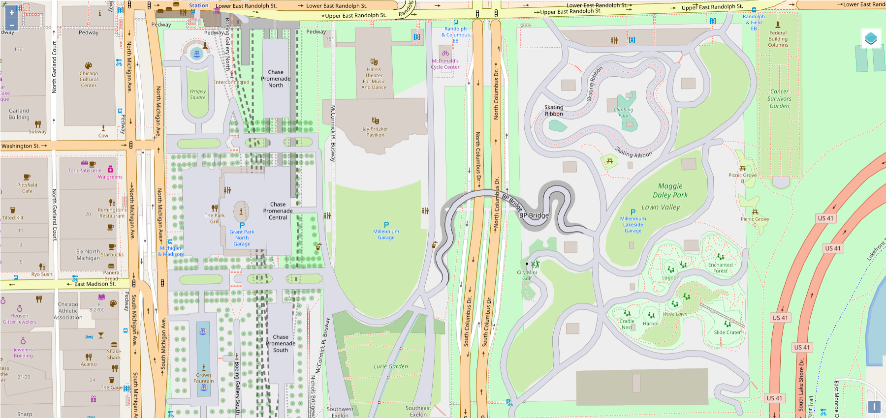
Another case when parking is too visible - big underground facilities in yellow make park look like a beach probably: http://www.openstreetmap.org/way/230629285#map=18/41.88262/-87.62070 UPDATE: This is how it looks after the color change - I still think if we should change the rendering for underground parkings (hide the landcover, hide the P or show it with a ^ above?): https://tile.iosb.fraunhofer.de//#map=17/41.8827/-87.6214/3 In the end the most important thing to show in such cases is the parking entrance: #2875. |
|
@Tomasz-W Maybe P combined with the down arrow on the bottom could work for underground parking? It could be simple and readable, I hope. What do you think? |
|
What about "P" under horizontal line? "P" with arrow is planned for #2875 |
|
Could you check both? I meant lower part of the letter to be an arrow, not two elements with smaller P, like in parking entry. |
|
Ok, I'll try. Btw. I think underground parking areas should be hidden the same as we hid underground platforms, I don't see a reason for showing them as they are covered by another elements (see the example above), so parking shape is invisible or hard readable anyway. Edit: Or maybe some dashed outline without filling simillar to 3rd test rendering there: #2475 (comment) |
|
Yes, my current idea is to hide all the areas (better than yellow, but still strange and misleading), but leave the mark on lower zoom level and show entries on higher zoom. I guess this would be enough and we don't have to remove the mark. |
|
Comparison of example with 3 underground parkings in Chicago on z17: Before (well, the icon is v3...) After (3 versions) |
|
What about bigger triangle on v3, like the whole width and probably P letter cut a bit on the bottom to make it fit? |
|
@kocio-pl Is possible to use dashed parking outline there (without filling)? Can you try it? PS. At this point I think it would be better if you will open new issue for underground parkings, because working on something in closed ticker which was about something different always makes discussion more complitated. |
|
I don't think the outline is good, it will be hard to know what is it. I will open new ticket once I get some time, I have too many things currently. |
|
My 2 cents: why not a roof over the "P" like this one |
|
Because it would fit rather parkings under |
|
Not just in building=roof but also parking=multi_storey; but indeed not underground. |
|
I vote for v5. |
|
Please continue further discussion about underground parkings in #3506. |


Parking is currently rendered too prominent. Compare for example the following renderings.
Before:

After (possible):

In the 'before' rendering, the parking is rendered more prominently than the buildings (including the supermarket). Can we tone down the rendering? Light gray like in the possible 'after' might be going too far, but do we have any other options?
The text was updated successfully, but these errors were encountered: