-
Notifications
You must be signed in to change notification settings - Fork 12.8k
New issue
Have a question about this project? Sign up for a free GitHub account to open an issue and contact its maintainers and the community.
By clicking “Sign up for GitHub”, you agree to our terms of service and privacy statement. We’ll occasionally send you account related emails.
Already on GitHub? Sign in to your account
Make the "help" button on generated rustdoc pages easier to find #90310
Comments
|
Yes, I think it would be helpful to show some help text in multiple places. The search tricks of the help could be added to the No results :( page and the other half (the keyboard shortcuts) could be shown somewhere else as well maybe. And I think |
|
Yeah, I often forget about the help button myself, even though I know we have one ;)
But then it'll no longer be next to the config icon, right? |
|
We could move both icons at the same time. |
|
Fine by me! |
It is weird that the theme icon is on one side and the others are on the opposite side, so moving all of them together sounds good. |
|
I'd like to break this down into sub-problems: Problem 1: Experienced Rust Developers don't know about the help popup. Problem 2: Experienced Rust Developers don't know about the things the help popup teaches them, specifically:
Keyboard Shortcuts? Show this help dialog Search TricksPrefix searches with a type followed by a colon (e.g., fn:) to restrict the search to a given item kind. In other words, almost all of the help popup is actually help about searching. We should present that information to people when it is most relevant: when they are searching. A quick mockup: That can do a more effective job teaching people about the search syntax and the search-related keyboard shortcuts, while reducing overall clutter. Excessive clutter around the search bar was one of the major themes of #59829. We should be aiming to remove elements surrounding the search bar rather than add more. For instance, in #84539 I propose that the paintbrush icon should be replaced with equivalent functionality in the settings menu, since picking a theme is a rare operation. If we use the search page to teach people about searching, we need to teach people about the remaining keyboard shortcuts:
@jyn514 when you talked to those Rust devs, what was the functionality you wanted them to know about inside the help popup? |
|
@jsha 2b, the search tips - this originally came up because someone suggested adding a |
IMO, that adds more clutter, since it's a whole sentence that'd appear every time you use the search box and distract from the search results.
I agree that we should reduce the number of elements, but I disagree that picking a theme is a rare operation. Since docs.rs does not persist settings across crates, because that's managed by rustdoc, I have to manually change the theme if I want to put the page in dark mode. Perhaps one way to mitigate this would be to make following the system theme the default setting—but then, since I prefer Ayu over the Dark theme, I'd still have to dig around in settings to switch the default dark theme to Ayu. |
Wait, what? We spent a long time making sure the theme syncs across pages, it even applies to the docs.rs homepage. |
I stand corrected! Wow, did that happen recently? I remember it not being synchronized... Anyway, that's amazing! |
My intent with the mockup was that there would be an easy, obvious button (mimicked with "[x]") that dismisses the tips forever.
It sounds like this is a third problem: people aren't noticing the "In Parameters" and "In Return Types" tabs of search, or notice them but don't internalize what they do. I think making the help popup more prominent doesn't actually solve this problem, right? |
How hard would it be for docs.rs to synchronize that between all crates like (I've now learned) it does for themes? Also, for locally built docs, you'd have to manually dismiss it each time you built the docs, which seems frustrating. |
Presumably not too hard, though @jyn514 can answer for sure. I agree it would be annoying if it wasn't synchronized!
We should turn the tips off when accessing via file:// URLs. |
That would solve the problem, but it feels like it adds complexity to rustdoc's behavior and could be confusing, though I guess it couldn't be too bad... |
Well, sort of - we have a link to doc.rust-lang.org/rustdoc in the popup and we could add some more docs there (#90309). But I agree it doesn't solve the problem on its own. |
I did it a few months ago. :)
Let's avoid that. I think showing a sentence which would open the popup is a good idea. People will simply ignore it after a few uses of the rustdoc search.
Let's not. Having different behaviours between local and non-local documentation is not a good idea at all.
It would only work if you have an internet connection, so not the best. I think the current way is fine. It's how we allow people to get to it which needs to be refined. |
|
@GuillaumeGomez I have trouble understanding this comment:
Right now we don't document the search tabs at all. |
|
I meant going to <doc.rust-lang.org/rustdoc>. If we add more information, only "non-vital" should be put outside of rustdoc as much as possible.
True, which isn't great... |
I agree that having different behaviors between local and non-local docs could be confusing, but I also don't think unconditionally showing the sentence is a good idea either. It's hard to find the right balance here. |
Since docs.rs is a single domain all local storage settings get shared across all documentation. As long as different versions of rustdoc are consistent in the settings they read/write they will synchronize the settings fine. |
This adds labels to the icons and moves them away from the search box.

These changes are made together, because they work together, but are based on
several complaints:

* The [+/-] thing are a Reddit-ism. They don't look like buttons, but look
  like syntax
  <https://rust-lang.zulipchat.com/#narrow/stream/266220-t-rustdoc/topic/More.20visual.20difference.20for.20the.20.2B.2F-.20.20Icons>,
  <rust-lang#59851>
  (some of these are laundry lists with more suggestions, but they all
  mention [+/-] looking wrong)

* The settings, help, and summary buttons are also too hard to recognize
  <https://lwn.net/Articles/987070/>,
  <rust-lang#90310>,
  <rust-lang#14475 (comment)>,
  <https://internals.rust-lang.org/t/improve-rustdoc-design/12758>
  ("Not all functionality is self-explanatory, for example the [+] button in
  the top right corner, the theme picker or the settings button.")

The toggle-all and toggle-individual buttons both need done at once, since we
want them to look like they go together. This changes them from both being
[+/-] to both being arrows.

Settings and Help are also migrated, so that the whole group can benefit from
being described using actual words.
This adds labels to the icons and moves them away from the search box.

These changes are made together, because they work together, but are based on
several complaints:

* The [+/-] thing are a Reddit-ism. They don't look like buttons, but look
  like syntax
  <https://rust-lang.zulipchat.com/#narrow/stream/266220-t-rustdoc/topic/More.20visual.20difference.20for.20the.20.2B.2F-.20.20Icons>,
  <rust-lang#59851>
  (some of these are laundry lists with more suggestions, but they all
  mention [+/-] looking wrong)

* The settings, help, and summary buttons are also too hard to recognize
  <https://lwn.net/Articles/987070/>,
  <rust-lang#90310>,
  <rust-lang#14475 (comment)>,
  <https://internals.rust-lang.org/t/improve-rustdoc-design/12758>
  ("Not all functionality is self-explanatory, for example the [+] button in
  the top right corner, the theme picker or the settings button.")

The toggle-all and toggle-individual buttons both need done at once, since we
want them to look like they go together. This changes them from both being
[+/-] to both being arrows.

Settings and Help are also migrated, so that the whole group can benefit from
being described using actual words.

Additionally, the Help button is only shown on SERPs, not all the time.
This is done for two major reasons:

* Most of what's in there is search-related. The things that aren't are
  keyboard commands, and the search box tells you about that anyway.
  Pressing <kbd>?</kbd> will temporarily show the button and its popover.
* I'm trading it off by showing the help button, even on mobile.
  It's useful since you can use the search engine suggestions there.
* The three buttons were causing line wrapping on too many desktop layouts.
This adds labels to the icons and moves them away from the search box.

These changes are made together, because they work together, but are based on
several complaints:

* The [+/-] thing are a Reddit-ism. They don't look like buttons, but look
  like syntax
  <https://rust-lang.zulipchat.com/#narrow/stream/266220-t-rustdoc/topic/More.20visual.20difference.20for.20the.20.2B.2F-.20.20Icons>,
  <rust-lang#59851>
  (some of these are laundry lists with more suggestions, but they all
  mention [+/-] looking wrong)

* The settings, help, and summary buttons are also too hard to recognize
  <https://lwn.net/Articles/987070/>,
  <rust-lang#90310>,
  <rust-lang#14475 (comment)>,
  <https://internals.rust-lang.org/t/improve-rustdoc-design/12758>
  ("Not all functionality is self-explanatory, for example the [+] button in
  the top right corner, the theme picker or the settings button.")

The toggle-all and toggle-individual buttons both need done at once, since we
want them to look like they go together. This changes them from both being
[+/-] to both being arrows.

Settings and Help are also migrated, so that the whole group can benefit from
being described using actual words.

Additionally, the Help button is only shown on SERPs, not all the time.
This is done for two major reasons:

* Most of what's in there is search-related. The things that aren't are
  keyboard commands, and the search box tells you about that anyway.
  Pressing <kbd>?</kbd> will temporarily show the button and its popover.
* I'm trading it off by showing the help button, even on mobile.
  It's useful since you can use the search engine suggestions there.
* The three buttons were causing line wrapping on too many desktop layouts.
This adds labels to the icons and moves them away from the search box.

These changes are made together, because they work together, but are based on
several complaints:

* The [+/-] thing are a Reddit-ism. They don't look like buttons, but look
  like syntax
  <https://rust-lang.zulipchat.com/#narrow/stream/266220-t-rustdoc/topic/More.20visual.20difference.20for.20the.20.2B.2F-.20.20Icons>,
  <rust-lang#59851>
  (some of these are laundry lists with more suggestions, but they all
  mention [+/-] looking wrong)

* The settings, help, and summary buttons are also too hard to recognize
  <https://lwn.net/Articles/987070/>,
  <rust-lang#90310>,
  <rust-lang#14475 (comment)>,
  <https://internals.rust-lang.org/t/improve-rustdoc-design/12758>
  ("Not all functionality is self-explanatory, for example the [+] button in
  the top right corner, the theme picker or the settings button.")

The toggle-all and toggle-individual buttons both need done at once, since we
want them to look like they go together. This changes them from both being
[+/-] to both being arrows.

Settings and Help are also migrated, so that the whole group can benefit from
being described using actual words.

Additionally, the Help button is only shown on SERPs, not all the time.
This is done for two major reasons:

* Most of what's in there is search-related. The things that aren't are
  keyboard commands, and the search box tells you about that anyway.
  Pressing <kbd>?</kbd> will temporarily show the button and its popover.
* I'm trading it off by showing the help button, even on mobile.
  It's useful since you can use the search engine suggestions there.
* The three buttons were causing line wrapping on too many desktop layouts.
This adds labels to the icons and moves them away from the search box.

These changes are made together, because they work together, but are based on
several complaints:

* The [+/-] thing are a Reddit-ism. They don't look like buttons, but look
  like syntax
  <https://rust-lang.zulipchat.com/#narrow/stream/266220-t-rustdoc/topic/More.20visual.20difference.20for.20the.20.2B.2F-.20.20Icons>,
  <rust-lang#59851>
  (some of these are laundry lists with more suggestions, but they all
  mention [+/-] looking wrong)

* The settings, help, and summary buttons are also too hard to recognize
  <https://lwn.net/Articles/987070/>,
  <rust-lang#90310>,
  <rust-lang#14475 (comment)>,
  <https://internals.rust-lang.org/t/improve-rustdoc-design/12758>
  ("Not all functionality is self-explanatory, for example the [+] button in
  the top right corner, the theme picker or the settings button.")

The toggle-all and toggle-individual buttons both need done at once, since we
want them to look like they go together. This changes them from both being
[+/-] to both being arrows.

Settings and Help are also migrated, so that the whole group can benefit from
being described using actual words.

Additionally, the Help button is only shown on SERPs, not all the time.
This is done for two major reasons:

* Most of what's in there is search-related. The things that aren't are
  keyboard commands, and the search box tells you about that anyway.
  Pressing <kbd>?</kbd> will temporarily show the button and its popover.
* I'm trading it off by showing the help button, even on mobile.
  It's useful since you can use the search engine suggestions there.
* The three buttons were causing line wrapping on too many desktop layouts.
This adds labels to the icons and moves them away from the search box.

These changes are made together, because they work together, but are based on
several complaints:

* The [+/-] thing are a Reddit-ism. They don't look like buttons, but look
  like syntax
  <https://rust-lang.zulipchat.com/#narrow/stream/266220-t-rustdoc/topic/More.20visual.20difference.20for.20the.20.2B.2F-.20.20Icons>,
  <rust-lang#59851>
  (some of these are laundry lists with more suggestions, but they all
  mention [+/-] looking wrong)

* The settings, help, and summary buttons are also too hard to recognize
  <https://lwn.net/Articles/987070/>,
  <rust-lang#90310>,
  <rust-lang#14475 (comment)>,
  <https://internals.rust-lang.org/t/improve-rustdoc-design/12758>
  ("Not all functionality is self-explanatory, for example the [+] button in
  the top right corner, the theme picker or the settings button.")

The toggle-all and toggle-individual buttons both need done at once, since we
want them to look like they go together. This changes them from both being
[+/-] to both being arrows.

Settings and Help are also migrated, so that the whole group can benefit from
being described using actual words.

Additionally, the Help button is only shown on SERPs, not all the time.
This is done for two major reasons:

* Most of what's in there is search-related. The things that aren't are
  keyboard commands, and the search box tells you about that anyway.
  Pressing <kbd>?</kbd> will temporarily show the button and its popover.
* I'm trading it off by showing the help button, even on mobile.
  It's useful since you can use the search engine suggestions there.
* The three buttons were causing line wrapping on too many desktop layouts.
This adds labels to the icons and moves them away from the search box.

These changes are made together, because they work together, but are based on
several complaints:

* The [+/-] thing are a Reddit-ism. They don't look like buttons, but look
  like syntax
  <https://rust-lang.zulipchat.com/#narrow/stream/266220-t-rustdoc/topic/More.20visual.20difference.20for.20the.20.2B.2F-.20.20Icons>,
  <rust-lang#59851>
  (some of these are laundry lists with more suggestions, but they all
  mention [+/-] looking wrong)

* The settings, help, and summary buttons are also too hard to recognize
  <https://lwn.net/Articles/987070/>,
  <rust-lang#90310>,
  <rust-lang#14475 (comment)>,
  <https://internals.rust-lang.org/t/improve-rustdoc-design/12758>
  ("Not all functionality is self-explanatory, for example the [+] button in
  the top right corner, the theme picker or the settings button.")

The toggle-all and toggle-individual buttons both need done at once, since we
want them to look like they go together. This changes them from both being
[+/-] to both being arrows.

Settings and Help are also migrated, so that the whole group can benefit from
being described using actual words.

Additionally, the Help button is only shown on SERPs, not all the time.
This is done for two major reasons:

* Most of what's in there is search-related. The things that aren't are
  keyboard commands, and the search box tells you about that anyway.
  Pressing <kbd>?</kbd> will temporarily show the button and its popover.
* I'm trading it off by showing the help button, even on mobile.
  It's useful since you can use the search engine suggestions there.
* The three buttons were causing line wrapping on too many desktop layouts.
…GuillaumeGomez rustdoc: redesign toolbar and disclosure widgets Fixes rust-lang#77899 Fixes rust-lang#90310 ## Preview | before | after | ------ | ----- |  | 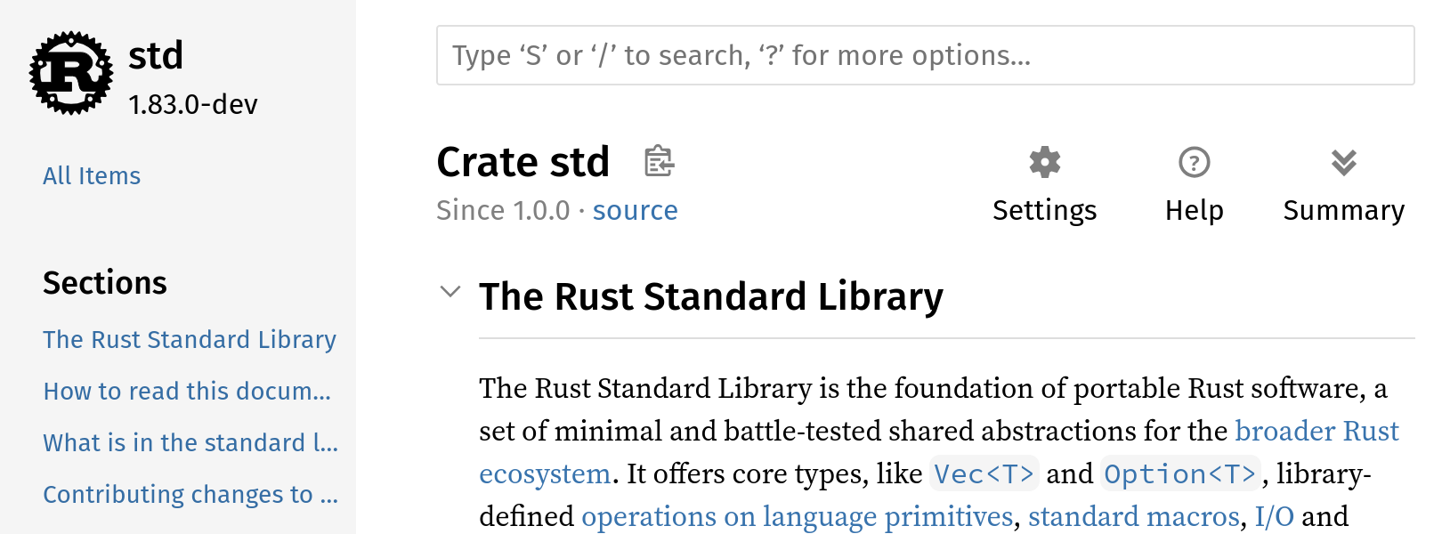 |  | 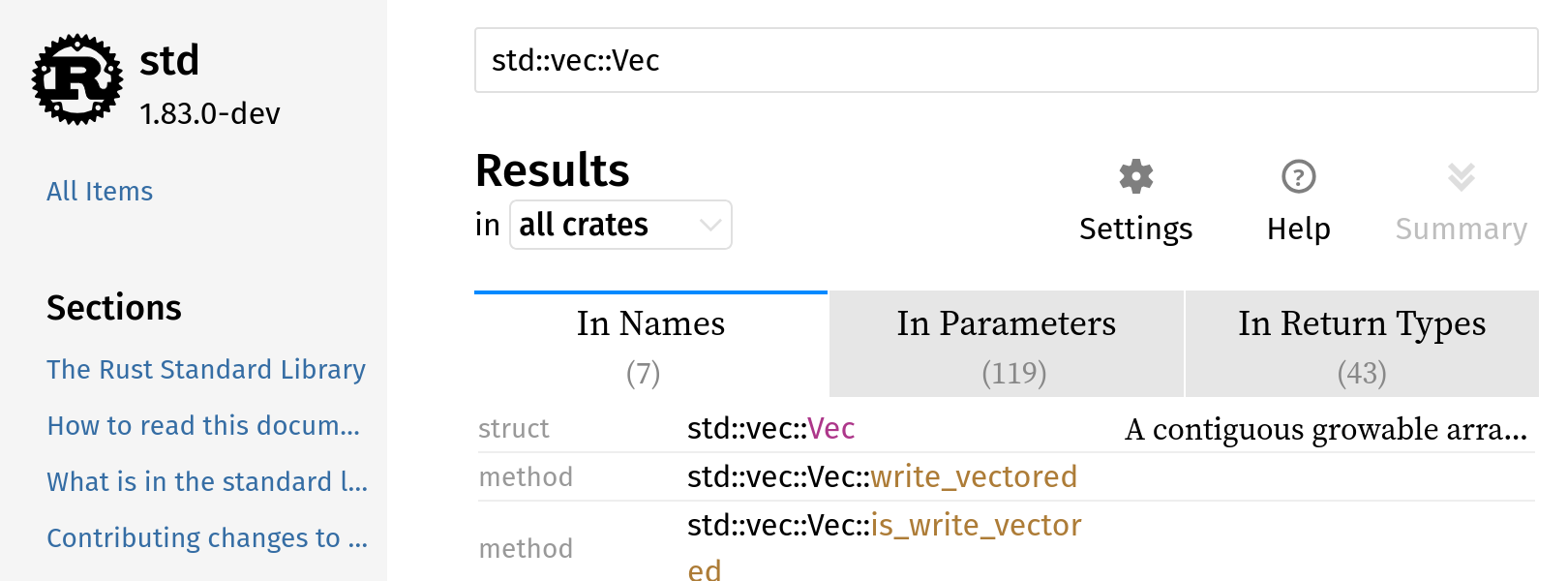 |  |  |  |  |  |  | N/A | 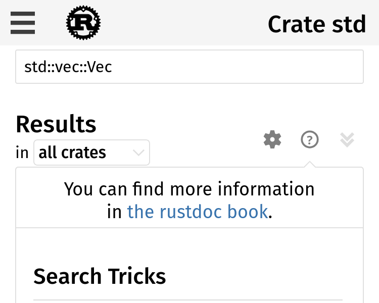 |  | 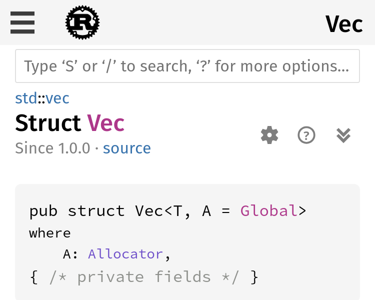 |  |  https://notriddle.com/rustdoc-html-demo-12/toolbar-v2/std/index.html ## Description This adds labels to the icons and moves them away from the search box. These changes are made together, because they work together, but are based on several complaints: * The [+/-] thing are a Reddit-ism. They don't look like buttons, but look like syntax <https://rust-lang.zulipchat.com/#narrow/stream/266220-t-rustdoc/topic/More.20visual.20difference.20for.20the.20.2B.2F-.20.20Icons>, <rust-lang#59851> (some of these are laundry lists with more suggestions, but they all mention [+/-] looking wrong) * The settings, help, and summary buttons are also too hard to recognize <https://lwn.net/Articles/987070/>, <rust-lang#90310>, <rust-lang#14475 (comment)>, <https://internals.rust-lang.org/t/improve-rustdoc-design/12758> ("Not all functionality is self-explanatory, for example the [+] button in the top right corner, the theme picker or the settings button.") The toggle-all and toggle-individual buttons both need done at once, since we want them to look like they go together. This changes them from both being [+/-] to both being arrows. CC <rust-lang#113074 (comment)> and `@jsha` regarding the use of triangles for disclosure, which is what everyone wanted, but was pending a good toggle-all button. This PR adds a toggle-all button that should work. Settings and Help are also migrated, so that the whole group can benefit from being described using actual words. The breadcrumbs also get redesigned, so that they use less space, by shrinking the parent module path parts. This is done at the same time as the toolbar redesign because it's, effectively, moving space from the toolbar to the breadcrumbs. This is aimed at avoiding any line wrapping at desktop sizes. ## Prior art This style of toolbar, with explicit labels on the buttons, used to be more popular. It's not very common in web browsers nowadays, and for truly universal icons like ⬅️ I can understand why, but words are great when icons fail. 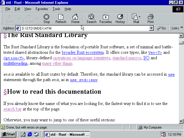
…GuillaumeGomez rustdoc: redesign toolbar and disclosure widgets Fixes rust-lang#77899 Fixes rust-lang#90310 ## Preview | before | after | ------ | ----- |  |  |  |  |  |  |  |  |  |  | N/A |  |  |  |  |  https://notriddle.com/rustdoc-html-demo-12/toolbar-v2/std/index.html ## Description This adds labels to the icons and moves them away from the search box. These changes are made together, because they work together, but are based on several complaints: * The [+/-] thing are a Reddit-ism. They don't look like buttons, but look like syntax <https://rust-lang.zulipchat.com/#narrow/stream/266220-t-rustdoc/topic/More.20visual.20difference.20for.20the.20.2B.2F-.20.20Icons>, <rust-lang#59851> (some of these are laundry lists with more suggestions, but they all mention [+/-] looking wrong) * The settings, help, and summary buttons are also too hard to recognize <https://lwn.net/Articles/987070/>, <rust-lang#90310>, <rust-lang#14475 (comment)>, <https://internals.rust-lang.org/t/improve-rustdoc-design/12758> ("Not all functionality is self-explanatory, for example the [+] button in the top right corner, the theme picker or the settings button.") The toggle-all and toggle-individual buttons both need done at once, since we want them to look like they go together. This changes them from both being [+/-] to both being arrows. CC <rust-lang#113074 (comment)> and `@jsha` regarding the use of triangles for disclosure, which is what everyone wanted, but was pending a good toggle-all button. This PR adds a toggle-all button that should work. Settings and Help are also migrated, so that the whole group can benefit from being described using actual words. The breadcrumbs also get redesigned, so that they use less space, by shrinking the parent module path parts. This is done at the same time as the toolbar redesign because it's, effectively, moving space from the toolbar to the breadcrumbs. This is aimed at avoiding any line wrapping at desktop sizes. ## Prior art This style of toolbar, with explicit labels on the buttons, used to be more popular. It's not very common in web browsers nowadays, and for truly universal icons like ⬅️ I can understand why, but words are great when icons fail. 
…GuillaumeGomez rustdoc: redesign toolbar and disclosure widgets Fixes rust-lang#77899 Fixes rust-lang#90310 ## Preview | before | after | ------ | ----- |  |  |  |  |  |  |  |  |  |  | N/A |  |  |  |  |  https://notriddle.com/rustdoc-html-demo-12/toolbar-v2/std/index.html ## Description This adds labels to the icons and moves them away from the search box. These changes are made together, because they work together, but are based on several complaints: * The [+/-] thing are a Reddit-ism. They don't look like buttons, but look like syntax <https://rust-lang.zulipchat.com/#narrow/stream/266220-t-rustdoc/topic/More.20visual.20difference.20for.20the.20.2B.2F-.20.20Icons>, <rust-lang#59851> (some of these are laundry lists with more suggestions, but they all mention [+/-] looking wrong) * The settings, help, and summary buttons are also too hard to recognize <https://lwn.net/Articles/987070/>, <rust-lang#90310>, <rust-lang#14475 (comment)>, <https://internals.rust-lang.org/t/improve-rustdoc-design/12758> ("Not all functionality is self-explanatory, for example the [+] button in the top right corner, the theme picker or the settings button.") The toggle-all and toggle-individual buttons both need done at once, since we want them to look like they go together. This changes them from both being [+/-] to both being arrows. CC <rust-lang#113074 (comment)> and ``@jsha`` regarding the use of triangles for disclosure, which is what everyone wanted, but was pending a good toggle-all button. This PR adds a toggle-all button that should work. Settings and Help are also migrated, so that the whole group can benefit from being described using actual words. The breadcrumbs also get redesigned, so that they use less space, by shrinking the parent module path parts. This is done at the same time as the toolbar redesign because it's, effectively, moving space from the toolbar to the breadcrumbs. This is aimed at avoiding any line wrapping at desktop sizes. ## Prior art This style of toolbar, with explicit labels on the buttons, used to be more popular. It's not very common in web browsers nowadays, and for truly universal icons like ⬅️ I can understand why, but words are great when icons fail. 
…GuillaumeGomez rustdoc: redesign toolbar and disclosure widgets Fixes rust-lang#77899 Fixes rust-lang#90310 ## Preview | before | after | ------ | ----- |  |  |  |  |  |  |  |  |  |  | N/A |  |  |  |  |  https://notriddle.com/rustdoc-html-demo-12/toolbar-v2/std/index.html ## Description This adds labels to the icons and moves them away from the search box. These changes are made together, because they work together, but are based on several complaints: * The [+/-] thing are a Reddit-ism. They don't look like buttons, but look like syntax <https://rust-lang.zulipchat.com/#narrow/stream/266220-t-rustdoc/topic/More.20visual.20difference.20for.20the.20.2B.2F-.20.20Icons>, <rust-lang#59851> (some of these are laundry lists with more suggestions, but they all mention [+/-] looking wrong) * The settings, help, and summary buttons are also too hard to recognize <https://lwn.net/Articles/987070/>, <rust-lang#90310>, <rust-lang#14475 (comment)>, <https://internals.rust-lang.org/t/improve-rustdoc-design/12758> ("Not all functionality is self-explanatory, for example the [+] button in the top right corner, the theme picker or the settings button.") The toggle-all and toggle-individual buttons both need done at once, since we want them to look like they go together. This changes them from both being [+/-] to both being arrows. CC <rust-lang#113074 (comment)> and `@jsha` regarding the use of triangles for disclosure, which is what everyone wanted, but was pending a good toggle-all button. This PR adds a toggle-all button that should work. Settings and Help are also migrated, so that the whole group can benefit from being described using actual words. The breadcrumbs also get redesigned, so that they use less space, by shrinking the parent module path parts. This is done at the same time as the toolbar redesign because it's, effectively, moving space from the toolbar to the breadcrumbs. This is aimed at avoiding any line wrapping at desktop sizes. ## Prior art This style of toolbar, with explicit labels on the buttons, used to be more popular. It's not very common in web browsers nowadays, and for truly universal icons like ⬅️ I can understand why, but words are great when icons fail. 
Rollup merge of rust-lang#129545 - notriddle:notriddle/toolbar-v2, r=GuillaumeGomez rustdoc: redesign toolbar and disclosure widgets Fixes rust-lang#77899 Fixes rust-lang#90310 ## Preview | before | after | ------ | ----- |  |  |  |  |  |  |  |  |  |  | N/A |  |  |  |  |  https://notriddle.com/rustdoc-html-demo-12/toolbar-v2/std/index.html ## Description This adds labels to the icons and moves them away from the search box. These changes are made together, because they work together, but are based on several complaints: * The [+/-] thing are a Reddit-ism. They don't look like buttons, but look like syntax <https://rust-lang.zulipchat.com/#narrow/stream/266220-t-rustdoc/topic/More.20visual.20difference.20for.20the.20.2B.2F-.20.20Icons>, <rust-lang#59851> (some of these are laundry lists with more suggestions, but they all mention [+/-] looking wrong) * The settings, help, and summary buttons are also too hard to recognize <https://lwn.net/Articles/987070/>, <rust-lang#90310>, <rust-lang#14475 (comment)>, <https://internals.rust-lang.org/t/improve-rustdoc-design/12758> ("Not all functionality is self-explanatory, for example the [+] button in the top right corner, the theme picker or the settings button.") The toggle-all and toggle-individual buttons both need done at once, since we want them to look like they go together. This changes them from both being [+/-] to both being arrows. CC <rust-lang#113074 (comment)> and ``@jsha`` regarding the use of triangles for disclosure, which is what everyone wanted, but was pending a good toggle-all button. This PR adds a toggle-all button that should work. Settings and Help are also migrated, so that the whole group can benefit from being described using actual words. The breadcrumbs also get redesigned, so that they use less space, by shrinking the parent module path parts. This is done at the same time as the toolbar redesign because it's, effectively, moving space from the toolbar to the breadcrumbs. This is aimed at avoiding any line wrapping at desktop sizes. ## Prior art This style of toolbar, with explicit labels on the buttons, used to be more popular. It's not very common in web browsers nowadays, and for truly universal icons like ⬅️ I can understand why, but words are great when icons fail. 
…Gomez rustdoc: redesign toolbar and disclosure widgets Fixes #77899 Fixes #90310 ## Preview | before | after | ------ | ----- |  |  |  |  |  |  |  |  |  |  | N/A |  |  |  |  |  https://notriddle.com/rustdoc-html-demo-12/toolbar-v2/std/index.html ## Description This adds labels to the icons and moves them away from the search box. These changes are made together, because they work together, but are based on several complaints: * The [+/-] thing are a Reddit-ism. They don't look like buttons, but look like syntax <https://rust-lang.zulipchat.com/#narrow/stream/266220-t-rustdoc/topic/More.20visual.20difference.20for.20the.20.2B.2F-.20.20Icons>, <rust-lang/rust#59851> (some of these are laundry lists with more suggestions, but they all mention [+/-] looking wrong) * The settings, help, and summary buttons are also too hard to recognize <https://lwn.net/Articles/987070/>, <rust-lang/rust#90310>, <rust-lang/rust#14475 (comment)>, <https://internals.rust-lang.org/t/improve-rustdoc-design/12758> ("Not all functionality is self-explanatory, for example the [+] button in the top right corner, the theme picker or the settings button.") The toggle-all and toggle-individual buttons both need done at once, since we want them to look like they go together. This changes them from both being [+/-] to both being arrows. CC <rust-lang/rust#113074 (comment)> and ``@jsha`` regarding the use of triangles for disclosure, which is what everyone wanted, but was pending a good toggle-all button. This PR adds a toggle-all button that should work. Settings and Help are also migrated, so that the whole group can benefit from being described using actual words. The breadcrumbs also get redesigned, so that they use less space, by shrinking the parent module path parts. This is done at the same time as the toolbar redesign because it's, effectively, moving space from the toolbar to the breadcrumbs. This is aimed at avoiding any line wrapping at desktop sizes. ## Prior art This style of toolbar, with explicit labels on the buttons, used to be more popular. It's not very common in web browsers nowadays, and for truly universal icons like ⬅️ I can understand why, but words are great when icons fail. 

I've talked to 3+ experienced rust developers this morning, all of whom were unaware of the existence of the help popup. They mentioned the following issues:
?is useless and doesn't have any non-trivial amount of info.We should move the icon to the left and make it larger. They also suggested duplicating the help text on the docs.rs homepage, which seems like a much bigger hammer, but maybe is worth considering.
cc @rust-lang/rustdoc
The text was updated successfully, but these errors were encountered: