-
Notifications
You must be signed in to change notification settings - Fork 12.8k
New issue
Have a question about this project? Sign up for a free GitHub account to open an issue and contact its maintainers and the community.
By clicking “Sign up for GitHub”, you agree to our terms of service and privacy statement. We’ll occasionally send you account related emails.
Already on GitHub? Sign in to your account
rustdoc: help widget oversized on mobile and can't scroll #77899
Comments
|
Appears to be a rustdoc issue, I can reproduce on https://doc.rust-lang.org/nightly/std/ |
|
Ah right, it wasn't possible before we added the button to have this popup. Maybe we should hide it when we're on mobile? |
|
#77979 is just a quick fix for now: we're still debating about whether or not we want to display this help popup and if so, how. |
…jyn514 Hide help button on mobile Addresses rust-lang#77899. This PR is just a quick fix for now: we're still debating about whether or not we want to display this help popup and if so, how. I'll open an issue once this PR is merged to discuss about it. Before:  After:  r? @jyn514
|
I propose to close this and consider #77979 the long-term fix. I think hiding the help button on mobile is the right thing to do. |
|
But that prevents to have access to the search help too, which is why I'm not super happy about it... |
|
Aha, that makes sense. |
…GuillaumeGomez rustdoc: redesign toolbar and disclosure widgets Fixes rust-lang#77899 Fixes rust-lang#90310 ## Preview | before | after | ------ | ----- |  | 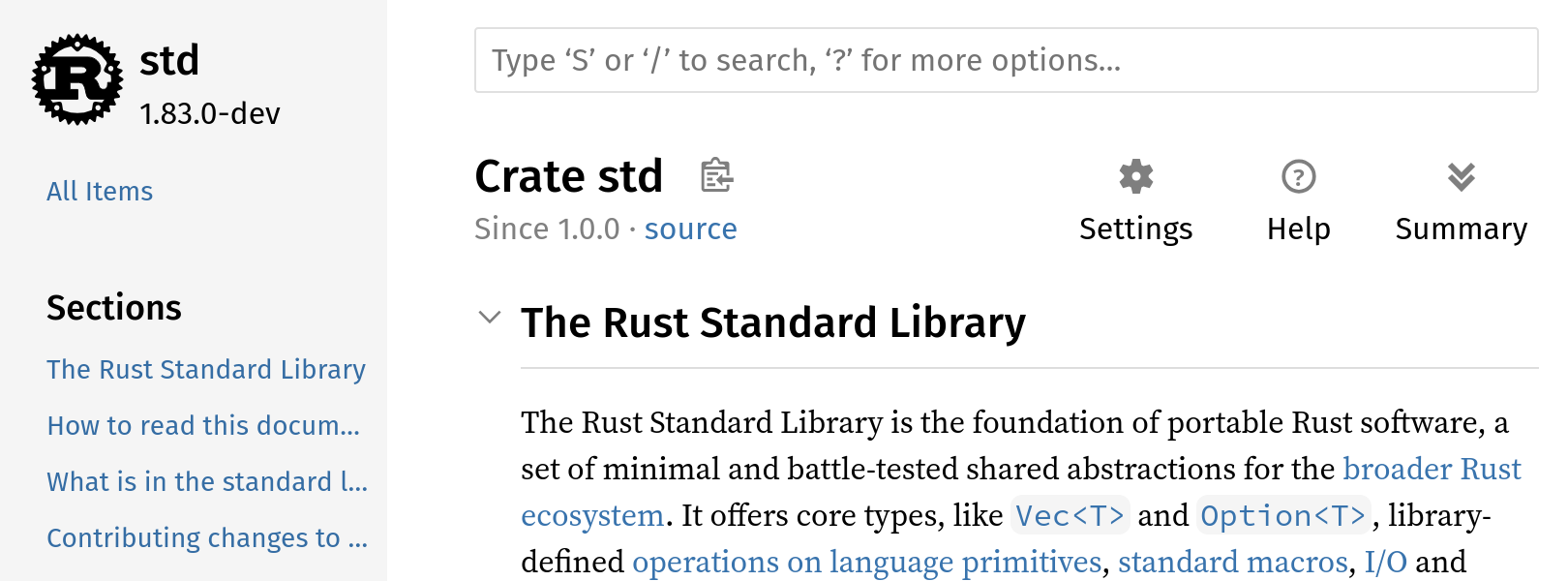 |  | 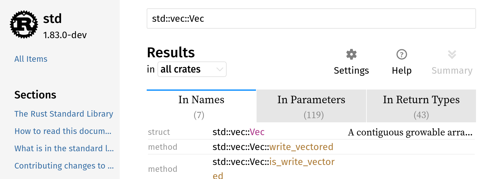 |  |  |  |  |  |  | N/A | 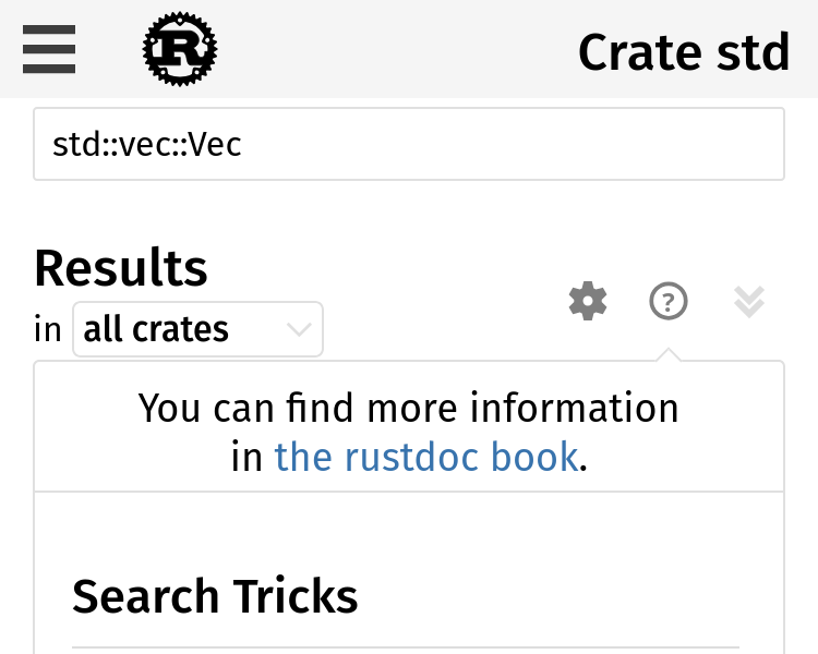 |  | 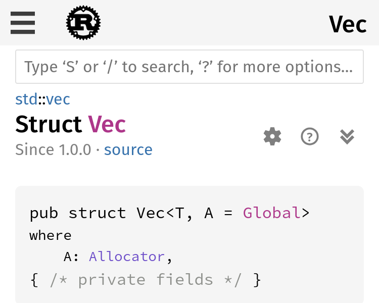 |  |  https://notriddle.com/rustdoc-html-demo-12/toolbar-v2/std/index.html ## Description This adds labels to the icons and moves them away from the search box. These changes are made together, because they work together, but are based on several complaints: * The [+/-] thing are a Reddit-ism. They don't look like buttons, but look like syntax <https://rust-lang.zulipchat.com/#narrow/stream/266220-t-rustdoc/topic/More.20visual.20difference.20for.20the.20.2B.2F-.20.20Icons>, <rust-lang#59851> (some of these are laundry lists with more suggestions, but they all mention [+/-] looking wrong) * The settings, help, and summary buttons are also too hard to recognize <https://lwn.net/Articles/987070/>, <rust-lang#90310>, <rust-lang#14475 (comment)>, <https://internals.rust-lang.org/t/improve-rustdoc-design/12758> ("Not all functionality is self-explanatory, for example the [+] button in the top right corner, the theme picker or the settings button.") The toggle-all and toggle-individual buttons both need done at once, since we want them to look like they go together. This changes them from both being [+/-] to both being arrows. CC <rust-lang#113074 (comment)> and `@jsha` regarding the use of triangles for disclosure, which is what everyone wanted, but was pending a good toggle-all button. This PR adds a toggle-all button that should work. Settings and Help are also migrated, so that the whole group can benefit from being described using actual words. The breadcrumbs also get redesigned, so that they use less space, by shrinking the parent module path parts. This is done at the same time as the toolbar redesign because it's, effectively, moving space from the toolbar to the breadcrumbs. This is aimed at avoiding any line wrapping at desktop sizes. ## Prior art This style of toolbar, with explicit labels on the buttons, used to be more popular. It's not very common in web browsers nowadays, and for truly universal icons like ⬅️ I can understand why, but words are great when icons fail. 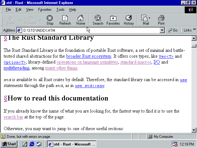
…GuillaumeGomez rustdoc: redesign toolbar and disclosure widgets Fixes rust-lang#77899 Fixes rust-lang#90310 ## Preview | before | after | ------ | ----- |  |  |  |  |  |  |  |  |  |  | N/A |  |  |  |  |  https://notriddle.com/rustdoc-html-demo-12/toolbar-v2/std/index.html ## Description This adds labels to the icons and moves them away from the search box. These changes are made together, because they work together, but are based on several complaints: * The [+/-] thing are a Reddit-ism. They don't look like buttons, but look like syntax <https://rust-lang.zulipchat.com/#narrow/stream/266220-t-rustdoc/topic/More.20visual.20difference.20for.20the.20.2B.2F-.20.20Icons>, <rust-lang#59851> (some of these are laundry lists with more suggestions, but they all mention [+/-] looking wrong) * The settings, help, and summary buttons are also too hard to recognize <https://lwn.net/Articles/987070/>, <rust-lang#90310>, <rust-lang#14475 (comment)>, <https://internals.rust-lang.org/t/improve-rustdoc-design/12758> ("Not all functionality is self-explanatory, for example the [+] button in the top right corner, the theme picker or the settings button.") The toggle-all and toggle-individual buttons both need done at once, since we want them to look like they go together. This changes them from both being [+/-] to both being arrows. CC <rust-lang#113074 (comment)> and `@jsha` regarding the use of triangles for disclosure, which is what everyone wanted, but was pending a good toggle-all button. This PR adds a toggle-all button that should work. Settings and Help are also migrated, so that the whole group can benefit from being described using actual words. The breadcrumbs also get redesigned, so that they use less space, by shrinking the parent module path parts. This is done at the same time as the toolbar redesign because it's, effectively, moving space from the toolbar to the breadcrumbs. This is aimed at avoiding any line wrapping at desktop sizes. ## Prior art This style of toolbar, with explicit labels on the buttons, used to be more popular. It's not very common in web browsers nowadays, and for truly universal icons like ⬅️ I can understand why, but words are great when icons fail. 
…GuillaumeGomez rustdoc: redesign toolbar and disclosure widgets Fixes rust-lang#77899 Fixes rust-lang#90310 ## Preview | before | after | ------ | ----- |  |  |  |  |  |  |  |  |  |  | N/A |  |  |  |  |  https://notriddle.com/rustdoc-html-demo-12/toolbar-v2/std/index.html ## Description This adds labels to the icons and moves them away from the search box. These changes are made together, because they work together, but are based on several complaints: * The [+/-] thing are a Reddit-ism. They don't look like buttons, but look like syntax <https://rust-lang.zulipchat.com/#narrow/stream/266220-t-rustdoc/topic/More.20visual.20difference.20for.20the.20.2B.2F-.20.20Icons>, <rust-lang#59851> (some of these are laundry lists with more suggestions, but they all mention [+/-] looking wrong) * The settings, help, and summary buttons are also too hard to recognize <https://lwn.net/Articles/987070/>, <rust-lang#90310>, <rust-lang#14475 (comment)>, <https://internals.rust-lang.org/t/improve-rustdoc-design/12758> ("Not all functionality is self-explanatory, for example the [+] button in the top right corner, the theme picker or the settings button.") The toggle-all and toggle-individual buttons both need done at once, since we want them to look like they go together. This changes them from both being [+/-] to both being arrows. CC <rust-lang#113074 (comment)> and ``@jsha`` regarding the use of triangles for disclosure, which is what everyone wanted, but was pending a good toggle-all button. This PR adds a toggle-all button that should work. Settings and Help are also migrated, so that the whole group can benefit from being described using actual words. The breadcrumbs also get redesigned, so that they use less space, by shrinking the parent module path parts. This is done at the same time as the toolbar redesign because it's, effectively, moving space from the toolbar to the breadcrumbs. This is aimed at avoiding any line wrapping at desktop sizes. ## Prior art This style of toolbar, with explicit labels on the buttons, used to be more popular. It's not very common in web browsers nowadays, and for truly universal icons like ⬅️ I can understand why, but words are great when icons fail. 
…GuillaumeGomez rustdoc: redesign toolbar and disclosure widgets Fixes rust-lang#77899 Fixes rust-lang#90310 ## Preview | before | after | ------ | ----- |  |  |  |  |  |  |  |  |  |  | N/A |  |  |  |  |  https://notriddle.com/rustdoc-html-demo-12/toolbar-v2/std/index.html ## Description This adds labels to the icons and moves them away from the search box. These changes are made together, because they work together, but are based on several complaints: * The [+/-] thing are a Reddit-ism. They don't look like buttons, but look like syntax <https://rust-lang.zulipchat.com/#narrow/stream/266220-t-rustdoc/topic/More.20visual.20difference.20for.20the.20.2B.2F-.20.20Icons>, <rust-lang#59851> (some of these are laundry lists with more suggestions, but they all mention [+/-] looking wrong) * The settings, help, and summary buttons are also too hard to recognize <https://lwn.net/Articles/987070/>, <rust-lang#90310>, <rust-lang#14475 (comment)>, <https://internals.rust-lang.org/t/improve-rustdoc-design/12758> ("Not all functionality is self-explanatory, for example the [+] button in the top right corner, the theme picker or the settings button.") The toggle-all and toggle-individual buttons both need done at once, since we want them to look like they go together. This changes them from both being [+/-] to both being arrows. CC <rust-lang#113074 (comment)> and `@jsha` regarding the use of triangles for disclosure, which is what everyone wanted, but was pending a good toggle-all button. This PR adds a toggle-all button that should work. Settings and Help are also migrated, so that the whole group can benefit from being described using actual words. The breadcrumbs also get redesigned, so that they use less space, by shrinking the parent module path parts. This is done at the same time as the toolbar redesign because it's, effectively, moving space from the toolbar to the breadcrumbs. This is aimed at avoiding any line wrapping at desktop sizes. ## Prior art This style of toolbar, with explicit labels on the buttons, used to be more popular. It's not very common in web browsers nowadays, and for truly universal icons like ⬅️ I can understand why, but words are great when icons fail. 
Rollup merge of rust-lang#129545 - notriddle:notriddle/toolbar-v2, r=GuillaumeGomez rustdoc: redesign toolbar and disclosure widgets Fixes rust-lang#77899 Fixes rust-lang#90310 ## Preview | before | after | ------ | ----- |  |  |  |  |  |  |  |  |  |  | N/A |  |  |  |  |  https://notriddle.com/rustdoc-html-demo-12/toolbar-v2/std/index.html ## Description This adds labels to the icons and moves them away from the search box. These changes are made together, because they work together, but are based on several complaints: * The [+/-] thing are a Reddit-ism. They don't look like buttons, but look like syntax <https://rust-lang.zulipchat.com/#narrow/stream/266220-t-rustdoc/topic/More.20visual.20difference.20for.20the.20.2B.2F-.20.20Icons>, <rust-lang#59851> (some of these are laundry lists with more suggestions, but they all mention [+/-] looking wrong) * The settings, help, and summary buttons are also too hard to recognize <https://lwn.net/Articles/987070/>, <rust-lang#90310>, <rust-lang#14475 (comment)>, <https://internals.rust-lang.org/t/improve-rustdoc-design/12758> ("Not all functionality is self-explanatory, for example the [+] button in the top right corner, the theme picker or the settings button.") The toggle-all and toggle-individual buttons both need done at once, since we want them to look like they go together. This changes them from both being [+/-] to both being arrows. CC <rust-lang#113074 (comment)> and ``@jsha`` regarding the use of triangles for disclosure, which is what everyone wanted, but was pending a good toggle-all button. This PR adds a toggle-all button that should work. Settings and Help are also migrated, so that the whole group can benefit from being described using actual words. The breadcrumbs also get redesigned, so that they use less space, by shrinking the parent module path parts. This is done at the same time as the toolbar redesign because it's, effectively, moving space from the toolbar to the breadcrumbs. This is aimed at avoiding any line wrapping at desktop sizes. ## Prior art This style of toolbar, with explicit labels on the buttons, used to be more popular. It's not very common in web browsers nowadays, and for truly universal icons like ⬅️ I can understand why, but words are great when icons fail. 
Steps to reproduce:
Expected result: Help dialog pops up
Actual result: Help dialog pops up, but is too big for the screen and not scrollable (see screenshot).
Note also that the keyboard shortcut section can probably be elided on mobile since there is usually no keyboard (though there can be!).
The text was updated successfully, but these errors were encountered: