App redesign #691
Comments
|
Iterated some more on the original idea.
Feedback is welcome! Will be exploring "logged in" screens next: moments, strategies, medications, groups, allies, etc. |

|
This looks amazing so far! Thanks for this 🎉 Looks like we should start off with redesigning our non-mandatory signed in pages. Wondering if the join link would appear in the header navigation when we navigate away from the homepage. Also would it help to have headings in the footer to provide context for each column? |
|
@julianguyen Ah, for the join link, I'll go ahead and adjust the last nav item so that it's "Sign in / Join." Also, I'll go ahead and add headings for each footer column to mirror the current site! Do you have any preference for the next screen to be designed? Was thinking of tackling moments. |
|
I would love to work on actually building these designs to the existing site, if no one has committed. Or if it's being done, let me know if I can help in any way! |
|
@rheupler We will likely have some dev planning discussions (either in Slack or somewhere in GitHub) once the redesigned screens are ready to be developed! We'll loop you in when we're there. @julianguyen Sounds good. 😄 |
|
Some more design progress. Finishing up the non-mandatory pages @julianguyen mentioned above before tackling logged in screens (moments, strategies, etc.). Will have a go at the resources page next. About
Blog
|

|
Wow I love the designs on the static pages! I'm wondering for our signed in pages whether we should using black text on white background to display Moments etc. |
|
Also do you think the colour contrast is enough for the selected link in the header? Should we be using |
|
@rheupler Can you email us at [email protected] so we can add you to our Slack? :D Thanks for expressing interest :D |
|
@julianguyen For moments cards etc. I'm definitely planning on using a black on white or some variant of it! For active links in the nav, I could try playing with adding another visual indicator other than color to make it more clear. Also, for blog posts, what do you think about adding posted date as well? |
|
@nshki This is super cool, love the visual revamp 🥇 |
|
As for next steps, I was thinking we can start slicing out sections/components and start an UI components library akin to what many folks are doing using React + StoryBook e.g https://hackoregon.github.io/component-library/ As for how we want to do that, do we want a separate NPM package to import into the main rails app? Or do we want to centralize it all inside the main app? @julianguyen @baohouse @nshki ? |
|
@nma Love that idea. I'm on board. I think I want to vote for keeping all components centralized in the main app unless we are willing to build a full API on the Rails side (to allow for separate front and back end repos). Building the components in a separate repo / package feels strange if we aren't building all the screens there as well. I can definitely be convinced otherwise though. |
|
@nshki I think that writing a full API on Rails at this moment is an anti-goal. My original thinking was that components could be worked on separately from the main app, and might be easier to contribute to, but after thinking about it more, creating two pull requests for each repo might not be a natural workflow for most people. We can build it into the main app, and its pretty easy to pull it out later if we need it. So centralized to start? |
|
@nma Centralized to start sounds good to me. As a general update, Sketch documents have been ported over to Figma, and @asiahoe and I will be collaborating on the designs moving forward. Let's hold off on building the component library until the designs are somewhat finalized, since a lot can still change. |
|
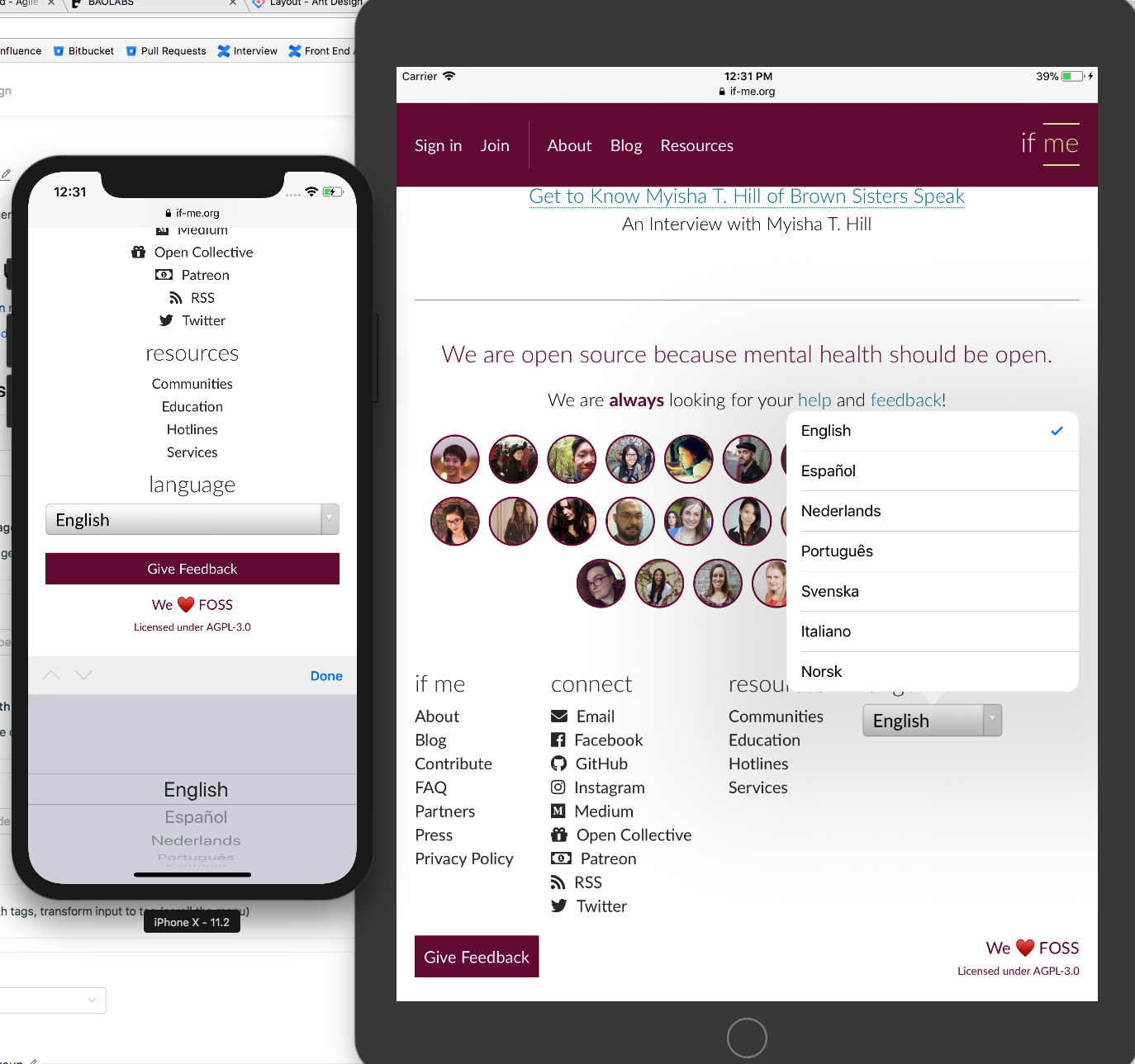
Another update. Since designs have been ported to Figma, I'll be able to share using links from this point forward (hurray!). You can catch the latest in design land with this link. I'll update the original comment to show this and a screenshot is attached as well.
|

|
@timofonic Thanks! We're still cranking away at the design. You can see the latest at this link. |
|
@julianguyen @nma @baohouse I apologize about the delay in updates! December was a crazy time for me and I had a hiatus due to an injury. I think we can go ahead and start development on the redesign, although not everything is complete yet. Basic atomic components are more or less defined, and I think in-browser development will give us the flexibility we need for design decisions that require more group contextual knowledge. What do you all think? |
|
Latest designs look fantastic! Looks like we can start creating issues for the basic atomic components! I think its' a good idea to build out the smaller components first, it would also get us using React more :D |
|
Just for easy access, here is the link to the Figma document: https://www.figma.com/file/RTjPkO0nSuJcMqqWLjeVdEof/if-me Alrighty! Now that it's verified that registered Figma users (don't worry it's free for individual accounts) can click around and view CSS properties (colors, dimensions, etc. thanks to @baohouse and @julianguyen), I think we're ready to move forward! Any illustrations that need to be exported should be exportable from the Figma document as SVGs. Please ping me if for some reason that is not working for you. I'll get a start on creating separate issues for components we can start building. |
|
@nshki So I'm testing out Ant Design Mobile at work, and it does raise an interesting question of how the mobile/tablet UI should behave.
There are two main things to note:
I'd like to know your thoughts regarding these. |


|
@baohouse Very cool! Thanks for bringing this up.
|
|
Worth noting on tablet, the UI component interaction is different than mobile. So tablet is in between mobile and desktop, in the sense that it behaves like desktop, but has the added capability of supporting gestures/touch. |
|
Colourwise I'd highly advise against using the red colour so much, it's overpowering. I'd advise a steel blue / neutral grey colour. In the latest screenshot for instance, we are using the red on a 'give feedback' icon - but users will always instinctively associate red with a negative action, and thus red should be reserved for such things. One could use the arguments of 'the colour represents our current branding' etc - but thats what this is, a large redesign, I would use it as an opportunity to establish a solid and consistent colour palette. The overall direction is solid though and I think many of the layout changes are good and justified. |
 and others
EDIT (Oct 26, 2017)
Designs have been ported to Figma and the latest can be viewed at this link.
Overview
The need for a full app redesign was discussed and we are currently working on rethinking it from the ground up. This thread originally started in the Slack community, but we are going to start documenting it in GitHub.
Initial Mockups
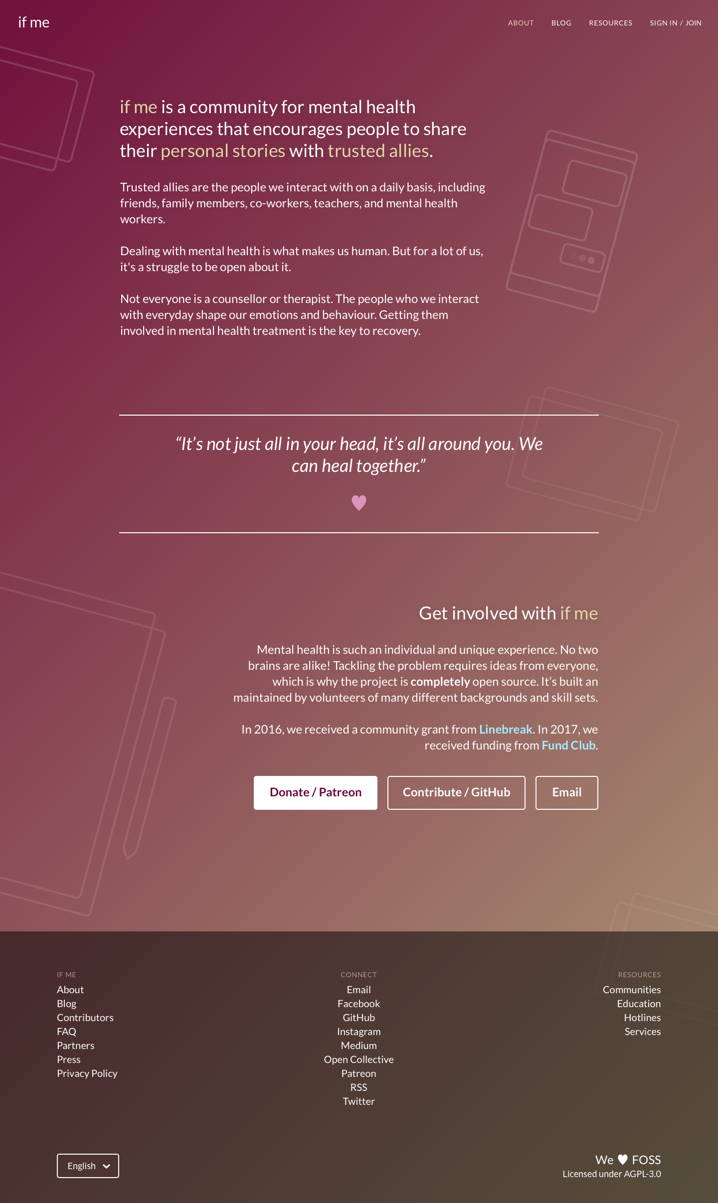
The following are some mockups of the homepage I created to explore a visual direction. The color scheme is likely going to stay the same as the current app, but I added pink/blue variation as well. Using a simple, line-based visual language to convey openness and focus. This style would be used throughout the entire app. The font used will likely be Lato to stay consistent with the logo.
Next Steps
And of course, design everything else :)
The text was updated successfully, but these errors were encountered: