-
-
Notifications
You must be signed in to change notification settings - Fork 5.7k
New issue
Have a question about this project? Sign up for a free GitHub account to open an issue and contact its maintainers and the community.
By clicking “Sign up for GitHub”, you agree to our terms of service and privacy statement. We’ll occasionally send you account related emails.
Already on GitHub? Sign in to your account
[Summary] Improve issue/PR comment editing experience #23290
Comments
|
related #15070 . |
From the feedback I've seen, a native textarea is preferred.
Lost comments (or description edits, file edits) is one of the more important things to improve for us, so any solution here would be very welcome. LocalStorage would improve the situation a lot I think. We used Phabricator before which would save drafts server side, and developers really liked that. You could start writing on one computer and then continue later on another. For example a desktop at work, laptop at home, phone during a commute, tablet, different operating system, etc. So maybe that approached could be considered too.
In general would be nice for any issue edits to not reload the page, including labels, projects, reviewers, etc. Some of this is already using AJAX but I guess it has to reload the page to confirm the edit completed successfully and update the timeline. Personally I could live without a timeline update.
Ability to drag & drop images and video directly into the textarea would be very welcome. |
|
Regarding storage of unsaved comments, it could use a simple key/value system where URL is the key and value are the data like title/body etc. For new issues/prs, it can be keyed on the "new" URL, for PR comments, I think it could use the "thread" id. So this will at most store one comment by URL, which is sufficient. Server-side storage might be nice, but needs some thoughts regarding "garbage collection", e.g. whether there should be age and size limits on how long to retain unsaved data as it will otherwise accumulate endlessly on the server. |
|
I recommend to start with the EasyMDE removal first before attempting other changes as that code would otherwise have to be thrown away most likely because EasyMDEs interface is so different from a textarea. |
|
|
There will be a lot of people who care about "privacy" having strong objection about the server-side storage. Update: I added this to the issue's description.
That's why the |
URL key only for the main comment box. Sub-Threads like PR comments have their thread id in the URL hash to allow multiples, e.g. URL with path and hash as key is sufficient. URL origin, I would remove from the key so multi-domain scenarios work. |
👍 from me. Native text boxes work well, and I'm constantly struggling with the current editor (like the Home key not taking line wrapping into account). I do feel that would be nice if this were paired with a consistent 'MarkDown input means preview is available' approach. For example new PRs cannot be previewed.
I don't know how currently updates from the back-end are sent to the front-end. If XHR/AJAX is used to submit changes, then it's good to have a way to asynchronously receive changes as well. For Flamenco (which is also a Go backend and a web frontend) I've used SocketIO for this, together with this approach:
This makes it very simple to have an always-up-to-date user interface, as it doesn't matter whether a change was done by the current user or by somebody else -- every change is sent via one channel: the SocketIO connection.
This I don't find terribly convincing. If those people are typing things with the intent to submit to Gitea anyway, it's not that much a matter of privacy, and more about predictability of the system. It makes total sense to be explicit about sending whatever is typed/pasted into input fields to the server. Having clarity and control over this IMO is key here. As Brecht also said, this feature is something Blender developers are used to, and have been happily using for years. It's something I'm missing too. Priority is to not loose any edits, though.
Local storage is cheap, so having some data linger on my own computer for a while longer is absolutely fine. As an extra thought, it would be great if some input fields could map to the same draft storage. This would make the PR review process a lot nicer for us. PR reviews often start with a discussion on the design of the approach; looking at the code comes later. This means that I'd have to open two tabs: one with the patch description (that contains the design description) and one with the code changes (that contains the comment box with the approve/reject buttons). It would be so much better if:
|
|
@drsybren Thank you very much.
That's really a good idea, and it would bring much more other benefits, the only problem is it's more complicated, even as GitHub, sometimes I still need to refresh the page to see some latest changes. So I think we can consider it after this proposal.
The problem is, I know some people worry about they might (by mistake) paste "password" or "secret" into the textarea, if the draft is stored on server-side, then these secrets would leak 😆 So I think at the moment LocalStorage is a generally acceptable solution. Maybe in the future we could make this feature as general as possible, then there would be a plug-able server-side storage for some deployments?
I will try to figure it out, but I haven't got a clear picture about all details. I think I would start the work after Gitea 1.19.0 or 1.19.1 releases, to prevent from making bug-fix backports difficult. |
Yeah, as I said, I don't find it a particularly strong argument. People who copy-paste secrets into a submission form that shouldn't receive those secrets are already doing something dubious. You have to balance that with the added comfort for anyone else who works on more than one computer. The final call is yours, of course, and I agree that a Local Storage based approach is a good start anyway. |
I would not recommend pointless That said, I don't see a compelling use case for commenting to use |
This is a bit harsh. SocketIO has features that I personally found very well suited for my use case:
Frankly that was enough for me to not bother implementing this myself.
I only used (and intended to suggest) SocketIO for server-to-client communication. In the Flamenco architecture the client sends data to the back-end via its OpenAPI REST API. SocketIO is only used to update the view of the web client when things change on the server (regardless of who triggered that change). What you implement in Gitea is of course 100% your choice. I just wanted to offer some inspiration. |
|
I see all your points, I am open to either solution as long as it's clear and functional. It's too early to make a decision for the framework and it's (somewhat) off-topic. I think we can postpone the framework choosing topic to the future when we have time for it? |
It would help  #23290

The issue-template code is only useful for "new issue" or "new PR", so
it could only be put in the `new_form.tmpl`
|
Will be a good idea to have |
I think we should remove |
Do you have an online demo or screenshot for the ps: besides some UI/UX problems (alignment, drag to textarea, etc), what's the major bugs of current dropzone? IIRC many uploading related bugs are related to Gitea's buggy code, and Gitea always tries to manage attachments / delete unused attachments, it's the key problem IMO. If let me decide, I would say never delete attachments, as long as an attachment is uploaded, store it forever. |
git clone [email protected]:silverwind/uppie.git && cd uppie
npm i -g http-server
http-server .
# open http://127.0.0.1:8080, drop files into the page or use the buttons
It's just a low-level module that abstracts unnecessary complicated browser APIs and delivers a flat list of files ready for upload.
Dropzone itself is flawless I think, the bugs come from our own code. Just try pasting attachments and deleting them again, it's a mess. My point for dropzone removal is that it's just unnecessary to have both dropzone and the file list, which do also get out of sync currently. Also, dropzone UX feels strange in many regards, one can for example not open an attached image in new tab etc, I just don't like it. It does not fit into Gitea with its animations and such and it wastes screen space when empty. |
Even if the attachment is 1GB? |
|
|
I'm of the opinion that deleted attachments should be deleted on disk. Let's say a user uploads a secret in a zip file. There is no way to undo that mistake without admin intervention, and that's just bad. Of course there could be made a config switch like |
That's all the modern systems do, you can not delete the attachment you ever uploaded to GitHub, etc. If you ever upload a secret, you should change your secret ASAP, instead of deleting it. Update: even if you uploaded SSN, as long as you do not expose the URL, it's still not accessible from public, so there is no risk and no need to call admin intervention. |
|
Some secrets are not changeable. Say for example a SSN. Best to just have a config switch. |
|
Welcome to help and try the first step: Introduce GitHub markdown editor, keep EasyMDE as fallback #23876 |
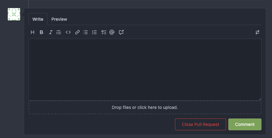
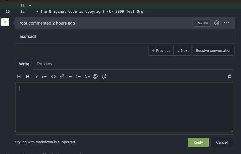
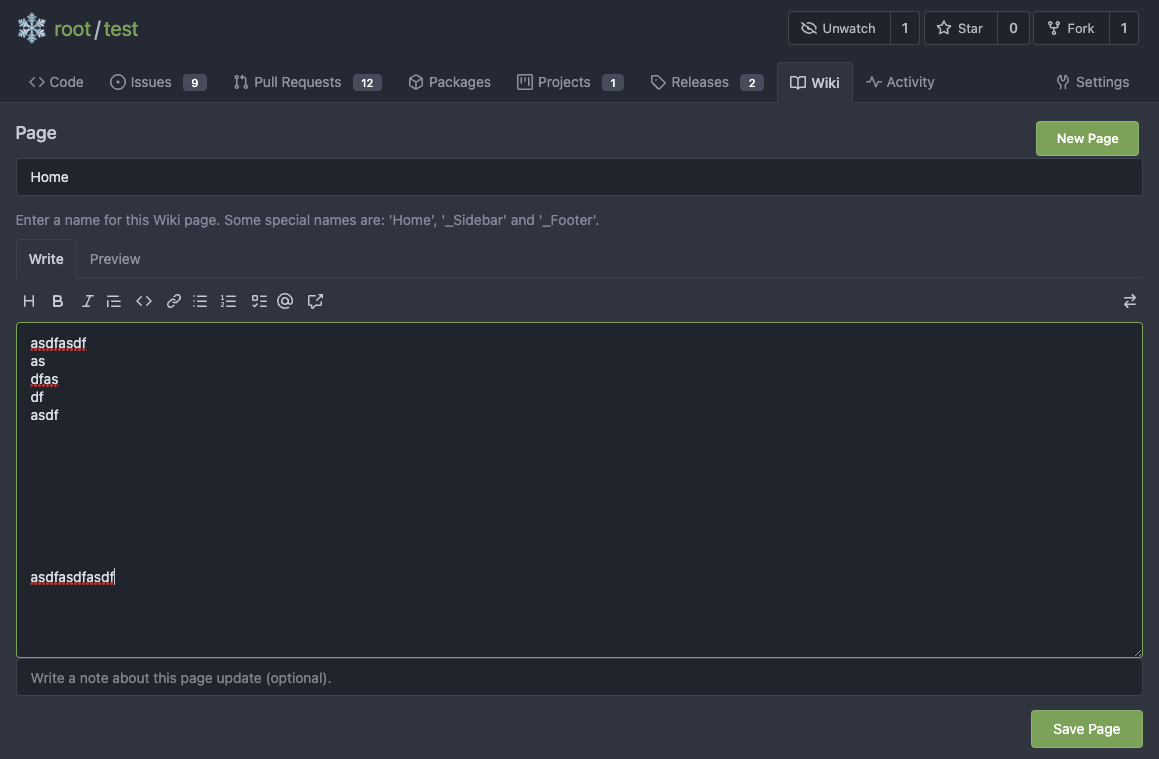
The first step of the plan * #23290 Thanks to @silverwind for the first try in #15394 . Close #10729 and a lot of related issues. The EasyMDE is not removed, now it works as a fallback, users can switch between these two editors. Editor list: * Issue / PR comment * Issue / PR comment edit * Issue / PR comment quote reply * PR diff view, inline comment * PR diff view, inline comment edit * PR diff view, inline comment quote reply * Release editor * Wiki editor Some editors have attached dropzone Screenshots: <details>     </details> --------- Co-authored-by: silverwind <[email protected]>
|
We can likely use text-expander-element in place of tribute.js. |
|
More custom element candidates:
|
|
Is there interest in unifying the "code review comment" and "PR/issue comment" code? I know we have traditionally tried to follow the GitHub UI/UX, but this "feature" has never made sense to me. |
|
You mean you want a threaded view for issue/pr comments? I think I personally would hate threaded comments in these context, but if something can be done to make replies more clear (like links to comments on the comment being replied to), I would consider it. |
Yeah, essentially. Mostly the fact that there are two totally different UIs for leaving comments in GitHub/Gitea (especially considering both can appear in PRs). They have different ways to interact, but 99% of the intention and capability is the same. When people are first starting to use github/gitea it's really confusing to see these two different styles of comments, and not clear why one has a "Reply" button and one doesn't. Even having gotten used to it, it still annoys me about GitHub (for example, I would love to have a reply thread here 😄). |
|
A flat list of comments has benefits as I see it easier to use overall. Are you familiar with threaded view of Jira comments? I absolutely hate such views when replies get nested 10 levels deep and the page shows horizontally tiny comments and a broken edit UI. Threaded view may work for UIs like reddit or hacker news where comment contents are short and can stretch the whole browser window, but even there it has it's limits when nested too deeply. |
I guess I don't think we need to support arbitrary depth of threads. Single-level, like we support now would be fine. Seems like a happy medium. The (seemingly arbitrary) inconsistency is the problem IMO. Why are replies okay for code review comments but not issue comments? |
|
I guess single-level replies could be supported as an alternative "view" mode for issue/pr comments. Should be a per-user setting. Would not enable it per default, though. |
Thought I must mention we must evaluate whether it is worth the complexity to support two different view modes (and the bugs that come will inevitably with it). I actually think it's not. Reply linking can be added so each replied comment displays an icon for each reply that links the two together visually. This may already be sufficient UI to better link comments to their replies. |
|
We can likely replace Browser cache currently works to some extends, but I think it's not a 100% thing. |
|
Quote my comments from another related issue: Actually
That's why "AJAX" is before the "LocalStorage Draft" in this summary issue. |
|
I do see https://github.com/github/session-resume has the drawback that it only supports a single concurrent form as it relies on a "global" variable, so if for some reason multiple forms submit at the same time (maybe when the user is frantically clicking multiple forms when their network goes offline), it may not work as expected. |
Follow #23290 Network error won't make content lost. And this is a much better approach than "loading-button". The UI is not perfect and there are still some TODOs, they can be done in following PRs, not a must in this PR's scope. <details>  </details>
|
After #25258 gets merged, I think the situation is much better than before. With "form-fetch-action (AJAX)" support, the only case I can imagine about "losing content" is: browser (OS) crash or computer power-off. |
|
I think I won't spend too much time on this problem in the foreseeable future. It just needs to refactor more forms to the "form-fetch-action (AJAX)" mode, then the content would be rarely lost. |
There are many issues about the issue editing problems. Including:
Proposal:
changed before this edit.
(there are a lot of related issues, I may link them here later)
The text was updated successfully, but these errors were encountered: