-
Notifications
You must be signed in to change notification settings - Fork 162
Home

Virtual reality (VR) or augmented reality (AR) applications must provide ways for users to interact -- to select items, to move them, to modify them, to trigger actions, to control their virtual world. The user experience (UX) can become increasingly complex as new features are introduced, leading to a long list of application-specific interactions that can conflict with each other and can be difficult for users to learn.
Hover UI Kit is built to solve this problem. It is a tool for creating beautiful, customizable, dynamic user interfaces. All interface interactions utilize a simple and consistent mechanism -- the "hover" -- which users can perform with any 3D input device. These interfaces are designed specifically for VR/AR applications, addressing the complex UX challenges of these immersive environments.
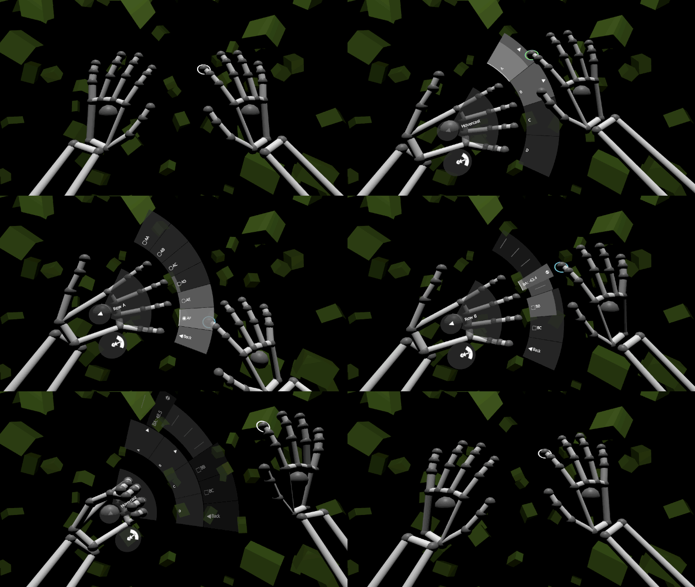
 📷 Using the Hovercast interface with Leap Motion hands
Hover UI Kit uses 3D cursors to interact with button and slider items. It includes support for any 3D input device, completely customizable item and cursor visuals, several pre-built interface concepts, and layout systems for each item shape. Getting Started>
The interactions in Hover UI Kit are based upon a core vision and philosophy for interactions in virtual envronments. They are designed to be simple, easy to discover, easy to learn, and easy to perform. They strive to be consistent across different usage scenarios, application types, and 3D input devices. Interaction Philosophy>
This project is designed and implemented by Zach Kinstner (Twitter, YouTube, GitHub, email). Zach's work combines the worlds of software, design, interaction, and user experience. He has provided consulting services via Aesthetic Interactive since 2007, specializing in VR/AR experiences since 2014.
The HoverKit prefab contains the core components for adding Hover UI Kit into a scene. The prefab's properties affect interactions and behavior for the entire scene, and these properties can be adjusted for the needs of each application. HoverKit Prefab>
Items are interactive elements, like buttons and sliders. Applications can listen for each item's events, and react accordingly. Items are highly customizable, both visually and functionally. Items>
Cursors interact with items, based on the distance between the two, to make selections. Each cursor's position and rotation maps to a particular point on a 3D input device (typically, a hand or controller). Cursors>
Layouts control the size and position of items to arrange them into a particular pattern. There are various layout styles for each item shape. Layouts can be nested to form more complex arrangements. Layouts>
Renderers provide the shape, size, and graphics for a target element (an item or cursor). They are completely customizable, and update dynamically based on the state of its element. Renderers>
Each input module provides support for a particular 3D input device, using the device's data to control cursors. Input Modules>
Each interface module uses items and layouts, combined with module-specific functionality, to create a particular type of interface. Interface Modules>
Each renderer module contains tools for creating item and cursor renderers, often with a module-specific visual style or effect. Renderer Modules>
General
Features
Modules
Other