-
Notifications
You must be signed in to change notification settings - Fork 4.3k
New issue
Have a question about this project? Sign up for a free GitHub account to open an issue and contact its maintainers and the community.
By clicking “Sign up for GitHub”, you agree to our terms of service and privacy statement. We’ll occasionally send you account related emails.
Already on GitHub? Sign in to your account
Tweak switcher to not scale icons down #9310
Conversation
No a11y objections but I'd say it should appear also on focus (or maybe always be displayed?). Just checked and there's no arrow on focus. Notice also the blue outline focus style, not sure that's desired: |
|
So, how about this icon? Here's the SVG in case you'd like to commandeer this PR, I have to step away until monday: |
|
Let's try it! And definitely also replace on focus. |
|
Quoting a comment by @rosswintle in #9127:
|
|
Wrong issue or not, I think it is probably still a good point. Just showing the switcher icon on hover/focus does not cover touch-screen users. Perhaps the switcher icon should always be shown in the corner or on the side of the button? |
|
Ignore me. Have been on holiday and seem to have forgotten how to use GitHub. 🤦♂️ |
We could always have a different solution for mobile. |
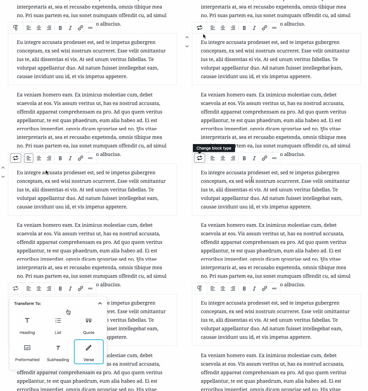
This PR fixes so the new block icons are not scaled down, and therefore blurry, in the switcher.

Additionally it removes the gray background color from the "block chip". This is in response to similar changes elswhere in the UI.

It also adds a little dropdown arrow on hover, but not sure that adds much value.
ca1c180 to
95214d8
Compare
|
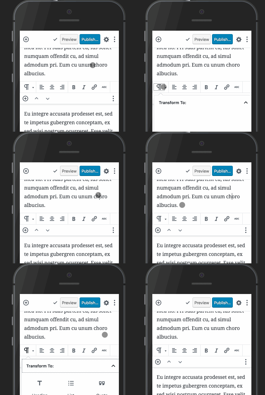
I pushed a few fixes to improve mobile, add consistency, and refine the code. I also made sure it was friendly to colored icons. Though note that it appears the inline styles for foreground and background colors are not output as part of the Here's how it looks now: One thing that seems very positive about the idea of having a fixed width switcher, is that it anchors the block. As you transform from one block to another and everything changes, one thing stays both in place, and due to the transform icon showing on focus, stays the same as well. This anchoring has a real emotional effect and makes it feel resilient, to me. |
|
Wow, that feels very nice! I think this is definitely an improvement over |
|
I like Kevin Hoffman's proposal but I like this idea even more. Ever since the Convert Block option was moved to the toolbar, I thought it should have its own icon so users know at a glance what it does. One thing I don't understand though is that when you hover over a block in the editor, you see the block's label in the top right corner. If that label is shown, why isn't the left most icon always the change block type icon. This would eliminate having to hover over that icon to see the convert block type option. As it stands, the icon mimicking the block being edited acts like a visual label, something that already exists in the top right corner of the block. |
We've been trying to balance things for a while here, with the hover outlines and hover label and the switcher. It's a very very delicate balance to achieve our goals and keep everyone happy. In this case, the Switcher interface is not available for every block, only blocks where transformations are reversible (i.e. lossless). If it is to double as a block type indicator, which I think is a totally fair proposal, we need to be mindful that it doesn't cause confusion with its dual roles. But I'll give this a shot. Note that as a separate exploration (see #9053 (comment)), we might show the block type icon for the selected block in the top toolbar as part of explorations into nested block UIs. That would essentially always show the icon of the selected block, sidebar open or not. |
|
Ahh ok, now I know why some blocks had the convert block option and some didn't. I thought any block could be converted to any other block. Knowing that now, it doesn't make sense to show the block change icon all the time. |
|
Has there been any consideration given to always showing the transform icon instead of the block icon? That seems like a clear and consistent indication of what the button does for the untrained observer. |
Yes, I think that's a fair option too. The way it's designed now is to actually be a callback to the classic paragraph dropdown, but just different enough to imply that it has augmented functionality. Given the attention this issue is receiving currently, how would you feel about us getting this merged in to the next release, getting a feel for it, and then revisiting if need be? |
|
I'd say it's definitely more helpful than the current implementation, shipping and iterating seems fine. |
There was a problem hiding this comment.
Choose a reason for hiding this comment
The reason will be displayed to describe this comment to others. Learn more.
| @@ -79,6 +79,7 @@ export class BlockSwitcher extends Component { | |||
| onKeyDown={ openOnArrowDown } | |||
| > | |||
| <BlockIcon icon={ blockType.icon && blockType.icon.src } showColors /> | |||
| <svg className="editor-block-switcher__transform" xmlns="http://www.w3.org/2000/svg" viewBox="0 0 24 24"><path d="M6.5 8.9c.6-.6 1.4-.9 2.2-.9h6.9l-1.3 1.3 1.4 1.4L19.4 7l-3.7-3.7-1.4 1.4L15.6 6H8.7c-1.4 0-2.6.5-3.6 1.5l-2.8 2.8 1.4 1.4 2.8-2.8zm13.8 2.4l-2.8 2.8c-.6.6-1.3.9-2.1.9h-7l1.3-1.3-1.4-1.4L4.6 16l3.7 3.7 1.4-1.4L8.4 17h6.9c1.3 0 2.6-.5 3.5-1.5l2.8-2.8-1.3-1.4z" /></svg> | |||
There was a problem hiding this comment.
Choose a reason for hiding this comment
The reason will be displayed to describe this comment to others. Learn more.
Do we need extra SVG attributes here, ala #9269?
| height: 21px; | ||
| width: 21px; | ||
| } | ||
| // Paint a dropdown. |
There was a problem hiding this comment.
Choose a reason for hiding this comment
The reason will be displayed to describe this comment to others. Learn more.
"Paint"? 😆
What is this trying to say? 😄
There was a problem hiding this comment.
Choose a reason for hiding this comment
The reason will be displayed to describe this comment to others. Learn more.
🎨
There was a problem hiding this comment.
Choose a reason for hiding this comment
The reason will be displayed to describe this comment to others. Learn more.
bob-ross.gif
|
Thanks for the review @tofumatt, I believe I have addressed all points. Comments were clarified, SVG attributes added (btw let's also look at https://github.com/webpack-contrib/svg-inline-loader), and IE11 should be addressed: |
There was a problem hiding this comment.
Choose a reason for hiding this comment
The reason will be displayed to describe this comment to others. Learn more.
Love how this turned out.
|
Tested locally and works great. I am wary about merging with failing tests, even when they are Docker-related. 🤷♂️ |
|
@jasmussen I really like this and think it should land as-is! But… would love if a slight delay on the hover animation was considered in a follow-up PR, or if the animation was something a little tamer (maybe with a slight fade-out as the block icon moves up, and a fade-in as the switcher icon moves into place?). I like the effect a lot but it feels slightly aggressive. Which is something I never thought I'd say about a small animation like this, but there you go :) |
|
Thanks Chris. It's intentionally fast so as to never make you feel like you need to "wait". I imagine a more elaborate animation is nice the first few times but becomes distracting after a while. However I might be wrong, and I would love to review a tweaked animation! |
|
@jasmussen I did a small iteration that fades the icons in and out as they move, and changes the movement speed to 0.2s. https://www.dropbox.com/s/q18q0cug1x8it8s/demo.mov?dl=0 Video link above shows the animation in this branch on the left, and my modification on the right, for comparison purposes. (Dropbox instead of GIF because a GIF was compressing too much for the subtle opacity change to be clear.) Gist for the changed |
|
Reverting to the pilcrow (¶) icon and the addition of the dropdown arrow improve the clarity and affordance of the control. It's more obvious now that the current block is a paragraph and that it has the potential to change as indicated by the arrow. However I'm not in favor of the hover effect with the circular arrows icon for the following reasons:
|
An unfamiliar concept is not necessarily a bad concept :) There's definitely a past legacy to account for, but new concepts are inevitable with Gutenberg. I think this PR solves the discoverability problem — at least partially — and once someone discovers the interface, its purpose is clear. |
|
Tests pass, and the iterative improvement is approved. Merging and then we can continue to refine. |
|
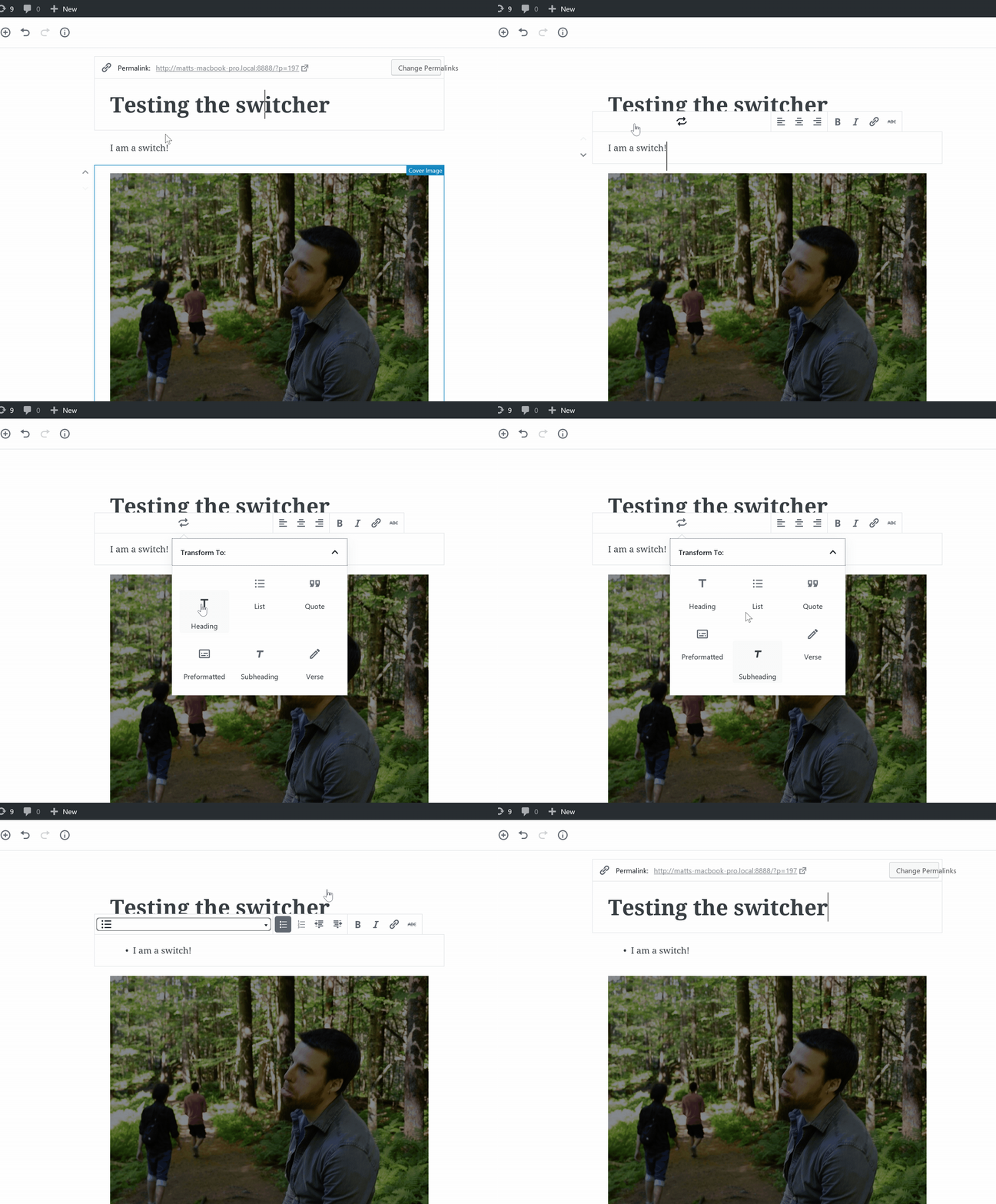
It feels weird for the "Transform" icon to stay, after you've made the target block selection. It's like the brain is looking for a confirmation "did it do the right thing?". Right now, you can only get confirmation if you mouse away from the "Transform" control and its icon circles back to the chosen target block icon. |
|
"Transform To" should probably be sentence case? |


This PR fixes so the new block icons are not scaled down, and therefore blurry, in the switcher.
Additionally it removes the gray background color from the "block chip". This is in response to similar changes elswhere in the UI.
It also adds a little dropdown arrow on hover, but not sure that adds much value, in use just this one place.
GIF: