-
Notifications
You must be signed in to change notification settings - Fork 4.3k
New issue
Have a question about this project? Sign up for a free GitHub account to open an issue and contact its maintainers and the community.
By clicking “Sign up for GitHub”, you agree to our terms of service and privacy statement. We’ll occasionally send you account related emails.
Already on GitHub? Sign in to your account
fix: Improve "add block" text in NUX onboarding #7511
fix: Improve "add block" text in NUX onboarding #7511
Conversation
|
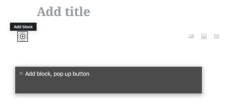
Hm, regarding the new text: the point is screen reader users have no clue what a "+" button is in the Gutenberg UI, as the plus is only visual while the accessible name (given in this case by the aria-label) says "Add block". Also, they can't see what is highlighted or not 🙂 The button is announced as "Add block" and should be referenced as such. This was also mentioned in the first discussion around the NUX, see #3670 (comment)
An option could be clarifying in the new wording that the button's name is "Add block" and visually appears as a plus icon. In the most simple way, something like Aside: this is one more downside of icon-only controls: when they need to be "explained" to users, that needs to happen referencing both their appearance and their action name. |
That's very confusing so I don't think is good.
I thought about that, and what I'd really like is for there to be off-screen text that said "Add block". I'm lost on how to do that with our gettext function. I'll have a look, there must be prior art. But showing that text to sighted users is decidedly inaccessible, because it forces them to hunt for a UI element ("Add block") that doesn't exist. 😄 |
A bit controversial, maybe 🙂the tooltip is displayed on hover and focus, users will learn the name of the "plus" button is "Add block". Ideally, the NUX tips should display the referenced UI controls in their hovered/focused state (alas, not possible for the Preview button I guess). Regardless, I'd say that hiding important information assuming that is useful only for screen reader users is just that, an assumption. Clear, visible, text benefits everyone. For example, not all screen reader users are 100% blind... |
|
A similar challeng has popped up with the modal component in development, where focus is automatically set on the Close button. In #6261 (comment) I suggested setting focus on the modal itself, so the first tabbing would go to the tab button. What wizardry is being employed here, and could we do the same for the modal? |
There was a problem hiding this comment.
Choose a reason for hiding this comment
The reason will be displayed to describe this comment to others. Learn more.
I am not sure we should say 'highlighted' cc @michelleweber for copy changes here before we merge those. We totally can work on things but I feel adjusting here needs at least an editorial review first from the person that worked on the copy.
|
Right on; updated the text a bit to remove the highlighted bit, but I want to make it clear the "+" button should be searched for so I settled on what's posted. |
|
There's no reason not to split the difference, is there? E.g., "Click the "+" button to add a new block. There are blocks available for all kind of content -- insert text, headings, images, lists, and lots more." |
As @afercia pointed out: there is–screen reader users will not see "+" button so we should reference the "Add block" text as well. How about: |
|
Right! Thank you. I think your version is right on. |
|
Editorial-approved copy added–should be good to go! |
There was a problem hiding this comment.
Choose a reason for hiding this comment
The reason will be displayed to describe this comment to others. Learn more.
Code LGTM!
Changes approved by editorial and code approved by core team member so I'll count this as addressed! :-)
|
@karmatosed Dismissed your review because editorial and a developer approved it and your concern was with editorial. Let me know if I'm wrong and shouldn't have done that, but if dismissing it was okay then enjoy one less PR to review 😉 |
* 'master' of https://github.com/WordPress/gutenberg: (69 commits)
  fix: Show permalink editor in editor (WordPress#7494)
  Fix text wrapping in Firefox. (WordPress#7472)
  Try another approach to fixing the sibling inserter in Firefox (WordPress#7530)
  fix: Improve "add block" text in NUX onboarding (WordPress#7511)
  Implement core style of including revisions data on Post response (WordPress#7495)
  Testing: Add e2e test for PluginPostStatusInfo (WordPress#7284)
  Add end 2 end test for sidebar behaviours on mobile and desktop. (WordPress#6877)
  Only save metaboxes when it's not an autosave (WordPress#7502)
  Fix broken links in documentation (WordPress#7532)
  Remove post type 'viewable' compatibility shim (WordPress#7496)
  Fix typo. (WordPress#7528)
  Blocks: Remove wrapping div from paragraph block (WordPress#7477)
  fix: change import for InnerBlocks (WordPress#7484)
  Polish library just a teeeeensy bit (WordPress#7522)
  feat: Add snapshot update script (WordPress#7514)
  Display server error message when one exists (WordPress#7434)
  Fix issues with gallery in IE11. (WordPress#7465)
  Polish region focus style (WordPress#7459)
  Fix IE11 formatting toolbar visibility (WordPress#7413)
  Update plugin version to 3.1. (WordPress#7402)
  ...
|
@tofumatt all good just wanted to get the copy review insight here, didn't need me :) Thanks. |
|
Noting PR for the copy guidelines here: #7588 |

Fixes #7506
Description
Updated the text to reference the "+" button instead of a non-existent "Add Block" button; also took the time to fix the British quotes and clarify the language. 🇺🇸!!!
How has this been tested?
Ran locally and updated jest snapshots.
Screenshots
Before
After
Types of changes
Text changes.
Checklist: