-
Notifications
You must be signed in to change notification settings - Fork 4.3k
New issue
Have a question about this project? Sign up for a free GitHub account to open an issue and contact its maintainers and the community.
By clicking “Sign up for GitHub”, you agree to our terms of service and privacy statement. We’ll occasionally send you account related emails.
Already on GitHub? Sign in to your account
fix: Fix inserter misalignment regression #10461
Conversation
There was a problem hiding this comment.
Choose a reason for hiding this comment
The reason will be displayed to describe this comment to others. Learn more.
Looks good! The only thing I spotted is that prior to #10295 the margin for the popver used to be -24px, and we might want to restore it to it's original value:
https://github.com/WordPress/gutenberg/pull/10295/files#diff-dcb8eefee4aaf82c9ddb042494547527L174
There was a problem hiding this comment.
Choose a reason for hiding this comment
The reason will be displayed to describe this comment to others. Learn more.
This needs slightly more time in the oven. Just noting here so you don't merge, will follow up with a comment shortly.
I saw that but didn't notice a difference when setting it… but maybe I set the wrong one and in general I found that CSS to be a bit hard to keep track of. 🤷♂️ I'll try again, after @jasmussen tells me what I undercooked! 😉 |
|
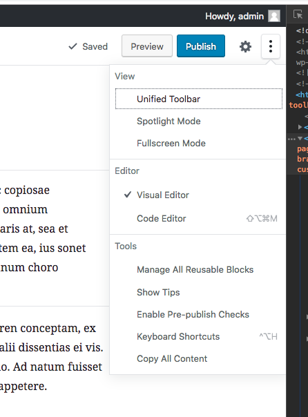
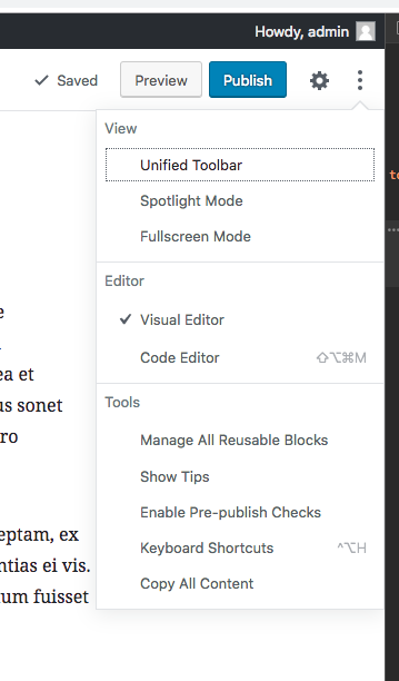
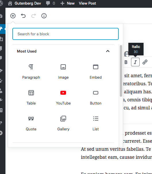
Thanks so much for working on this, nice work. I'm happy to see that this also appears to fix a regression with tooltips that's currently present in master: This branch: 3.9: But sadly there is a little more work to be done. This branch: 3.9: Notice how in this branch, the triangle is way on the edge, whereas in 3.9 it's indented a bit. To be perfectly precise the triangle is right, but the popout is not. This also manifests in other usage of the popout component. This branch: 3.9: This branch: 3.9: HOPEFULLY the fix is as simple as using a negative margin to position the content, rather than a zero margin. But let me know if you need any help and I can jump in. |
|
❤️ for all the info. I'll get on this after espresso. |
|
No worries, and like I said if the CSS gives you headaches, reach out and we'll work on it together. |
|
@tofumatt Setting the margin to -24px should fix the issue mentioned by @jasmussen 😄 Perhaps should have been clearer in my message about what the differences were. |
|
Good catch! That looks good to me. @jasmussen? Also, since #10430 was merged earlier, it might be worth rebasing if you haven't already. I don't know if it'll effect this PR, but it does change the padding in those menus. |
3575057 to
b2a58af
Compare
|
Looking now. |
|
Rebased and did not notice any issues. On very small screens the issue above (the "…" menu's edge being pushed off-screen) still happens, but that seems to be an existing thing and this is at least better for most screen sizes. |
|
I have to admit, I vastly prefer the negative margin of 24px to $grid-size-large, even if it means the ellipsis menu is cut off on the right. Here's 24px: In this, everything seems more balanced and attached. While it would be nice for everything to be on a base8 grid, given that we're not at the time, perhaps we can compromise and land on 20px? Here's 20: (flush against the edge there!) |
|
That 20px is so far against the edge of the page that it’s perceptibly the same as 24px to me.
If you prefer 24px I say we make it look nice there and treat the overflow off the page as a separate issue. The 20px seems a perfect compromise in that no one is happy ;-)
I’ve set it back to 24px; if you’re cool with that let me know.
|
There was a problem hiding this comment.
Choose a reason for hiding this comment
The reason will be displayed to describe this comment to others. Learn more.
With 24px it looks to me the same as it did before the regression. This is a good baseline to get back to. I'm sure separate iterations will look at popovers.


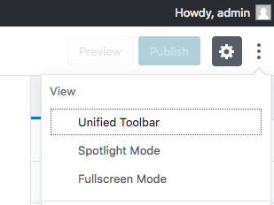
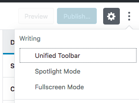
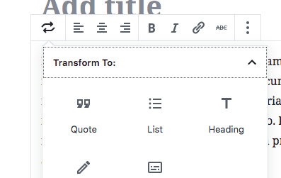
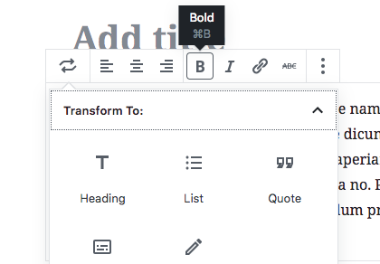





Fix #10453
Description
Fixed the visual regression caused in #10295 by moving the margin fix to target the NUX tooltips specifically.
How has this been tested?
Tested in RTL and LTR, in Firefox, mobile and larger viewports.
Screenshots
Before
After