-
Notifications
You must be signed in to change notification settings - Fork 55
Styling a Button
We're excited to present the first glimpse of Pixate Freestyle on Android. Over the past few months, we've rewritten our early Android prototype framework from scratch using a unified architecture with our iOS version.
This post will demonstrate how to style a button using Pixate.
Pixate for Android is provided as a library jar that can be attached to your project. You may download the library from here. We also encourage you to grab the source for our the demo app and play with it.
Our demo project comes fully configured with the Pixate library. Follow these steps to set it up in your ADT:
- Right-click at the Project Explorer to select
Import -> Existing projects into workspace. - Select
import from archiveand browse to the PixateButton.zip file you've downloaded. - In your workspace, click
Project -> Cleanto force a rebuild and remove any pending errors. - Right click the
PixateButtonDemoproject and selectRun As -> Android Application.
In case you'd like to start from scratch with your own project, you may follow these steps:
- Attach the Pixate library JAR to your project. For example, in ADT, simply drop the JAR into the
libsdirectory. - Create a
default.cssfile in yourassetsdirectory. In this file you'll define the styles of your application. - Initialize Pixate in the main activity by making a call to
Pixate.init(...)
@Override
protected void onCreate(Bundle savedInstanceState) {
    super.onCreate(savedInstanceState);

    Pixate.init(this);

    setContentView(R.layout.main);
}For our first demo, we've chosen the Button View to demonstrate how it can be styled via CSS.
Our demo app displays a list of predefined color scheme items that will generate an initial CSS by tapping on them.

Our app generates a CSS that maps a style ID to a Button ID that was defined in the layout XML.
<Button
    android:id="@+id/button1"
    android:layout_width="260dp"
    android:layout_height="wrap_content"
    ... />
And in our css...
#button1 {
   /* declarations... */
}
We made it a little easier to insert new styles. Press and hold a button to display the styles menu, then pick the style you would like to add.

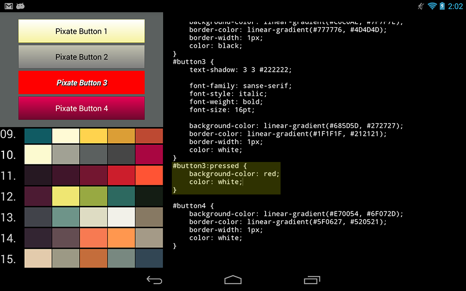
As you may have noticed, the initial state of the styled buttons does not indicate a pressed state when the button was clicked. In other words, our background is set for all of the button's states.
In the Android's layout XML you would have to define a drawable that specifies all the required states and set it as the button's background. Like this, for example:
<?xml version="1.0" encoding="utf-8"?>
<selector xmlns:android="http://schemas.android.com/apk/res/android">
    <item android:drawable="@drawable/button_pressed"
        android:state_pressed="true" />
    <item android:drawable="@drawable/button_default" />
</selector>
In the CSS file, this can be defined as a pseudo class, just like that:
#button1:pressed {
    backgroud-color: blue;
    color: white; /* sets the text color, in the case of a Button */
}
Adding a state to our button will cause it to react to clicking. Our demo adds a solid red background to demonstrate that.
Also note that right now we support the native state names, as defined by Android. In the near future we will support aliases for Web CSS states and iOS states.

Setting the font is also straightforward. Press and hold a button to select the fonts option. This will inject a few font declarations for the selected button CSS. You can edit the CSS manually to set the font bigger or smaller. The app will pick up the change and will re-style the button immediately.

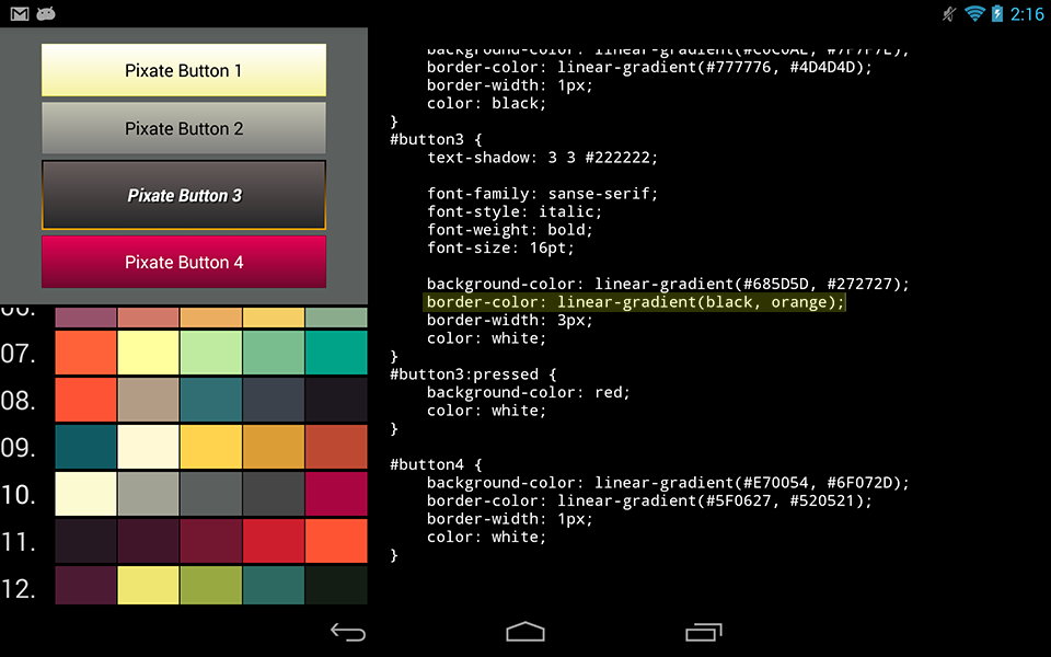
Borders are easily changeable for our buttons. You can control the width of the border, and even set a gradient color to create a sense of depth for the button.
For example, apply this code to one of the buttons:
#button1 {
    border-color: linear-gradient(black, orange);
    border-width: 3px;
}
You may also apply a 9-patch image as your button's background. The demo app includes a sample 9-patch purple.9.png under res/drawable-mdpi, and you can manually apply it to one of the buttons by setting a background-image declaration in the CSS:
#button1 {
    background-image: url(purple.png); /* We omit the '.9' when requesting a 9-patch image */
}
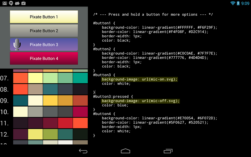
Last but not least, you may apply an SVG (Scalable Vector Graphics) as a button's background. Press and hold a button to select the SVG option. This will a couple of SVG background declarations for the selected button CSS.

In this post we showed you how to use Pixate in order to style buttons in your app. We will continue to enhance these capabilities and expand them to other views, so stay tuned for more!
[Publishe: 2013-10-30]