Ui facelift and usability improvements #1261
Conversation
|
@tvdeyen Wenn du Lust und Zeit hast und es das Review einfacher macht, können wir uns auch gerne mal zu einer Screenhero-Session verabreden. LG, Björn |
|
WOW! 😍 This will take some time, but at the first glance this looks like amazing work. Thanks Björn! NOTE: This will be merged into master after we released a Rails 5 compatible version (Alchemy 4.0). |
@rbjoern84 gerne! |
|
Wow! Thank you very much for the very detailed explanation and all the screenshots! I see these UI changes as big improvements and I really like them! I haven't looked at the code yet, but I am really stunned from how it looks like. :) |
|
Thanks mates! I'm very lucky that you like it 😄 |
|
@rbjoern84 that is sooo awesome!!! Thank you so much for all you've done! I don't actually think that is is so much about code review, as it is to:
I really didn't think that the core team would ever have so much time to go through it all and do what you've done! Thanks a lot again! I think that have only one suggestion on the code:
Thanks again! |
|
Thank you for your positive feedback @mtomov ! :) I've had a look on the gem and fontello. Fontello I already knew. It works nearly the same like IcoMoon (I used in this case). Generally I like the idea of automating the process, but I'm afraid that it will not work straightforward for some reasons:
But I see the actual problem of contributing to the icons you want to address. So I thought about another solution and added an instruction "How to update the icon font" to the top of the icon-font.scss. It's available now within the last commit. Thank you for you useful feedback! |
|
I'm very excited for this to get merged. Nice work! |
I see the overall excitement and am very much excited myselfEasy, everybody, hold your 🐴 I would like to take an iterative approach instead of an "all-in-one PR". And we need to talk about some fundamentals before we start to discuss on the implementation itself.
I don't think this works out with UI. Changing colors and icons on a regular basis is very confusing for users. So, we should not rush this in, despite all of the excitement. These are the issues I see right now having played around with this awhile
Again, this is great work and I really appreciate the work and effort that went into thisSo please don't see this as an criticism of your person or work. There is lots of great stuff in this PR and I really want to have this in, but we still have room for improvement. |
|
Hi @tvdeyen, thank you for your detailed feedback. I completely agree that there is still room for improvement and that we should get the regular basis satisfying before we go public. In some points you are right. In other "issues" I don't share your opinion. Let's go through it: 1. Icons
Could you explain more detailed what you exactly mean, please? If you just mean the details of the graphic, yes, this can be still improved (Although I don't see this that critical like you). 2. Icon colors
You're completely right with your contradiction :)
That's not true. The reasons why we use colored icons are:
What I agree is, that the highlight color values could be improved, although we have to keep in mind that it will look different on every monitor. Removing them at all I keep not for a good idea. 3. Colors general
It's hard to become unique through the interface theme color (without getting colorful). The funny part is, that I even tried to achive this by adding some blue to the neutral gray.
Ähm, actually this is already a light theme ;) Of course, we could lighten it a little bit in general. But then the contrast between the different grays would decrease and, especially on bad displays, they might get to close and harder to distinguish. 4. Buttons and forms
What I agree to: What I disagree to: That they look disabled I can not agree, too. Usually disabled buttons have less contrast to the background and the text labels and icons are very translucent. BTW: The "everything is flat" trend is not over. It is just matured and improved with (sometimes) very slight gradients, shadows, rounded corners and transitions where it makes sense to support the mental model of the user, improve affordance or make it more appealing. But in comparison to the former (skeumorphic) trend it's still flat.
It depends. If I can also type in values directly into the select box, your're right.
Don't worry :) As you know I'm always open for discussion. And for improvements more than ever. |
1. Icons
Yes, I mean the graphical design. They don't look like been drawn by the same person. They have different sizes, different stroke widths and not matching positions. This looks jumpy and inconsistent.
I see this critical, as I don't want to change icons in the near future. Adding icons that are 80% ok, but change them some months later on, or even worse live with bad icons for ever, is a no go for me. That's what I liked about the current icons (although they are very outdated, sure): They are consistent as they share the same graphical design. They look drawn by the same person and therefore give a very solid and "professional" look. There are some good candidates of free sets out there. I will collect some resources and share them with the rest of us, so we can decide on a good set of icons. For me this is the No. 1 blocker of this PR. 2. Icon colors
I agree to not remove them completely, but let's try to improve them and only use them where they are absolutely necessary. 3. Colors general
One of the reasons why the overall trend of dark/gray/monochrome interfaces is a bad trend at least from a brand-thinking kind of standpoint 😏
I am totally fine with the blueish tones. I just don't like the greenish grays. Like I said I like the colors in the main nav, but the body BG is not fitting. Maybe just try white as body bg?
I don't follow trends and fashion. I consider this bad habit in UI/UX. Good UI and even more good UX are based on research and knowing how people work, not what designers think is beautiful (I don't mean you by that, as you are a UX person). It's more mathematical then aesthetical (you now this better then me). That said, I know that we basically are on the same track here. I just don't follow your argument, as you know better than me that this is BS ;)
Don't show me the dark theme 😆
I like the dark main menu
Maybe we don't need so many different grays? What about white on the body?
I agree and think the element panel grays are good (slightly less greenish), but yes. It's mostly the body background. 4. Buttons and forms
Thought the same 👍 colored is good. Primary and secondary actions colors.
Agree, add some color and we should be fine 👍
There is a huge span from plastically buttons to flat buttons, but yeah agree. But please don't confuse web design buttons (these thin lined hollow buttons that arise all over the place) with user interface buttons. These are different things. We are designing an web app here, but you know that ;)
Maybe disabled is the wrong term. Secondary action would fit better. They don't look like the primary action. But we already agreed on adding some background color to them 👍
That's what I meant. They coming back from overall flat and no gradients and no shadows at all to having slight shadows and gradients. And this is what I want.
Simplicity is fine, but not sacrificing usability
I think the select style you have in this PR is actually pretty great. If we color the buttons and reduce vertical depth (meaning inner shadow) of the inputs - so they actually look like they belong to the same graphical style as the selects - we're all fine.
Always a pleasure to discuss UX with you, Björn! 💋 |


Re: IconsI think actually Fontawesome 4 is a good choice:
We should give it a try |
1. Icons
I see the alignment issue now. The trash and destroy icon seem to be hanging a bit. 👍 The stroke width differs in some icons on purpose, e.g. the arrows and the close icon, because of the context they are used in. The Icons consisting of strokes because of its natural shape (eg. sidebar toggle and change order) have thicker strokes (2px) to increase the weight to better fit together with the filled ones. The strokes you can find on some filled icons like "select/unselect", "go to page" or "leave" should have all 1px strokes (it's too tiny for 2px). Maybe the cut, link and unlink icon could have a bit more weight, if it's possible with this detailed shapes. The other icons seem to be ok for me related to the stroke width.
I already took a couple of them and modified them so that they fit into the 16px grid I've choosen for the icons. Because FA4 is designed for a 14px grid and this is more tiny in our user interface than it has to be. Just applying a font size of 16px would cause bluryness. In addition to that there are quite a couple of icons we need that FA4 does not provide or only provide as lined icons (e.g. order, pictures, all the filetype icons, select all/nothing, ...). And some of them have mistakes. (See e.g. logout: The arrow should be in the opposite direction). Some of them are much more inconsistent (like you mentioned above) and neither fit the filled nor the lined icons (e.g. logout or the eye). That's why I had to modify them or even create custom ones by myself. I'm not in favour to replace the set with FA in general and add the custom ones afterwards. 2. Icon colors
Adjusting the colors, yap, let's play around with it again. 3. Colors General
Mmnnn ... I don't think a dark interface is bad in general. There are some reasons for it's popularity, even from the UX perspective:
But there is also a downside (= advantage of light UI): Negative text and icons is harder to read, especially when they are very small). But anyway, I guess basically we both like the current combination of dark and light :)
I'm going to slightly adjust the bg colors again.
I basically agree. There are sometimes trends set by famous brands like apple that establish (at least for a certain time) although they cause some usability issues and many people follow blindly. Depending on the target group even these new "patterns" will be adapted and issues are tolerated (or stay unknown) by designers. In cases where the branding is very important and the target group is very affine it sometimes even makes sense. It depends on the target group.
A white bg I would advise against. This would take away the possibility to place lighter elements on it, which is very useful to bring them to the front, like Input fields or the panels on the page view.
Here is a former mockup I made in the past.
4. Buttons and Forms👍 We're on the same track. SummaryTo sum up I have in mind the following ToDos:
Are you fine with that? Did I miss something? Do we need further discussion on something? LG |
|
I think we're coming towards a difficult spot here where the discussion starts revolving around matters of taste. That's a spot I'd very much like to avoid, as it's just very hard to build consensus on taste. What about we commit, instead, to a different goal than "make the UI/UX nicer": "Make the UI/UX easier to customize from the host app". A good test for this would be to implement the theme in this PR from a host app, with as few changes as possible to Alchemy's core. This PR shows a number of spots in which we need to get better to accomplish the goal of a theme-able Alchemy backend:
I think if we go about this issue that way we might be able to sidestep the taste discussion. |
|
@mamhoff I like the approach, but that is a very different scope and a very different PR. I definitely vote for doing it, but afterwards. The UI Björn built and wants to merge is so much better than what we have right now. If we use that as our base to move towards the goal of making UI development more flexible in the future that sounds great to me! |
|
I'm with @mamhoff here.
is just another matter of taste. I disagree on many ways, but this is also just a matter of taste. Also there are still many missing places and some wrong colors. What is due to the huge change and that lots of stuff has to be tackled. Smaller, incremental PRs would help here. There are on the other hand many good things in this PR that I would like to have in:
We should concentrate on that before we actually change colors and icons. These are not a matter of taste, but are improvements of the UI, which I'm absolute fine with. Then we should
Doing this the other way round would never lead to anything mergeable. We then would lose all the good stuff of this PR. Which would be sad. Because again, there is great stuff in this PR. |
|
I pretty much like this idea from @mamhoff of customizing themes, but do not completely agree on what should be custumized. The things I see in a customizable theme are interface colors, a custom logo and probably the font. Spacing I wouldn't make editable in a template. Why should anybody want to clutter the layout? The spacing should be as optimal as it could be. But in general, I see this as a separate feature I would appreciate to build on top. I don't want to do this just as a compromise because of disagreement in "taste". Also with a customizable template we would have to decide for a default theme!
To be honest, we are not talking about taste that much. The decisions I made in terms of color and icons (there is the main disagreement I feel), I argued conclusively in my comments above. Of course, there are always different ways to go and space for improvements. But in general, in comparison to the current state, it is NOT just another matter of taste.
Please be more constructive with your critics. Otherwise it sounds like blaming and has no information I can work on. What do you mean by "wrong colors"? Where are the many missing places?
True. It is a huge PR, indeed. Smaller, incremental PRs sounds easy, but would have resulted in hight inconsistency where we would have had much more issues to discuss that we have right now. Some things can only evaluated in context, because everything is linked. Until now I've heard no reason to basically replace one of the icons (I mean basically, not in terms of alignment or moving some pixels). There were neither questioning nor suggestions for replacing a certain icon we could discuss about. That's why I actually don't understand the problems you have with the icons @tvdeyen. The things you mentioned above where all minor adjustments, but you are intensively arguing for a complete replacement of the whole icon set and this one you suggested is not that far away from what we have in this PR (except the icons are designed smaller and incomplete for what we need). That's why I have the feeling we go round in circles and I've still not figured out the actual problem. I think we will only come to a conclusion if either the problems are named more detailed or you come up with a draft or example that shows the idea you have in mind.
The suggested steps only move the discussion we have right now, but not solve it. But this is a separate feature that has nothing to do with the goal of improving the UI/UX and making it visually feel state of the art. Please don't get me wrong. I'm very open to add this feature in this PR. But keep in mind that we would make it even bigger and the discussion about icons and color would persist. |
|
BTW: Yesterday I pushed some commits where I changed the primary buttons, improved the input fields, slightly adjusted the colors and fixed some missing icons. (only to make sure this discussion will go on from the same base) |
 rbjoern84
force-pushed
the
ui-facelift
branch
3 times, most recently
from
rbjoern84
force-pushed
the
ui-facelift
branch
3 times, most recently
from
a3d3bb7 to
4e8fd99
Compare
|
Well, I tried out the version that you have just now. My personal taste would be to go with warmer colors .. I have a feeling that the existing interface has had enough of greyish and bluish and the darker blue on the side bar seems too corporate. I don't think that a CMS backend has to look corporate, and on the contrary - newer SaaS start-ups indeed prefer more vibrant colors to look more friendly. -- As to having settings to adjust spacing .. that's too much indeed. If one is up for it CSS is enough flexible to allow to override existing classes. Having settings to adjust colors .. I think the colors that we have now are already in SASS variables, so wouldn't it be a matter of adding a Then again, I also don't think that this is a priority, as I can't imagine any of our clients investing money in changing those colors .. and if they do, I'm sure that I will be happy to contribute the code refactoring back. So, I'd really avoid spending time in features with unclear benefit. Edit:, oh, and @mamhoff's idea on the color variable names was a really good one!
Not so much taste, as sometimes difficulty in naming the color and even more so making later refactoring difficult. Apart from the non-constructive criticism above, I have few small details that I noticed : )
|
|
@mtomov Thank you for your feedback. The screenshots are very helpful to fix the remaining issues with the icons 👍
I agree. The content should be king, not the interface.
Do you have an example you are in favor for? Just for inspiring, not for discussing.
Basically yes. We would provide an alchemy settings file with default variables we want to be able to customize. But I guess we can not just take our variables file for it, because it contains more than this. The question we are still struggling with is if it should be part of this PR. I also would like to do this as a separate task, to not blow the PR up even more. Still waiting for feedback from @tvdeyen . In the meantime (when I'm able to spend time) I go on fixing the interface bugs and playing around with the colors again. I still didn't give up hope to find a satisfying solution we all can live with :) Thanks again. Was very helpful. |
|
What do you think about that?
|
|
Hey @rbjoern84! First things first: We really appreciate your work on Alchemy's appearance. This PR has many things that we really like and that we would love to merge into Alchemy. However, some things are still subject to discussions, most notably icons and colors. That's why we would like you to send those things that we agree on as separate PRs, that can then be discussed and merged in a more focused and fast manner. As much as you say you "have argued conclusively", we're not convinced. And as long as we're not convinced, we won't merge this PR, simple as that. I've been through this exact process - proposing a large change and being rejected because of how large it is - many times, in Alchemy, Spree and Solidus. I know how much it feels like the work is done, and it should just be merged and we can get on with our lives. But Open Source is about forging compromise, and compromise is easily forged with small changes. This change, as it stands, contains too many arguable changes, and they're holding the good stuff back. Thomas laid out a clear route for this to be merged, and it is: PR the things all of us agree on. If at the end of that process we end up with a themeable Alchemy, and you happen not to agree with the core team's design choices, you will be free to use your icons and colors in your theme. Win-win! |
|
Hi @mamhoff, I understand that reviewing all the commits is horrible and that it would have been better to separate it. But sending the things you agree on as separate PRs afterwards unfortunately sounds easier as it is. The problem is, that many commits were build on top of the changes of previous ones and would not work independently. Even thought I would insanely start at zero, when it comes to the icons we would run into the same issue: Anyway. My main motivation for this PR was making the look of the interface more state of the art and addressing the icons that are incomprehensible. The other smaller improvements like text labels, table paddings and some refactoring stuff came along the process. Did I understand you right, you want me to extract these minor things and drop the other 90% of my work (icons and colors)? Sorry mates. This is not an option. I'm not willing to start at zero. I'm still open for discussion about the icons and colors (or whatever comes up). If you compare the last screenshot to this one from the initial PR, you should already see a difference at some icons, the buttons, the inputs and the colors as well. I would be glad to get some feedback because I thought I've had solved the issues Thomas mentioned at the beginning. At the moment I have no further indications I could work on related to the icons and colors. I will instantly push the current version (if you want to play around with it). It already contains some additional themeable variables. Otherwise I sadly give up and quit. |
- seperate icon codes from other styles to make adding new icons easier
- group selectors for color and other icon adjustments
where we have enough space and where it improves understanding
- most frequently used on the left and right (settings and publish)
- publish was often overseen by clients > now it's more prominent at the last position
- was broken after changing of the icon class names
to save space at the table header so that will not be cutted on smaller desktop screens
- icon classes where changed from `.icon .iconname` to `.icon-iconname`so the tests had to be adjusted, too.
- Make primary buttons more obvious (blue)
- Improve input fields style to fit general UI style
- Slightly improve link/unling field in elements panel
and slightly adjust background colors
…nterface colors:

- Variables for frames, buttons, effects, flash notices etc.
- Remove some outdated variables
- Apply new variables to related elements
- Color values of the grays adjusted
|
Hello @mamhoff & @tvdeyen Separating it into different PR's without breaking something, missing some icons or being inconsistent would still be very time consuming and challenging I think. Feel free to try it out if you still think that this is necessary :) |
|
Superseded by #1342 |
Hi!
First I want to apologize for this very comprehensive PR. At the beginning I thought about changing the icons first and then the other things step by step. But it turned out, that the interim results were not satisfying. The new single colored icons would only look nice in the context of an adjusted color scheme. But there is also a good news: Although there is a huge amount of changes the code base shrinked:
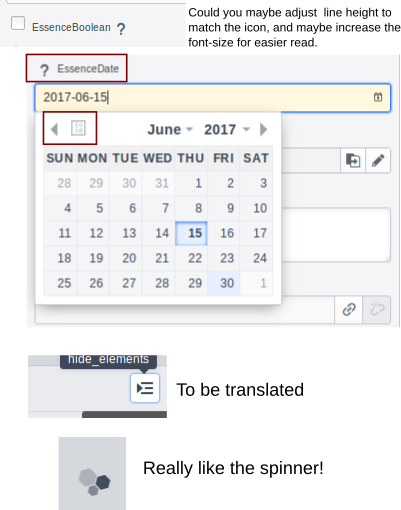
74 files changed, 826 insertions(+), 896 deletions(-):)To make the review easier for you, I will try to summarize the changes I did on the interface and provide some screenshots:
1.) Icons
All png icons were replaced with a new icon font (a combination of google material icons, font awesome and customly created ones)
Some Icons were summarized (e.g. the context based create-, add- and delete icons)
Some Icons were basically changed for better distinguishing and consistency
( e.g. "destroy", "languages", "publish", "go to page", "sites", "reorder pages", "leave page", "hide elements")
A new icon as a "drag indicator" was assigned to the element panels. (I recognized that the order changing of elements was not obvious enough to the clients)

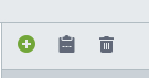
Some status icons and icons for critical or primary actions were colored, e.g.


:
2.) UI surface
Screenshot: Page edit view (before/after)
Screenshot: Pages view (before/after)
Screenshot image library (before/after)
3.) Tables
(e.g. Tags > before/after)
(e.g. Dashboard > before/after)
Further improvements of consistency and usability
Reason: "Publish" was often not recognized by our clients, so that we had to mention it again and again. Now it's more prominent and obvious.
Probably I missed some details to explain but basically these are the changes the PR contains.
Although it's big and will take some time to review I look forward to hearing from you soon :)
Björn