-
Notifications
You must be signed in to change notification settings - Fork 24
Postprocessing: visualizing soil data
In this page you will find a few examples of the soil plots that are currently available in our output processing scripts. These are a work in progress so the examples here may not exactly match the state of the scripts!
Make a basic plot, note all the command line args available for controlling pixel, timestep, etc.
$ ./scripts/output_utils.py --yx 9 9 \
--timestep 25 \
--timeres monthly \
--stage tr \
soil-profiles \
--vars RH SOC \
DATA/SouthBarrow_10x10/output/

With a command line option (--print-full-table) you can get a tabular printout
to the console:

- You must have outputs for
LAYERDEPTH, andLAYERDZspecified in your output_spec.csv file!
$ ./scripts/output_utils.py --yx 0 0 \
--timeres monthly \
--stage tr \
fronts \
--show-layers \
--layer-colors \
/home/vagrant/better_fronts/
Here is the initial overview:

And to see anything useful you typically have to zoom in to a tighter time
and depth range:

-
There is a bug with drawing the final segment in the fronts line. This happens when there is more than one front in the fronts dequeue (i.e. a freezing and thawing front).

-
There is minimal error handling in case of improper argument combinations.
-
When viewing a long timeseries the plot is too busy and the axes (and data) are hard to read. Try using the matplotlib interactive zoom tool to view a a subset of the data!
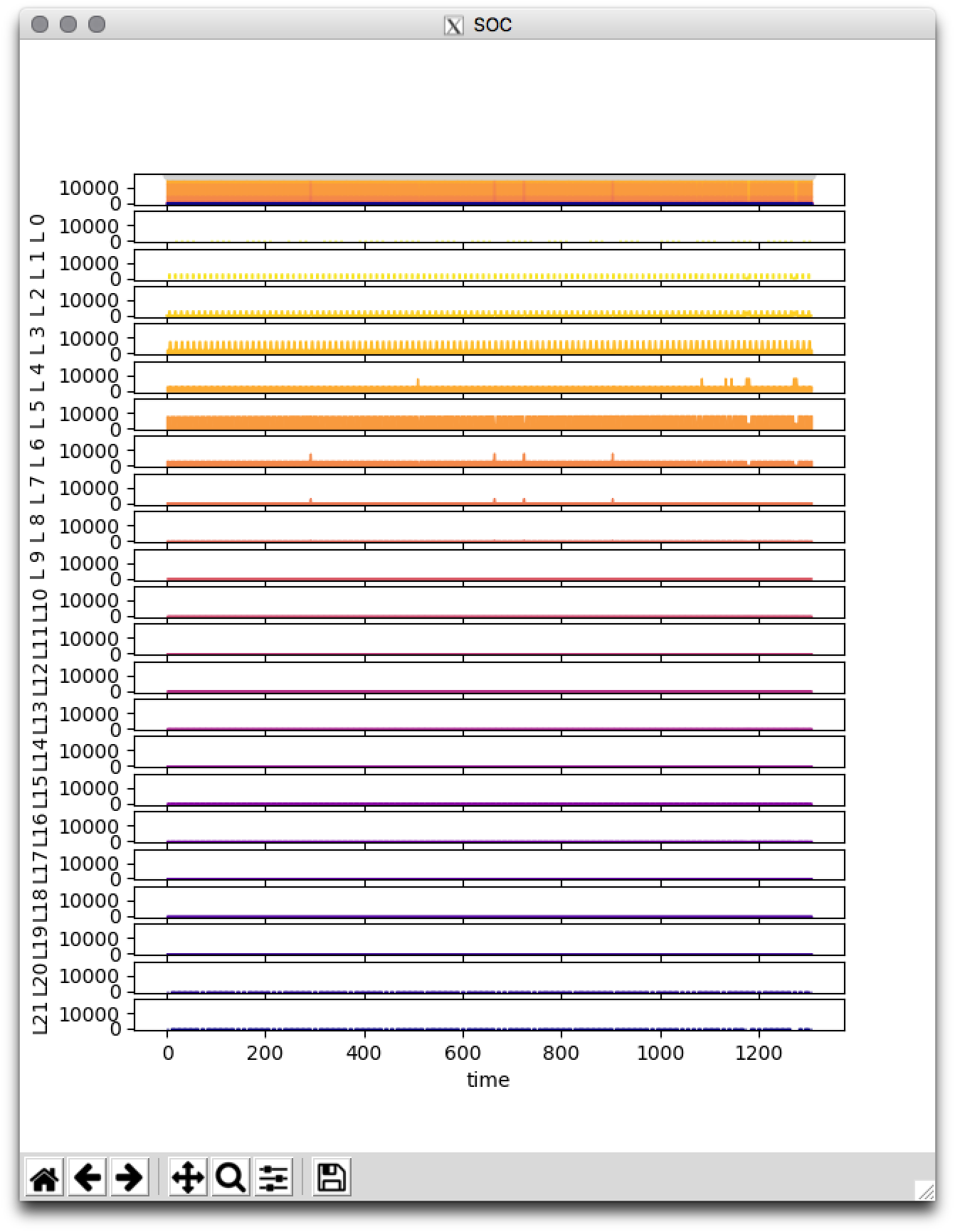
Layers are colored using a sequential colormap. The thickness of the colored band represents the value for that layer for the variable in question.
$ ./scripts/plot_output_var.py --yx 9 9 \
--layer-sum \
--sharex --sharey \
--file DATA/SouthBarrow_10x10/output/SOC_monthly_tr.nc \
--layers 0 21

Note that in the above image, the x and y axes are shareds so you can zoom and
pan one plot and they all remain aligned. Also note that the Y scale is shared
so that you can see the relative contribution from each layer. If you want to
see better detail for each layer, try without the --sharey command line arg:

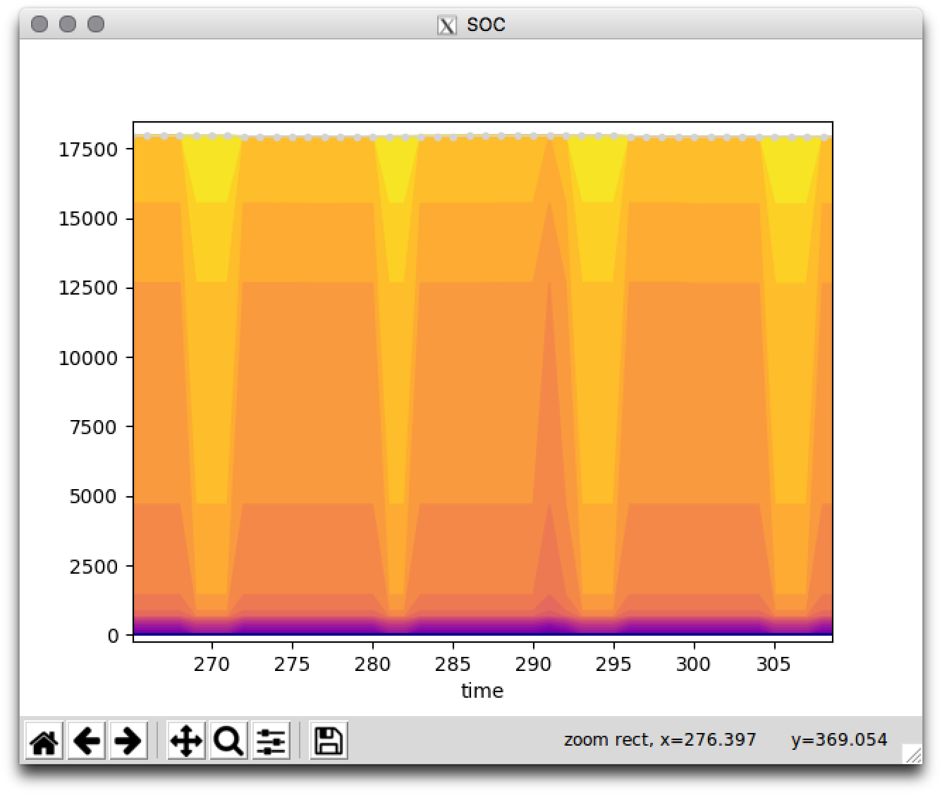
Again, with this macro view it is really hard to see what is really going on, so
try zooming in, either with the interactive zoom tool or the command line
options. This is what it looks like if you provide the
--hide-individual-layers option:

And if you zoom in using the interactive zoom tool:

-
This original features of this script were not heavily tested after adding the layer plotting capability.
-
The biggest issue to be aware of is that the layer color map is not fixed to the maximum number of layers (22). So if you choose to plot only 3 layers (with command line flag
--layers 0 2) you will get a purple, orange and yellow layer. In other words the whole range of the color map will be used to the layers you have selected. This means that a given color of layer is not necessarily the same layer in a plot made with different command line arguments.