Fix arrow colour on popover bottom #13164
Conversation
Stop arrow from being white on bottom popover, as the arrow sits on the title bar, so should match the title bar's background colour.
|
Could you post a live example (e.g. JS Fiddle) that demonstrates the problem? |
| @@ -108,9 +108,10 @@ | |||
| &:after { | |||
| content: " "; | |||
| top: 1px; | |||
| margin-left: -@popover-arrow-width; | |||
| margin-left: -@popover-arrow-width - 1px; | |||
There was a problem hiding this comment.
LESS requires parentheses around arithmetic expressions; this isn't compiling correctly currently.
|
Please include |
|
Ah, didn't realise LESS is meant to have parentheses, it compiles fine on mine (less and jekyll-less ruby gems) I'll update that and include the generated CSS. JSFiddles: |
Add parenthesis to LESS computed values
|
Yeah, please use our Grunt task when building/testing for a pull request, to ensure that you're using the correct versions of everything. |
|
It's meant to be white 😁. |
|
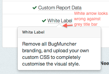
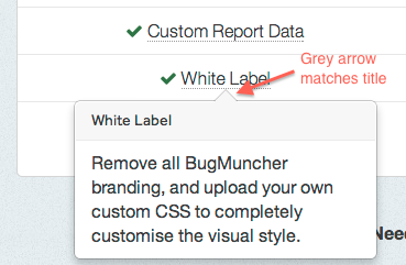
Are honestly saying that when the popover is using the bottom positioning the arrow looks better white than grey? I understand that when the popover is left, top or right the arrow should be white, because it matches the white of the popover body. But when bottom positioned, the arrow sits above the title bar, which is grey, so the white arrow doesn't look as good. I've just noticed - look at this conversation, the arrow that points to my face is grey, to match the title bar, bootstrap's popovers would look better if they did the same. |
|
Well, but not every popover is required to have a title bar, so it then would look bad if the arrow was gray and no title bar was present. |
|
Hmm, now that is a good point, I suppose you could have an additional class to make the popover's arrow grey for when it's positioned bottom with a title? |
|
I guess we could kinda override the white triangle with a gray one, like this, but it seems to be a rather hacky solution... |
Yup, I designed both :). The Bootstrap popover is meant to tie into the inner border on popovers. Look closely and you'll see a 1px white inner border (set with |
Before:
After:
Stop arrow from being white on bottom popover, as the arrow sits on the title bar, so should match the title bar's background colour.