-
-
Notifications
You must be signed in to change notification settings - Fork 78.9k
New issue
Have a question about this project? Sign up for a free GitHub account to open an issue and contact its maintainers and the community.
By clicking “Sign up for GitHub”, you agree to our terms of service and privacy statement. We’ll occasionally send you account related emails.
Already on GitHub? Sign in to your account
Grid System inconsistency in Mac Safari #9282
Comments
|
Confirmed with latest Safari. |
|
This is a Safari specific rounding issue and one we can't even try to solve until Less 1.4 is baked into Recess (the /cc @jonschlinkert though to confirm that last part though. |
|
the |
|
here is the commit for adding support for fractions to rounding: less/less.js@86520e5 also, once 1.5.0 lands I'll be spending some time on recess. |
|
At every media breakpoint, the width for col-*-1 is 8.333333333333332% this is what I did to address rounding only on safari 5 and up. It appears to work great. Let me know. This uses the less variables in the media queries, which are min-width 768px; *** I added a class .safari-fix on the row. |
|
@mdo So, now that we're using an up-to-date version of Less, do we want to attempt a |
|
You can resolve this problem of 12 grid columns in Safari browser by doing this: |
Thank you very much! this should be pinned |
|
@Barelmusenga thanks a lot man... you're a star :D
|
|
I need a clarification on this, that is why the layouts are collapsing in the safari browser alone. Is there any specific reason on using bootstrap V4* |
|
For anyone else that can come across this one --> the issue happens with Bootstrap 3 grid on Safari 13 but not on Safari 14. |


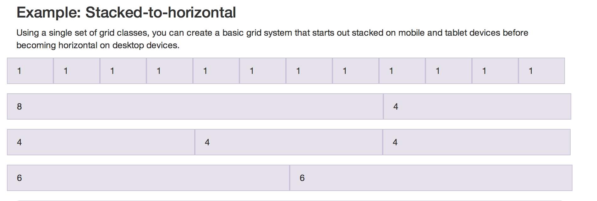
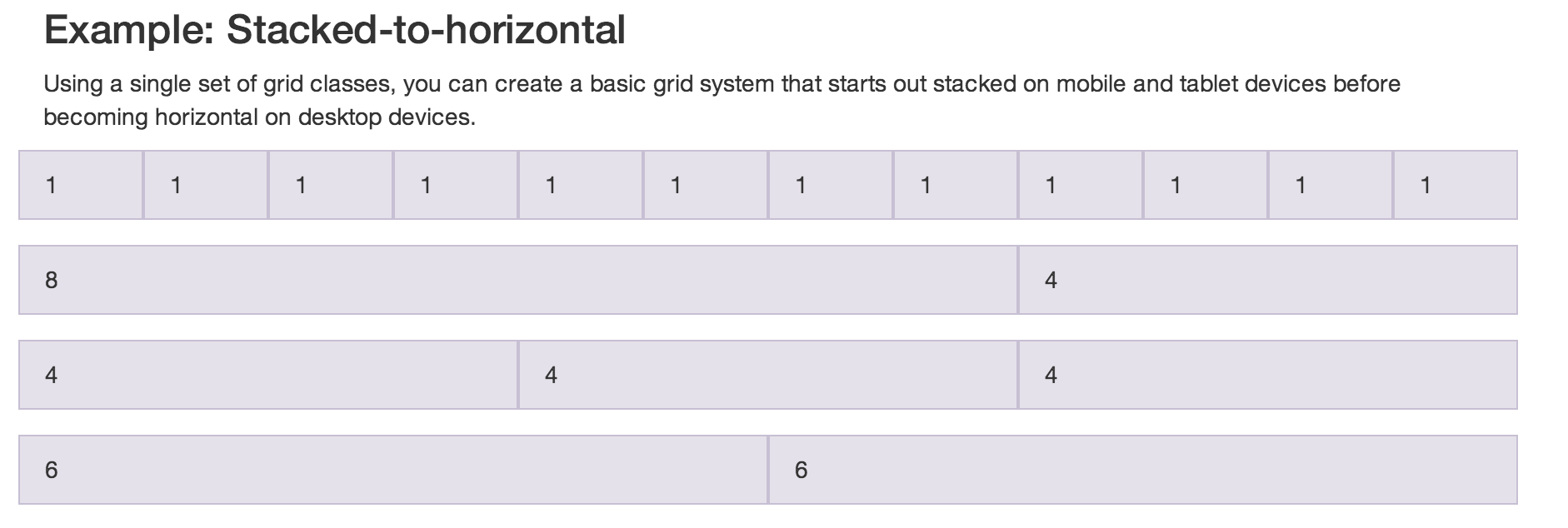
The Grid system is, can I say inconsistent? in Mac Safari. I tested on rMBP and MBA
This is the same case with Bootstrap 2.x as well. I am not sure if there's a Safar-Specific fix for it, as it would appear to be a Safari Problem.
Mac Safari Screenshot:


Mac Opera/Chrome Screenshot:
The text was updated successfully, but these errors were encountered: