Skip to content

Official React components built for Flowbite and Tailwind CSS

License

Notifications You must be signed in to change notification settings

tulup-conner/flowbite-react

Β 
Β 

Folders and files

NameName
Last commit message
Last commit date

Latest commit

Β 
Β 
Β 
Β 
Β 
Β 
Β 
Β 
Β 
Β 
Β 
Β 
Β 
Β 
Β 
Β 
Β 
Β 
Β 
Β 
Β 
Β 
Β 
Β 
Β 
Β 
Β 
Β 
Β 
Β 
Β 
Β 
Β 
Β 
Β 
Β 
Β 
Β 
Β 
Β 
Β 
Β 
Β 
Β 
Β 
Β 
Β 
Β 
Β 
Β 
Β 
Β 
Β 
Β 
Β 
Β 
Β 
Β 
Β 
Β 
Β 

Repository files navigation

🚧 flowbite-react (unreleased) 🚧

Flowbite - Tailwind CSS components

Build websites even faster with components on top of React and Tailwind CSS

Discord Total Downloads Latest release Licenese


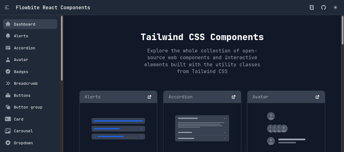
Screenshot of flowbite-react.com


flowbite-react is an open source collection of UI components, built in React, with utility classes from Tailwind CSS that you can use as a starting point for user interfaces and websites.

Table of Contents

Documentation

Documentation for flowbite-react is not yet finished.

If you want to browse the components, visit flowbite-react.com.

If you want to learn more about Flowbite, visit Flowbite docs.

Getting started

Make sure you have Node.js installed.

To use flowbite-react, you need to setup flowbite and also install flowbite-react from npm or yarn.

flowbite can be included as a plugin into an existing Tailwind CSS project.

  1. Install flowbite as a dependency using npm by running the following command:
npm i flowbite flowbite-react # or yarn add flowbite flowbite-react
  1. Require flowbite as a plugin inside the tailwind.config.js file, and include content from flowbite-react:
module.exports = {
  content: [
    ...,
    'node_modules/flowbite-react/**/*.{js,jsx,ts,tsx}'
  ],
  plugins: [..., require('flowbite/plugin')],
  ...
};

Customize components

You can customize every component in flowbite-react. We've provided a few different methods so just about any use case you have should be covered for now.

See https://flowbite-react.com/theme

Components

Alerts Badge Breadcrumbs
Tailwind CSS Alerts Tailwind CSS Badge Tailwind CSS Breadcrumbs
Buttons Button group Cards
Tailwind CSS Buttons Tailwind CSS Button Group Tailwind CSS Cards
Dropdown Forms List group
Tailwind CSS Dropdown Tailwind CSS Forms Tailwind CSS List group
🚧 Typography Modal Tabs
Tailwind CSS Typography Tailwind CSS Modal Tailwind CSS Tabs
Navbar Pagination Timeline
Tailwind CSS Navbar Tailwind CSS Pagination Tailwind CSS Timeline
Progress bar Tables Toast
Tailwind CSS Progress Bar Tailwind CSS Tables Tailwind CSS Toast
Tooltips 🚧 Datepicker Spinner
Tailwind CSS Tooltips Tailwind CSS Datepicker Tailwind CSS Spinner
Footer Accordion Sidebar
Tailwind CSS Footer Tailwind CSS Accordion Tailwind CSS Sidebar
Carousel Avatar Rating
Tailwind CSS Carousel Tailwind CSS Avatar Tailwind CSS Rating
Input Field File Input 🚧 Search Input
Tailwind CSS Input Field Tailwind CSS File Input Tailwind CSS Search Input
Select Textarea Checkbox
Tailwind CSS Select Tailwind CSS Textarea Tailwind CSS Checkbox
Radio Toggle Range Slider
Tailwind CSS Radio Tailwind CSS Toggle Tailwind CSS Range Slider
🚧 Floating Label
Tailwind CSS Floating Label

Community

If you need help or just want to discuss about the library join the community on Github:

⌨️ Discuss about Flowbite on GitHub

For casual chatting with others using the library:

πŸ’¬ Join the Flowbite Discord Server

Contributing

Thank you for your interest in helping! Visit our guide on contributing to get started.

Figma

If you need the Figma files for the components you can check out our website for more information:

🎨 Get access to the Figma design files

Copyright and license

The Flowbite name and logos are trademarks of Crafty Dwarf Inc.

πŸ“ Read about the licensing terms πŸ“€ Brand guideline and trademark usage agreement

About

Official React components built for Flowbite and Tailwind CSS

Resources

License

Code of conduct

Stars

Watchers

Forks

Packages

No packages published

Languages

  • TypeScript 97.0%
  • CSS 2.2%
  • JavaScript 0.8%