-
Notifications
You must be signed in to change notification settings - Fork 82
Customization
There are a number of ways to customize the way that PullToRefresh behaves and looks.
There are a number of XML attributes you can use to change the functionality/appearance. The best way is to look at the attrs.xml file as it is documented and always up to date.
You can adjust the friction value or the smooth scroll duration by setting attributes. These affect movements when pulling or scrolling.
The ptrFriction attribute is for the friction value( default value is 2.0 ).
The ptrSmoothScrollDuration attribute is for the smooth scroll duration(default value is 200 ms). See below.
<com.handmark.pulltorefresh.library.PullToRefreshListView
    xmlns:ptr="http://schemas.android.com/apk/res-auto"
    android:id="@+id/pull_to_refresh_listview"
    android:layout_height="fill_parent"
    android:layout_width="fill_parent"
    ptr:ptrFriction="3.0"
    ptr:ptrSmoothScrollDuration="400"
    />
Also, you can set ptrSmoothScroll__Long__duration attribute, but this attribute is rarely used ( only by calling PullToRefreshBase.smoothScrollToLonger(...) ).
There are also a number of methods available, most of which accompany the XML attributes above. The easiest way to see these is by looking at the interface source file. This contains all of the PullToRefresh related methods, and their Javadoc:
The animation style controls how the Pull-to-Refresh functionality is presented to the user. The different options are:
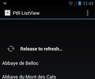
Rotate is the default as it allows you to make easy customizations to the look and feel by changing the Drawable used. The Drawable is rotated based on how far the user pulls, and is then continuously rotated while refreshing. Most of the samples use this option.
If you want to explicitly show that you are using this layout, set the ‘ptrAnimationStyle’ attribute as below.
<com.handmark.pulltorefresh.library.PullToRefreshListView
    xmlns:ptr="http://schemas.android.com/apk/res-auto"
    android:id="@+id/pull_to_refresh_listview"
    android:layout_height="fill_parent"
    android:layout_width="fill_parent"
    ptr:ptrAnimationStyle="rotate"
/> 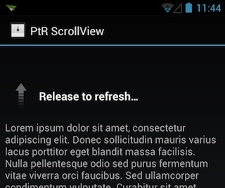
Flip is the old style animation, and is what is commonly used by applications on iOS. The arrow flips and changes direction based on how far the user has pulled. When refreshing, a Progress Bar is displayed instead. You can see this in the ScrollView sample.
If you want to use this layout, set the ‘ptrAnimationStyle’ attribute as below.
<com.handmark.pulltorefresh.library.PullToRefreshListView
    xmlns:ptr="http://schemas.android.com/apk/res-auto"
    android:id="@+id/pull_to_refresh_listview"
    android:layout_height="fill_parent"
    android:layout_width="fill_parent"
    ptr:ptrAnimationStyle="flip"
/> Set the ‘ptrPullLabel’, 'ptrRefreshLabel' and 'ptrReleaseLabel' attribute as below.
<com.handmark.pulltorefresh.library.PullToRefreshListView
    xmlns:ptr="http://schemas.android.com/apk/res-auto"
    android:id="@+id/pull_to_refresh_listview"
    android:layout_height="fill_parent"
    android:layout_width="fill_parent"
    ptr:ptrPullLabel="The custom label being displayed when pulling"
    ptr:ptrRefreshLabel="The custom label being displayed when resfreshing"
    ptr:ptrReleaseLabel="The custom label being displayed when release"
/> Override FlipLoadingLayout or RotateLoadingLayout
package com.example.yourproject;

public final class CustomLoadingLayout extends FlipLoadingLayout {

 public FlipLoadingLayout(Context context, Mode mode,
         Orientation scrollDirection, TypedArray attrs) {
     super(context, mode, scrollDirection, attrs);
 }

 @Override
 protected String loadPullLabel(Context context, TypedArray attrs, Mode mode) {
     return "Custom pull label";
 }

 @Override
 protected String loadRefreshingLabel(Context context, TypedArray attrs, Mode mode) {
     return "Custom refreshing label";
 }

 @Override
 protected String loadReleaseLabel(Context context, TypedArray attrs, Mode mode) {
     return "Custom release label";
 }
 /**
  * Custom icon of loading layout
  */
 @Override
 protected int getDefaultDrawableResId() {
     return R.drawable.my_arrow;
 }
}
Create assets/pulltorefresh.xml file in your project as below.
<?xml version="1.0" encoding="UTF-8"?>
<PullToRefresh>
 <LoadingLayouts>
   <layout name="custom”>com.example.yourproject.CustomLoadingLayout</layout> <!— Add here —>
 </LoadingLayouts>
</PullToRefresh>
Add the 'ptrAnimationStyle' attribute to use the new loading layout
<com.handmark.pulltorefresh.library.PullToRefreshListView
    xmlns:ptr="http://schemas.android.com/apk/res-auto"
    android:id="@+id/pull_to_refresh_listview"
    android:layout_height="fill_parent"
    android:layout_width="fill_parent"
    ptr:ptrAnimationStyle="custom"
/> 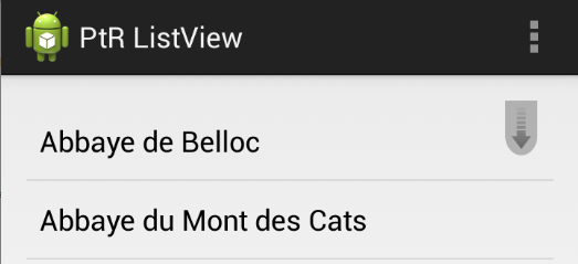
The indicator layout is only supported for AdapterView based Pull To Refresh views(such as Pull To Refresh ListView, Pull To Refresh GridView). This layout tells you "I'm ready to do refreshing, when you pull right now" by showing the indicator icon.
If you use the indicator layout , set ptrShowIndicator to true!
<com.handmark.pulltorefresh.library.PullToRefreshListView
    xmlns:ptr="http://schemas.android.com/apk/res-auto"
    android:id="@+id/pull_to_refresh_listview"
    android:layout_height="fill_parent"
    android:layout_width="fill_parent"
    ptr:ptrShowIndicator ="true"
/> Naturally, the default indicator layout is being used as default. When you set 'ptrShowIndicator' to true in Pull To Refresh View, this layout is shown as default.
If you want to explicitly show that you are using this layout, set the ‘ptrIndicatorStyle’ attribute to 'default' as below.
<com.handmark.pulltorefresh.library.PullToRefreshListView
    xmlns:ptr="http://schemas.android.com/apk/res-auto"
    android:id="@+id/pull_to_refresh_listview"
    android:layout_height="fill_parent"
    android:layout_width="fill_parent"
    ptr:ptrIndicatorStyle ="default"
/> Override DefaultIndicatorLayout
package com.example.yourproject;

public class CustomIndicatorLayout extends DefaultIndicatorLayout {

     public CustomIndicatorLayout(Context context, Mode mode) {
          super(context, mode);
     }

     @Override
     protected Drawable getIconDrawable(Context context, Mode mode) {
          return getResources().getDrawable(R.drawable.my_indicator_arrow);
     }
}
Create assets/pulltorefresh.xml file in your project as below.
<?xml version="1.0" encoding="UTF-8"?>
<PullToRefresh>
 <IndicatorLayouts>
   <layout name="custom”>com.example.yourproject.CustomIndicatorLayout</layout> <!— Add here —>
 </IndicatorLayouts>
</PullToRefresh>
Set the 'ptrAnimationStyle' attribute in some PullToRefresh view to use new indicator layout
<com.handmark.pulltorefresh.library.PullToRefreshListView
    xmlns:ptr="http://schemas.android.com/apk/res-auto"
    android:id="@+id/pull_to_refresh_listview"
    android:layout_height="fill_parent"
    android:layout_width="fill_parent"
    ptr:ptrShowIndicator="true"
    ptr:ptrIndicatorStyle="custom"
/> (NOTE : This mode works over Android 3.x(Honeycomb), thus under 2.x, the mode is automatically changed to pullFromStart mode. )
You may replicate the behavior of Gmail app by setting the ptrMode to google as shown below :
<com.handmark.pulltorefresh.library.PullToRefreshListView
    xmlns:ptr="http://schemas.android.com/apk/res-auto"
    ...
    ptr:ptrMode="google"
    />
This results in the following animation : Click Here
However, setting this mode disables the following properties,
- Orientation (the return value of
getPullToRefreshScrollDirection()) : VERTICAL - ptrListViewExtrasEnabled attribute : false
- ptrShowIndicatorLayout attribute : false
This is the layout shown at the top of the screen, covering the action bar.
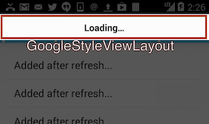
You may customize the default layout by extending GoogleStyleViewLayout as shown below.
(1) Extend and override GoogleStyleViewLayout
public class CustomGoogleStyleViewLayout extends GoogleStyleViewLayout {
  ...

  @Override
  public void pullToRefresh() {
    // do when pulling
  }

  @Override
  public void releaseToRefresh() {
   // do when releasing
  }

  @Override
  public void refreshing() {
    // do when refreshing
  }

  @Override
  public void reset() {
    // do when resetting
  }

  @Override
  public void onPull(float scale) {
    // scale is the proportion of limit of pulling
  }
}
(2) Add the customized layout to assets/pulltorefresh.xml
<?xml version="1.0" encoding="UTF-8"?>
<PullToRefresh>
    ...
    <GoogleStyleViewLayouts>
       <layout name="[Custom Layout Name]">[The classpath of the layout here]</layout>
    </GoogleStyleViewLayouts>
</PullToRefresh>
(3) Set the ptrGoogleViewStyle attribute to [Custom Layout Name]
<com.handmark.pulltorefresh.library.PullToRefreshListView
    xmlns:ptr="http://schemas.android.com/apk/res-auto"
    ...
    ptr:ptrGoogleViewStyle="[Custom Layout Name]"
    />
Note: The height of the layout is set to the action bar height. If you want to modify its height, set the following attribute to "false" (Not recommended).
<com.handmark.pulltorefresh.library.PullToRefreshListView
    xmlns:ptr="http://schemas.android.com/apk/res-auto"
    ...
    ptr:ptrSetGoogleViewLayoutSizeToActionbarHeight="false"
/> GoogleStyleProgressLayout governs the progress bar and similar to the GoogleStyleViewLayout, it is shown over the action bar.
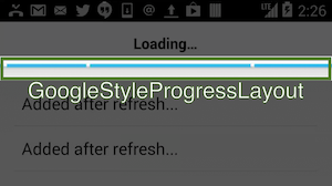
You may customize the default layout by extending GoogleStyleProgressLayout as shown below.
(1) Extend and override GoogleStyleProgressLayout
public class CustomGoogleStyleProgressLayout extends GoogleStyleProgressLayout {
  ...

  @Override
  public void pullToRefresh() {
    // do when pulling
  }

  @Override
  public void releaseToRefresh() {
   // do when releasing
  }

  @Override
  public void refreshing() {
    // do when refreshing
  }

  @Override
  public void reset() {
    // do when resetting
  }

  @Override
  public void onPull(float scale) {
    // scale is the proportion of limit of pulling
  }
}
(2) Add the customized layout to assets/pulltorefresh.xml
<?xml version="1.0" encoding="UTF-8"?>
<PullToRefresh>
    ...
    <GoogleStyleProgressLayouts>
       <layout name="[layout name]">[The classpath of the layout here]</layout>
    </GoogleStyleProgressLayouts>
</PullToRefresh>
(3) Set the ptrGoogleViewStyle attribute to [Custom Layout Name]
<com.handmark.pulltorefresh.library.PullToRefreshListView
    xmlns:ptr="http://schemas.android.com/apk/res-auto"
    ...
    ptr:ptrGoogleProgressStyle="[Custom Layout Name]"
/> You may customize the durations of various animations, or even enable/disable them completely by changing the options below.
- ptrShowGoogleStyleViewAnimationEnabled : Shows/hides the GoogleStyleViewLayout's fade-in/out animation when pulling
- ptrShowGoogleStyleViewAnimationDuration : Fade-in/out duration of GoogleStyleViewLayout
- ptrHideRefeshableViewWhileRefreshingEnabled : Shows/hides the RefreshableView while while the refresh animation is running
- ptrHideRefeshableViewWhileRefreshingDuration : Fade-in/out duration of RefreshableView
- ptrViewRefeshableViewProgressBarOnCenterWhileRefreshingEnabled : Shows/hides the progress bar while refreshing
- ptrViewRefeshableViewProgressBarOnCenterWhileRefreshingDuration : Fade-in/out duration of the progress bar
- ptrRefeshableViewProgressBarOnCenterWidth, ptrRefeshableViewProgressBarOnCenterHeight : Sets the dimensions of the progress bar