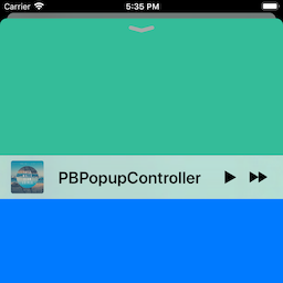
PBPopupController is a framework for presenting bars and view controllers as popup, much like the look and feel of Apple Music App.
PBPopupController allows to configure a popup bar (like the mini player of Apple Music App), docking it to the bottom bar of a presenting view container controller (like UITabBarController, UINavigationController). The presenting view controller can be any UIViewController subclass.
Each view controller can present a popup bar, docked to a bottom view. For UITabBarController subclasses, the default is the tab bar. For UINavigationController subclasses, the default view is the toolbar. For other classes, the popup bar is presented at the bottom of the screen. View controller subclasses can provide their own bottom bar views.
Once the popup bar is configured (see the properties in the PBPopupBar class) with a style, an image, a title, a sub-title, buttons, effects and colors, you present it with the above view controller providing a required popup content view controller (like the maxi player of Apple Music App).
Once the popup bar is presented with a popup content view controller, the user can swipe or tap the popup bar at any point to present the content view controller. After finishing, the user dismisses this view controller by either swiping or tapping the popup close button porvided by the system.
Popup close buttons styles are labeled chevron for modern style chevron close button and round for iOS 9-style close buttons.
You can also present and dismiss the popup content view controller programmatically.
The popup bar has a prominent style based on the modern Music app look and feel and a compact style for iOS 9-style look and feel.. You can change these default values. For each, there is a floating parameter for matching the style like in Apple's Music application since iOS 17.
You can also present completely custom popup bars.
The presentation options provided by the framework are listed in the PBPopupPresentationStyle enumeration. They make the presentation look like the behavior of the Apple Music App. For iOS 9, the presentation style was fullScreen by default and for iOS 10 and below, the style was deck. The default is deck. You can change these default values. The custom option allows you to present the controller on a part of the screen.
PBPopupController supports SPM versions 5.1.0 and above. To use SPM, you should use Xcode 11 or above to open your project. Click File -> Swift Packages -> Add Package Dependency, enter https://github.com/iDevelopper/PBPopupController. Select the version you’d like to use.
Add the following to your Cartfile:
github "iDevelopper/PBPopupController"
Make sure you follow the Carthage integration instructions here.
Drag the PBPopupController.xcodeproj project to your project, and add PBPopupController.framework to Embedded Binaries in your project target's General tab. Xcode should sort everything else on its own.
PBPopupController is available for installation using the Cocoa dependency manager CocoaPods.
Add the following to your project's Podfile:
pod 'PBPopupController'- iOS 13 or later.
- ARC memory management.
- Category methods on UIViewController.
- Handling of rotations.
- Plays nicely with any child view controllers or parent controllers.
- Seamless integration of tap and pan gesture recognizers.
- Delegate methods for getting full state of the controller and implementing your own code hooks for customizing behavior.
- Data source methods for asking custom popup bar' labels.
- Full Right-To-Left support.
- Accessibility support.
- iOS 13 dark mode support.
- macOS Catalyst support.
- macOS Apple Silicon support.
- iPad look and feel support.
- Floating bar style support.
- Configuring and presenting a popup bar:
        self.tabBarController?.popupController.delegate = self

        if let popupBar = self.tabBarController?.popupBar {

            popupBar.dataSource = self

            popupBar.image = UIImage(named: "Cover01")
            popupBar.title = "Title"
            popupBar.subtitle = " A subtitle"
            popupBar.accessibilityLabel = "My custom label"

            let popupPlayButtonItem = UIBarButtonItem(image: #imageLiteral(resourceName: "play-small"), style: .plain, target: self, action: #selector(playPauseAction(_:)))
            popupPlayButtonItem.accessibilityLabel = NSLocalizedString("Play", comment: "")
            let popupNextButtonItem = UIBarButtonItem(image: #imageLiteral(resourceName: "next-small"), style: .plain, target: self, action: #selector(nextAction(_:)))
            popupNextButtonItem.accessibilityLabel = NSLocalizedString("Next track", comment: "")

            popupBar.rightBarButtonItems = [popupPlayButtonItem, popupNextButtonItem]

            let popupContentVC = self.storyboard?.instantiateViewController(withIdentifier: "PopupContentViewController") as? PopupContentViewController

            self.tabBarController?.presentPopupBar(withPopupContentViewController: popupContentVC, animated: true, completion: {
                print("Presented")
            })
}- Opening a popup content view controller programmatically:
        self.tabBarController?.openPopup(animated: true, completion: {
            print("Open")
})- Closing a popup content view controller programmatically:
        self.tabBarController?.closePopup(animated: true, completion: {
            print("Closed")
})- Delegate methods for getting state of the controller:
    func popupController(_ popupController: PBPopupController, stateChanged state: PBPopupPresentationState, previousState: PBPopupPresentationState) {
        PBLog("stateChanged state: \(state.description) - previousState: \(previousState.description)")
    }
func popupController(_ popupController: PBPopupController, didOpen popupContentViewController: UIViewController) {
PBLog("didOpen - state: \(popupController.popupPresentationState.description)")
}etc...
PBPopupBardataSource methods for providing label instances (such as MarqueeLabel):
    lazy var label: MarqueeLabel = {
        let marqueeLabel = MarqueeLabel(frame: .zero, rate: 15, fadeLength: 10)
        marqueeLabel.leadingBuffer = 0.0
        marqueeLabel.trailingBuffer = 5.0
        marqueeLabel.animationDelay = 1.0
        marqueeLabel.type = .continuous
        return marqueeLabel
    }()
...
    func titleLabel(for popupBar: PBPopupBar) -> UILabel? {
        return self.label
    }
func subtitleLabel(for popupBar: PBPopupBar) -> UILabel? {
return self.sublabel
}Since iOSS 13, the status bar is not animated correctly by Apple. So, you can set the properties:
popupPreferredStatusBarStyle for the preferred status bar style of the popup content view controller,
containerPreferredStatusBarStyle for preferred status bar style of the container view controller.
When you override the preferredStatusBarStyle variable in your popup content view controller, return container.popupController.popupStatusBarStyle:
    override public var preferredStatusBarStyle: UIStatusBarStyle {
        guard let containerVC = self.popupContainerViewController else {return.default}
        guard let popupContentView = containerVC.popupContentView else {return .default}

        if popupContentView.popupPresentationStyle != .deck {
            return .default
        }
        return containerVC.popupController.popupStatusBarStyle
}You can find the docs here. Documentation is generated with jazzy and hosted on GitHub-Pages.
The framework uses:
- smooth-gradient Copyright (c) 2016 Jansel Valentin
The demo project uses:
- MarqueeLabel Copyright (c) 2011-2024 Charles Powell
- LoremIpsum Copyright (c) 2013 Lukas Kubanek
A Special Thank to Leo Natan.
This code was inspired on his excellent framework LNPopupController.
Patrick BODET aka iDevelopper
PBPopupController is available under the MIT license, see the LICENSE file for more information.
Please tell me when you use this controller in your project!
Regards,
Patrick Bodet aka iDevelopper


