Refactor responsive styles #1707
Conversation
|
❤️ ❤️ ❤️ In Firefox the footer is showing up like this: (even on large screens) Also, the header and footer should be width-constrained on large screens: |


|
@seanlinsley Hrm. I can't reproduce that in Firefox 19.0 or 25.0.1 on Mac OS X. What version/system are you using? Is it possible you've got some local cache? If it's something older, do we have any explicit browser version support policy? Google has a pretty radical one (https://support.google.com/a/answer/33864) to support the current and previous major versions of Chrome, Safari, Firefox and IE. Maybe we should try to codify something similar. |
|
@dominic Thanks so much for the contribution. :-) To date every change to Gittip has run through my brain, and that's not scalable. As an experiment in loosening my grip in the hopes of increasing the rate at which we can process PRs and improve Gittip, I've decided not to pay any attention whatsoever to this PR. I hope you can take that as a sign of trust in you and our Gittip team rather than indifference. :-) Instead, I've asked @clone1018 @bruceadams and @seanlinsley to manage this PR start to finish (I'll let them decide what "manage" means between the three of them). [IRC] Ideally you'll be able to coordinate with @zwn to deploy this once it lands in master. That way I'll be out of the loop entirely, which will be a significant first for Gittip. I suppose if you all get mired in controversy you can bring me back in, but knowing the five of you I'm not too worried. Okay! Good luck! 💃 |
|
I'm experiencing the above layout issues in the latest Firefox, Safari, and Chrome 😦 I don't know if Gittip has any such cache, but force refreshing my browser doesn't solve the problem. |
|
Disregard; it turns out my local install was configured to grab its CSS from the production server instead of locally. |
|
This looks great! Any ideas on how to get our graphs to fit? |

|
Not yet, but I've barely looked at the graphs. Will make that my next priority. Do you think that should be in this pull, or as a separate one for #1703? |
|
In that case it should probably be its own pull request. |
|
Cool. In that case, this branch is no worse off than before on pages with graphs, and I'll start on those later today. |
|
That ticket can be answered later, for now this pull request is a HUGE improvement on what we already have. I'm going to go ahead and merge it in and get someone on IRC to push it live. Thanks for the contribution, it's freaking awesome! !m @dominic |
|
Yes! Thanks so much @dominic ! |
|
@bruceadams @clone1018 Thanks y'all! The first of many, I hope :) |
I originally started this while looking at #1652, but found the entire responsive stylesheet to be a bit of a mess (the first line being "
/* A Special Responsive Hell */"). I've attempted to bring a little more consistency and usability to the flexible screen experience, as documented below:The responsive layout now provides a larger gutter (5% each side) and enforces a minimum width of 320px (iPhone portrait width - a threshold that no modern smartphone is crossing as far as I'm aware). Device examples below:
Device examples:
Phones
(Images reduced 50% from retina resolution)
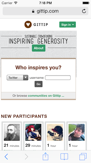
Page top
Before:

After:

The top of the page loses the centered icon (which can run into the logged in user's name), increases the hero copy size, and reformats the "Who inspires you?" block to have much larger touch targets.
Portraits (#1652)
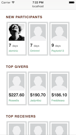
Mobile layouts reduce the number of visible portraits per section from 4 to 3. Previously, this caused an extra gutter on the homepage as the page contents overflowed the viewport boundaries.
Before:
After:
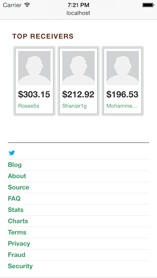
Footer
I've made the footer touch friendly, providing full-width, fixed touch targets that don't reflow at various screen sizes.
Before:

After:
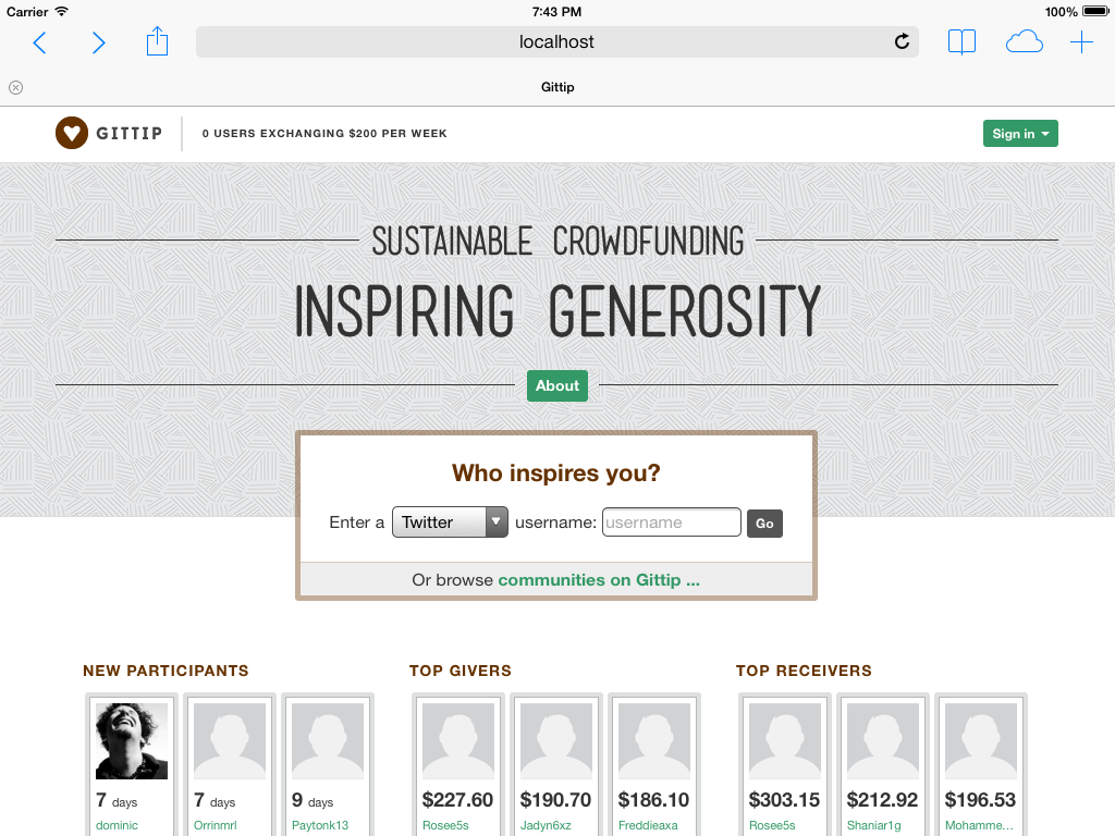
Tablets
Landscape
Larger tablets (> 900px, so iPads and similarly sized devices) receive the full desktop layout of (3 columns of portraits, 2 columns on a profile page).
Before:
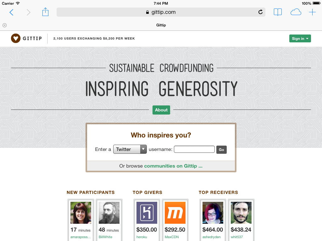
After:
Other Changes
Some work has been put into being more Sass-like with our CSS, including breaking out some standard widths into variables and functions, as well as adding the commonly used
clearfixmixing in place of<div class="clear"></div>Remaining issues:
Charts still break out of the layout causing unsightly gutters.
Logged in navigation still needs some work at the smallest mobile size:
Thoughts?