-
-
Notifications
You must be signed in to change notification settings - Fork 26
Button
Brandon Blanker Lim-it edited this page Sep 6, 2021
·
11 revisions
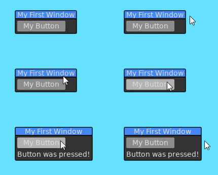
Buttons are simple controls which respond to a user's left mouse click. Buttons will simply return true when they are clicked.
Slab.BeginWindow('MyFirstWindow', {Title = "My First Window"})

if Slab.Button("My Button") then
	ButtonPressed = true
end

if ButtonPressed then
	Slab.Text("Button was pressed!")
end

Slab.EndWindow()
Radio buttons offer the user to select one option from a list of options.
local SelectedButton = 1
local Options = {"Apple", "Banana", "Orange", "Pear", "Lemon"}

Slab.BeginWindow('RadioButton', {Title = "Radio Button"})

for I, V in ipairs(Options) do
	if Slab.RadioButton(V, {Index = I, SelectedIndex = SelectedButton}) then
		SelectedButton = I
	end
end

Slab.EndWindow()
Below is a list of functions associated with the Button API.
Adds a button to the active window.
| Parameter | Type | Description |
|---|---|---|
| Label | String | The label to display on the button. |
| Options | Table | List of options for how this button will behave. |
| Option | Type | Description |
|---|---|---|
| Tooltip | String | The tooltip to display when the user hovers over this button. |
| Rounding | Number | Amount of rounding to apply to the corners of the button. |
| Invisible | Boolean | Don't render the button, but keep the behavior. |
| W | Number | Override the width of the button. |
| H | Number | Override the height of the button. |
| Disabled | Boolean | If true, the button is not interactable by the user. |
| Image | Table | A table of options used to draw an image instead of a text label. Refer to the 'Image' documentation for a list of available options. |
| Color | Table | The background color of the button when idle. The default value is the ButtonColor property in the Style's table. |
| HoverColor | Table | The background color of the button when a mouse is hovering the control. The default value is the ButtonHoveredColor property in the Style's table. |
| PressColor | Table | The background color of the button when the button is pressed but not released. The default value is the ButtonPressedColor property in the Style's table. |
| PadX | Number | mount of additional horizontal space the background will expand to from the center. The default value is 20. |
| PadY | Number | mount of additional vertical space the background will expand to from the center. The default value is 5. |
| VLines | Number | number of lines in a multiline button text. The default value is 1 |
| Return | Description |
|---|---|
| Boolean | Returns true if the user clicks on this button. |
Adds a radio button entry to the active window. The grouping of radio buttons is determined by the user. An Index can be applied to the given radio button and a SelectedIndex can be passed in to determine if this specific radio button is the selected one.
| Parameter | Type | Description |
|---|---|---|
| Label | String | The label to display next to the button. |
| Options | Table | List of options for how this radio button will behave. |
| Option | Type | Description |
|---|---|---|
| Index | Number | The index of this radio button. Will be 0 by default and not selectable. Assign an index to group the button. |
| SelectedIndex | Number | The index of the radio button that is selected. If this equals the Index field, then this radio button will be rendered as selected. |
| Tooltip | String | The tooltip to display when the user hovers over the button or label. |
| Return | Description |
|---|---|
| Boolean | Returns true if the user clicks on this button. |