Skip to content
New issue

Have a question about this project? Sign up for a free GitHub account to open an issue and contact its maintainers and the community.

By clicking “Sign up for GitHub”, you agree to our terms of service and privacy statement. We’ll occasionally send you account related emails.

Already on GitHub? Sign in to your account

Replacing Helvetica Neue as the main font #8

Closed
khawkins98 opened this issue Dec 2, 2016 · 16 comments
Closed

Replacing Helvetica Neue as the main font #8

khawkins98 opened this issue Dec 2, 2016 · 16 comments

Comments

@khawkins98
Copy link
Contributor

This repo — somewhat confusingly — also contain the typeface we need for EMBL-EBI "brand compliance": Helvetica Neue.

The move from Verdana in the new EBI Visual Framework has largely been a big success, however there is still work to be done.

The biggest among them is that Helvetica Neue does not work well on all Windows browsers.

From a recent ticket:

  • The vertical alignment is different between Chrome on Windows and Chrome on Mac OSX causing a misalignment with the title icons.
  • Some letters aren't rendering well on Chrome on Windows.

There are at least three ways to approach this:

  1. Use a different font on Windows (Liberation Sans/Arimo is a popular choice)
  • Pro: Looks good on Mac, looks good on Windows
  • Con: Not branding compliant, alters the experience between platforms, fragments testing
  1. Just use Liberation Sans/Arimo everywhere
  • Pro: Consistent experience and it's an open source font
  • Con: Not branding compliant
  1. "Fix" Helvetica Neue
  • Pro: Consistent experience
  • Con: No one really knows how to do this, needs more investigation!
  1. Do nothing
  • Pro: Branding compliant
  • Con: Leaves windows a bit wonky

Either way, this sort of change would likely need to be done in v1.2 of the Icon Fonts and Framework, so it's a target for summer 2017.

@khawkins98
Copy link
Contributor Author

khawkins98 commented Dec 2, 2016

Some examples from the http://www.ebi.ac.uk/research/eipp page.

Chrome on Mac vs Windows
Note the lack of 300 font weights for Windows.
screen shot 2016-12-02 at 14 16 44

Poor rendering of "w" on IE and Chrome on Windows
screen shot 2016-12-02 at 14 17 02
screen shot 2016-12-02 at 14 16 55

@khawkins98
Copy link
Contributor Author

khawkins98 commented Jan 19, 2017

Feeding back in some recent conversation at the January Web Guidelines Committee and with our colleagues at EMBL; want in a future font that has:

  • A variety of weights and styles (light, ultra-light, bold, italic, etc.)
  • Support for foreign characters (You guessed it: I'm looking at ü)
    • Also for non-Latin script, e.g. Greek, for scientific notations
  • Consistent rendering across the many devices/browsers
  • Looks good at small sizes (so we can use it for data tables and visualisations)
  • Not too radical a deviation from Helvetica (using a serif as the primary font is likely not an option as it would blow up too many applications)
  • Huge bonus points for a liberal or open source license
  • Nice if the font has a little personality (Helvetica, for example, is very generic and does not make our "brand" more recognisable)
  • harmonising with Helvetica (the font in the logo)
  • Bonus points for

Additional caveat:

  • Ideally we'll have ONE font for print and web. This has obvious impacts outside of the WGC and requires coordination

Any font that can pass those requirements is likely a good candidate.

Some initial options that are proposed:

Once a few favourites have been settled on we would also need to do some testing (both with users and on various types of pages/content).

@khawkins98 khawkins98 changed the title Using Helvetica Neue for the text font Replacing Helvetica Neue as the main font Jan 19, 2017
@khawkins98
Copy link
Contributor Author

khawkins98 commented Jan 27, 2017

You can see a preview of these fonts at https://ebiwd.github.io/EBI-Pattern-library/sample-site/fonts/fonts.html#samples

Currently it demoes the "Impact" page, but we'll add more examples as the list narrows.

@jonathanhickford
Copy link

There's a growing movement around using 'native' or 'system fonts', e.g. the default fonts of the major device categories over the classic web fonts. Bootstrap 4 is going to do this and there's an interesting article on Smashing Magazine on how Medium does this.

I can see the desire for using system fonts, especially in an app environment where you're trying to make it feel more integrated with the device. Perhaps this is less relevant though in our case. Perhaps there is a growing change in expectation, where people are more accepting that a site looks different per device.

Anyway noting it here as several of our suggested fonts are the system defaults. I'm not sure how comfortable everyone would be about having different fonts per device, and the testing implications of that.

@sebpca
Copy link

sebpca commented Nov 3, 2017

Using System font seems a good way to go also for me. We are experimenting that on the new InterPro (on dev). So far, it seems to work the same on Windows and Mac. I didn't notice any big differences in the font rendered. You have to call it using something like this in the CSS font-family: -apple-system,BlinkMacSystemFont,Segoe UI,Roboto,Oxygen-Sans,Ubuntu,Cantarell,Helvetica Neue,Helvetica,Arial,sans-serif;
Windows will render the font "Segoe UI" and Mac will render "San Francisco (apple-system)". The big advantage is that you don't need to import any font file (so probably more performant). The drawbacks are that you need to maintain this list, and that old machine will just be able to read the text in fallback fonts like Helvetica or Arial. More info https://bitsofco.de/the-new-system-font-stack/

@khawkins98
Copy link
Contributor Author

khawkins98 commented Nov 7, 2017

Following up after today's Web Guidelines Committee.

  1. Here is the slide deck:

    https://docs.google.com/presentation/d/1EUx4cZfpobUHAleN1F5JOdoxyXJAhzA820n5Pwd_IMY/

  2. Here is a thought we discussed after the meeting:

    After the meeting some of us had a brief chat about the use of an EMBL-brand font on service pages – a good way to maximise the need for branding and usability of services would be to use the EMBL-font in the global masthead (black bar) and global footer, and then to default to the brand-font in the local-header and content space.
    But guidelines would allow for (and support) the use of a native-fonts method – perhaps we could enable system fonts with a div class="system-fonts"
    I'm sure that's clear as mud, I'll try and this up in the v1.3 alpha.

@khawkins98
Copy link
Contributor Author

khawkins98 commented Nov 9, 2017

A follow-up with some additional thinking:

  1. 👍 A data font:
    • Supporting (a specific set of?) non-brand fonts for service content areas feels like it makes sense. We do need to be supportive of EMBL branding, but the science must come first.
    • This could be an intermediary "compatibility" step as we get more familiar with the Fira font.
  2. 🤔 System fonts:
    • Using native system fonts per browser type feels like it could be opening a can of worms and greatly increases the need of technical and UX (i.e. This bit of button text wraps to two lines with Gnome, these tables aren't readable with Ubuntu's font)

Questions and to-dos:

  1. Narrow down, capture evidence of Fira's shortcomings:
  2. How to approach a data font:
    • If we do not use the native system fonts, we could instead use Arial and plain Helvetica as our data font. People are used to reading these simple workhorse of data fonts.
    • We could use these fonts by default on all tables
    • Use of either Fira or Arial/Helvetica could be semantically invoked with .font-embl or .font-data
    • We could also use $fontEmbl and $fontData as our Sass variable names

@khawkins98
Copy link
Contributor Author

khawkins98 commented Nov 9, 2017

Another approach is to investigate using Fira Code as our data font, using Expression Atlas as an example:

1. Now

image

2. Fira

image

3. Fira Code

image

khawkins98 added a commit to ebiwd/EBI-Framework that referenced this issue Nov 9, 2017
@khawkins98
Copy link
Contributor Author

khawkins98 commented Nov 9, 2017

To the v1.3 dev assets, I've added the utility classes:

  .font-embl { font-family: $body-font-family; }
  .font-code { font-family: $code-font-family; }

And added the sass vars:

  $code-font-family: 'Fira Code', Consolas, 'Liberation Mono', Courier, monospace;
  $table-font-family: $code-font-family;

I've also tightened the p leading to be 1.5 (was 1.6);

So our revised screenshots:

Expression Atlas
image

Data table
image

khawkins98 added a commit to ebiwd/EBI-Framework that referenced this issue Nov 9, 2017
@BurkovBA
Copy link

BurkovBA commented Dec 17, 2017

I was migrating RNAcentral's future release-9 layout from 2013-ish Uniprot-esque design to 2016 design, similar to Ken's @khawkins98 new Expression Atlas, loosely following EBI Framework.

I found out that since our old "design" is based on 2013 EBI theme, our repository contains and serves "Helvetica Neue Lt Pro". Also, I was looking into Seb's @sebpca new InterPro client, and it is using "Helveitca Neue" as the main font instead of Verdana.

As much as I love its appearance, "Helvetica Neue" is NOT a free font. If you want to use it, you can either (1) assume that user's machine has a local copy of it (this is ok from legal standpoint, cause you're not distributing anything), or (2) you can distribute it as a web font, in which case you need to buy a license.

Clearly, we can't assume (1) that "Helvetica Neue" is ubiquitous on user's machines. For instance it's not available on my Debian 9 Linux and, reportedly, some Windows machines have issues with it, too.

As for (2) webfont option, is it even OK from legal standpoint that we've been serving "Helvetica Neue Lt Pro" for god knows how many years now? Does EBI have a license for it? In case it does, can it also buy "Helvetica Neue" license per institution?

Obviously, I don't want to stick with coarse Verdana as the main body font. So, license for "Helvetica Neue" or Fira?

@khawkins98
Copy link
Contributor Author

Hi @BurkovBA -- You're spot on with the comments.

The current thinking:

  1. In the mid term (later in 2018/9): EMBL has a new corporate design coming, at which point we may see a switch to Fira as the main font.
  2. In the near term (next couple of months): Stop serving Helvetica Neue files, and begin to serve fonts on the OS, a la: 'Helvetica Neue', Helvetica, Arial, sans-serif

Number 2 offers the benefits of:

  • Avoiding any potential licensing issues
  • Save bandwidth of serving the webfonts
  • Avoids Helvetica Neue's poor rendering on windows

@BurkovBA
Copy link

BurkovBA commented Dec 18, 2017

Hi @khawkins98, thanks for your suggestion. Ok, I'll stick with option (2) then, following csstricks' system font stack or smashing magazine's paper that you suggested.

I looked at how this solution works on Debian 9 in Seb's @sebpca InterPro 7, where he applies it to headers - and it's fine, headers render with Gnome's beloved Cantarell as expected both in Chrome and Firefox.

At the same time, Seb is using font-family: Helvetica Neue, Helvetica, Roboto, Arial, sans-serif for the main body font and on Linux this leads to inconsistent results:

  • Chrome renders it with Liberation Sans (apparently it considers it closest available system font to Helvetica Neue)
  • Firefox just fallbacks to the next option in the list - Helvetica, which results in a relatively poor experience

@khawkins98
Copy link
Contributor Author

khawkins98 commented Dec 26, 2017

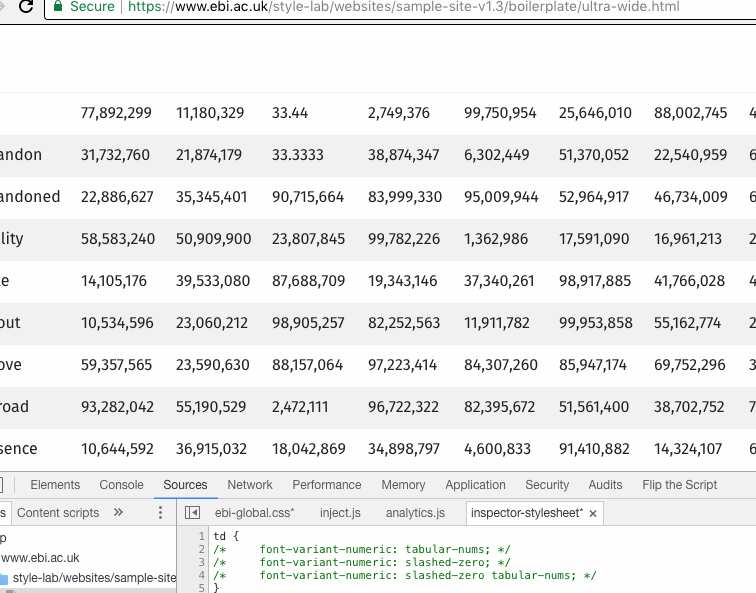
I'll leave a few notes here about Fira and its use in data tables; we can potentially better it in two ways:

  1. font-variant-numeric: tabular-nums; and
  2. font-variant-numeric: slashed-zero;

Here's that in action (gif):
tnum

And legacy support (mostly needed for IE/edge):

  /* https://helpx.adobe.com/typekit/using/open-type-syntax.html */
  font-variant-numeric: tabular-nums;
  -moz-font-feature-settings: "tnum";
  -webkit-font-feature-settings: "tnum";
  font-feature-settings: "tnum";

And a comparison of various fonts:

image

@khawkins98
Copy link
Contributor Author

Here's the font spec we're considering switching to until the new EMBL-wide design language is ready:
font-family: Helvetica, Arial, FreeSans, "Liberation Sans", sans-serif;

Change is being tested in v1.3 ebiwd/EBI-Framework@4926329

@khawkins98
Copy link
Contributor Author

khawkins98 commented Jan 12, 2018

We intend to remove Helvetica Neue from the Framework CSS stack, and any locations it appears on web-dev's repositories.

Below is a GIF that shows the before/after of the change and a copy of the e-mail to be sent to the Web Guidelines Committee members:

Testing the change

font-swap

Code snippet

Add to bottom of your site's CSS, or via the web inspector tools.

h1, h2, h3, body {
  font-family: Helvetica, Arial, FreeSans, "Liberation Sans", sans-serif !important;
}

Announcement e-mail

Subject: Helvetica Neue font to be removed from EBI servers

WGC members,

As discussed in the January WGC meeting [https://www.ebi.ac.uk/seqdb/confluence/pages/viewpage.action?spaceKey=WGC&title=2018-01-09+WGC+Meeting+Agenda], we will resolve outstanding issues with Helvetica Neue [this page]. In summary: the performance of Helvetica Neue is problematic and inconsistent, so we will remove Helvetica Neue from repositories managed by web-dev. This will impact all EBI Visual Framework versions and services still using the compliance theme.

We will also adjust the CSS font stack in EBI Visual Framework v1.1 and v1.2:
font-family: Helvetica, Arial, FreeSans, "Liberation Sans", sans-serif;

For most users the change will be technically and visually transparent (as Windows and Linux browsers often do not render Helvetica Neue and instead fall back to Arial or system fonts). Users with an EBI Mac can expect a minor change to the look of H1, H2 and H3 elements (these will no longer show as thin text); before and after on a Mac (spot the small difference):

If you need assistance or have concerns please e-mail [email protected]

To reiterate:

  • The change is being made to improve performance and make testing more consistent.
  • Implementation is scheduled for 6 February.
  • For most users the change will be invisible.
  • No action is required by service teams.

As a final note, if you host copies of the Helvetica Neue webfont directly on any server/VM (helveticaneueltprolt.*), we recommend you remove the assets.

Discussion on moving to Fira is on pause for the moment.

khawkins98 added a commit to ebiwd/EBI-Framework that referenced this issue Feb 7, 2018
@khawkins98
Copy link
Contributor Author

As Helvetica Neue is now removed, closing this issue. There's good info/comment in here on Fira, we'll continue to reference that in future discussions, issues.

Sign up for free to join this conversation on GitHub. Already have an account? Sign in to comment
Labels
None yet
Projects
None yet
Development

No branches or pull requests

4 participants