Base Telemetry Widget
Most of the widgets that form the Flight Telemetry Panel follow similar UI traits. To provide ease of implementation and uniform behavior, this abstract class is used to build the telemetry widgets.
abstract class BaseTelemetryWidget<T> @JvmOverloads constructor(
        context: Context,
        attrs: AttributeSet? = null,
        defStyleAttr: Int = 0,
        val widgetType: WidgetType,
        protected val widgetTheme: Int = 0,
        @StyleRes protected val defaultStyle: Int
) : ConstraintLayoutWidget<T>(context, attrs, defStyleAttr)
The WidgetType supports three values:
| Type | Layout | Example |
|---|---|---|
| TEXT |  |
Horizontal Velocity Widget |
| TEXT_IMAGE_LEFT |  |
Location Widget |
| TEXT_IMAGE_RIGHT | 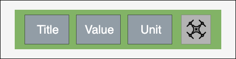 |
Vertical Velocity Widget |
The configuration is final and at the time of widget creation. It cannot be modified runtime. The default values for any child of this widget should be provided via defaultStyle in the constructor. The widgetTheme provides an option to change appearance of the widget.
The UI elements can be customized to match the style of the user's application. The customizations can be done using attributes in XML or programmatically using the APIs.
List of the customizable XML attributes
-
uxsdk_label_string- The telemetry label string. -
uxsdk_label_text_size- The telemetry label text size. -
uxsdk_label_text_color- The telemetry label text color. -
uxsdk_label_text_appearance- The telemetry label text appearance. -
uxsdk_label_background- The telemetry label background. -
uxsdk_label_visibility- The telemetry label visibility. -
uxsdk_value_string- The telemetry value string. -
uxsdk_value_text_size- The telemetry value text size. -
uxsdk_value_text_color- The telemetry value text color. -
uxsdk_value_text_appearance- The telemetry value text appearance. -
uxsdk_value_background- The telemetry value background. -
uxsdk_value_visibility- The telemetry value visibility. -
uxsdk_unit_string- The telemetry unit string. -
uxsdk_unit_text_size- The telemetry unit text size. -
uxsdk_unit_text_color- The telemetry unit text color. -
uxsdk_unit_text_appearance- The telemetry unit text appearance. -
uxsdk_unit_background- The telemetry unit background. -
uxsdk_unit_visibility- The telemetry unit visibility. -
uxsdk_widget_icon- The icon of widget. -
uxsdk_widget_icon_color- The color for tint of the widget icon. -
uxsdk_widget_padding_left- The left padding of the widget. -
uxsdk_widget_padding_right- The right padding of the widget. -
uxsdk_widget_padding_top- The top padding of the widget. -
uxsdk_widget_padding_bottom- The bottom padding of the widget. -
uxsdk_error_text_color- The color for value in error state. -
uxsdk_normal_text_color- The color for value in normal state.
List of the customization APIs
-
var labelString: String?- The telemetry label string. -
fun setLabelTextAppearance(@StyleRes textAppearanceResId: Int)- Set the telemetry label text appearance. -
var labelTextSize: Float- The telemetry label text size. -
var labelTextColor: Int- The telemetry label text color. -
var labelTextColors: ColorStateList?- The telemetry label text color state list. -
var labelBackground: Drawable?- The telemetry label background. -
fun setLabelBackground(@DrawableRes resourceId: Int)- Set the telemetry label background resource. -
var labelVisibility: Boolean- The telemetry label visibility. -
var valueString: String?- The telemetry value string. -
fun setValueTextAppearance(@StyleRes textAppearanceResId: Int)- Set the telemetry value text appearance. -
var valueTextSize: Float- The telemetry value text size. -
var valueTextColor: Int- The telemetry value text color. -
var valueTextColors: ColorStateList?- The telemetry value text color state list. -
var valueBackground: Drawable?- The telemetry value background. -
fun setValueBackground(@DrawableRes resourceId: Int)- Set the telemetry value background resource. -
var valueVisibility: Boolean- The telemetry value visibility. -
var unitString: String?- The telemetry unit string. -
fun setUnitTextAppearance(@StyleRes textAppearanceResId: Int)- Set the telemetry unit text appearance. -
var unitTextSize: Float- The telemetry unit text size. -
var unitTextColor: Int- The telemetry unit text color. -
var unitTextColors: ColorStateList?- The telemetry unit text color state list. -
var unitBackground: Drawable?- The telemetry unit background. -
fun setUnitBackground(@DrawableRes resourceId: Int)- Set the telemetry unit background resource. -
var unitVisibility: Boolean- The telemetry unit visibility. -
fun setContentPadding(left: Int, top: Int, right: Int, bottom: Int)- Set the padding of widget content. -
var contentPaddingLeft: Int- Left padding for widget content. -
var contentPaddingTop: Int- Top padding for widget content. -
var contentPaddingRight: Int- Right padding for widget content. -
var contentPaddingBottom: Int- Bottom padding for widget content. -
@ColorInt var errorValueColor: Int- Color of the telemetry value in error state. -
@ColorInt var normalValueColor: Int- Color of the telemetry value in normal state.
List of the customizable XML attributes
-
uxsdk_widget_icon- The icon of widget. -
uxsdk_widget_icon_color- The color for tint of the widget icon. -
uxsdk_widget_icon_background- The background of the widget icon. -
uxsdk_widget_icon_visibility- The visibility of the widget icon.
List of the customization APIs
-
var widgetIcon: Drawable?- The icon of widget. -
fun setIcon(@DrawableRes resourceId: Int)- Set the icon resource. -
@ColorInt var widgetIconColor: Int- The color for tint of the widget icon. -
var widgetIconBackground: Drawable?- The background of the widget icon -
fun setIconBackground(@DrawableRes resourceId: Int)- Set the icon background resource. -
var widgetIconVisibility: Boolean- The visibility of the widget icon