Tutorial: 3.3. Create Plots
At first you have to decide which data you want to plot - the original benchmark or the aggregated data from the Data table tab:

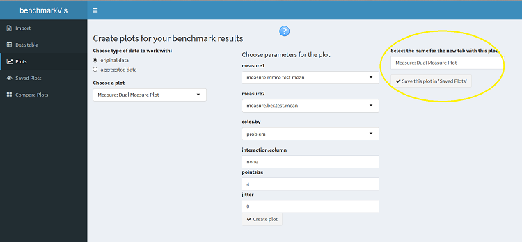
Afterwards you can select one of the plots that are available for your data (depends on the presence of "measure" or "list" columns, "*.parameter" columns and "iteration" field in algorithm.parameter, see Create Plots for more information):

Each plot has some parameters to be set before rendering. If you are not sure about what these parameters exactly mean, don't hesitate to look them up in the package documentation. Many of them come with default values, so you can create charts also without having to deal with all parameters available. Some parameters are basically a selection of columns from your table, so in this way you can influence what exactly has to be plotted, while others are rather "technical" such as size of points for a scatter plot etc. After you have set all the values you need, just click on the Create plot button:

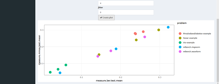
Your plot will be rendered below:
You also have the possibility to save the current plot internally for the later use in the app. There is a text input field where you can provide a name for your plot (or just leave it unchanged as a default name will be automatically created based on the plot's name). Then click on the Save this plot in 'Saved Plots' button:
If you want to inspect one of your saved plots without all the UI overhead for creating plots, just go to the Saved Plots tab and select the chart of your interest. There is also a possibility to delete the plot if you don't need it anymore:

Compare Plots tab serves for simultaneous rendering of two saved plots side by side:
