iSlider is a lightweight, high-performant, no library dependencies cross-platform slide controller. It can help handling most sliding effects, offering dozens of transition animations, and presenting various scenarios.
- Outstanding performance, less memory usage;
- Various animation effects, including effects such as
default,rotate,depth,flow,flip,card,fade, etc., and capability of adding custom animations; - Provide rich callback trigger. Adding a callback function is easy, regardless of initialization or during operation;
- Easy to configure, e.g. Slide the dampening effect of the cycle, automatic sliding effect, horizontal / vertical sliding, etc.
- Automatic matching the desktop mouse movements or gestures on mobile device. Easy to test and use cross platforms;
- Supports for image pre-loaded, excellent user experience;
- [Plugin] Offers a variety of plug-ins, such as a toggle button, the scene indicator, image scaling, etc. Provides plug-in registration, management and other methods to facilitate custom extension;
- [2.0+] Can be loaded on demand (effect or plug-in);
- [2.0+] Supports more types of elements. Automatically matches the data type. Capable of image recognition and pre-loading;
- [2.0+] Better delegated event management mechanism, optimized memory usage;
- [2.0+] Enriched callback events, more flexible event management and trigger mechanisms;
Demo http://be-fe.github.io/iSlider/index.html
git clone https://github.com/be-fe/iSlider.gitbower install iSlidernpm install islider.jsThe easiest way of getting started is to consult our examples, please visit the DEMOs.
<div id="iSlider-wrapper"></div>var data = [
{content: "imgs/1.jpg"},
{content: "imgs/2.jpg"},
{content: "imgs/3.jpg"}
];<script src="iSlider.min.js"></script>var islider = new iSlider(document.getElementById('iSlider-wrapper'), data);Or,
var islider = new iSlider({
    dom : document.getElementById('iSlider-wrapper'),
    data : data
});
var islider = new iSlider(document.getElementById('iSlider-wrapper'), data, {
dom : document.getElementById('iSlider-wrapper'),
data : data
});If you want more effects, you can load the animation effect extensions, set up the configuration when initializing iSlider and specify animationType.
<script src="iSlider.min.js"></script>
<script src="iSlider.animate.min.js"></script>
var islider = new iSlider({
dom: document.getElementById("iSlider-wrapper"),
data: list,
isVertical: true,
isLooping: false,
isDebug: true,
isAutoplay: false,
animateType: 'rotate'
});From 2.x, iSlider supports extension registration. You can now extend iSlide with your own features.
<script src="iSlider.min.js"></script>
<script src="iSlider.plugin.dot.min.js"></script>
var islider = new iSlider({
dom: document.getElementById("iSlider-wrapper"),
data: list,
plugins: ['dot'],
});You can also pass in more custom params to the extension initialize method.
var islider = new iSlider({
    dom: document.getElementById("iSlider-wrapper"),
    data: list,
    plugins: [['dot', {background:'rgba(0,0,0,0)'}]],
});
That's it!
【Notice】: if you use npm to install iSlider, it will not contain plugin default, you can involve plugin like this:
var iSlider = require('islider.js');
require('../node_modules/islider.js/build/iSlider.plugin.button'); //引入button插件Scene toggle button. For switching to the previous (left/up) or next (right/down) scene of the current scene.
Scene indicator, the current location and switch to a scene function
Mobile image scaling, image in non-background mode by double-clicking on the image or two fingers to enlarge, to amplify the effect of the preview.
- Known issues: must restore the default size by double-clicking, double that currently can not be reduced to its default state
Touch points from the edge of the area to identify, although has joined edge processing mouseout and touchcancel, but for some applications, the definition from the top (bottom) menu bar remains powerless. Meaning that it can take the initiative to identify areas of these regions is set to touch on detachment.
From 2.x, iSlider no longer requires type to specify the data type. It can now detect wisely, so that you can easily use various types of data, e.g. images, HTML elements, fragments or selectors.
var data = [{
    'content' : './qrcode.png'  // picture
},{
    'content' : '<div><h1>Page1</h1><h2>This is page1</h2><p>page1 is pretty awsome</p><div>' // HTML
},{
    'content' : (function () { // element
            var dom = document.createElement('div');
            dom.innerHTML = 'Element';
            return dom;
        })()
},{
    'content' : (function () { // fragment
            var frag = document.createDocumentFragment();
            var dom = document.createElement('div');
            dom.innerHTML = 'Fragment';
            frag.appendChild(dom);
            return frag;
        })()
}{
      'content' : document.getElementById('node') // selectors
}];
To learn more advanced features, please refer to WIKI
- new iSlider(
DOM, DATA, OPTIONS); {HTMLElement}- DOM Container
- Though the first parameter is not required, it is highly recommended, as setting a DOM container can make it more convenient to use iSlider.
- new iSlider(DOM,
DATA, OPTIONS); {Array}- Data list
- Though it's not required, the second param is also recommended.
- Allowed types: URLString, HTMLString, HTMLElement, HTMLFragment.
- TODO: Currently, each of the member in the array is type of
{Object}, which only supports content property, in the future, it will get more extensions, such as the configuration of the effect about each scene transitions, wait time, etc. - Data format:
[
    {
        content:'{URLString|HTMLString|HTMLElement|HTMLFragment}',
    },
    ...
]- new iSlider(DOM, DATA,
OPTIONS); {Object}
{HTMLElement}- dom node which is used as Container, same as the role of the parameter [DOM] (#dom), if this has been setted, DOM will be overwritten.
{Array}- A list of data, same as the role of the parameter [DATA] (#data), if this has been setted, DATA will be overwritten.
{String}- Animation
- Currently supports: default (scrolling), rotate (rotation), depth, flow, flip, card, fade (fade in / hidden), (outside / inside zoom) zoomout
- Precondition: Loading library iSlider.animate(.min).js which is used for effects
- Default: "default"
{Number}- Animation duration
- Unit: ms
- Default: 1000
{String}- Animation curve
- Options: linear, ease, ease-in, ease-out, ease-in-out, even cubic-bezier
- Default: ease
{Boolean}- Turn on / off the automatic sliding mode
- Default: false (Disabled)
{Number}- Suspending time of scene when it's playback automatically
- Suspending time of each scene, it switches to the next scene when it is ended
- Unit: ms
- Precondition: isAutoplay ===
TRUE
{Number}- User click/tap behavior(eg: active a link), or if the page loses focus will stop autoplay.
- This configuration will attempt to restart autoplay after N milliseconds.
- AutoPlay will be forced to wake up, even when the user fill in a form items !
- It will be blocked by "lock()"
- Unit: ms
- Precondition: isAutoplay ===
TRUE
{Boolean}- Repeat Mode
- Default: false (Disabled)
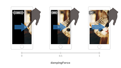
{Number}- Damping force, the rebound effect of overflow Scene
- Range: 0 ~ 1, Sliding distance decreases with increasing values (more difficult to slide)
- Default: 0
- Precondition: isLooping ===
FALSE

{Boolean}- Vertical sliding mode
- Default: false (Disabled)
{Boolean}- Background Tile
- If the scene is picture mode (URL), use the CSS3 backgrounds ways to filling the scenes
- Default: false (Disabled)
{Boolean}- Touch events
- Default: true (Enabled)
{Boolean}- On / off debug mode, it will print more information about the log
- Default: false (Disabled)
{Number}- Index of the list which is used for the first screen
- Default: 0
{Number}- The scope of wrong touch, if it's bigger than the value of scope, the touchMove will be treat as an effective distance of slide
- Default:10(px)
{Boolean|Array|String}- Prevent native event
- Prevent to trigger the event in the scene shield, such as: scroll, drag, zoom, etc.
- "A" elements, prevented, the mobile terminal is recommended to use user-defined tap (touch-based event jointly judgment)
- For the form element "SELECT", "INPUT", "TEXTAREA", "BUTTON", "LABEL", in any situations it will not to be prevented
- *Exclude strategies:if the type of param is string(rule,querySelector selector string)or Array(mutiple regulations),this option is in opening status(true)and exlude elements with composite regulations, treat as
iSlider.FIX_PAGE_TAGS
- Default: true (Enabled)
{Boolean}- To fill the gaps between scenes
- There is some rendering problems in the browser of some systems, resulting in a gap between scenes, this situation is particularly evident when the scene had setted the background color and use ** ** for connected.
- Default: false (Disabled)
{Array}- Enable plug-ins and configure the initialization parameters
- Incomming a name list of plugins which would be actived:
['dot', 'button', 'zoompic', ...], in addition, it's support incoming initialization parameters:[..., ['zoompic', {zoomFactor: 2}], ...] - It will be ignored if the plug-in does not exist or is not loaded
{Function}- Incomming at initialization, it's needed to beginning with on and it would to be Camel-Case
- OR all lowercase !! Will be discarded, If the Camel-Case or All-Lower-Case coexist, the Camel-Case will be used.
- Binding with method "on" at living example, please use the Camel-Case, refer to the following list.
- *Due to the different scenes,callback method should be different , there will be different between the incoming parameters.
Example:
var S = new iSlider({
	...,
	onSlideChange: callback
	onSlideChanged: callback
	onslidechanged: callBack, // !!All lower case will be abandoned, and now, it will be covered camelCasing
	...
});

// OR
S.on('slideChanged', callBack);- Start initialization (After the call setting, Before rendering)
- Parameters: None
- When initialization is complete (after rendering)
- Parameters: None
- (Each)Be triggered at initialization
- Parameters: None
- Be triggered when all plug-in initialization is complete
- Parameters: None
- Be triggered when the outer container is rendered completely
- Be triggered before reset, loadData
- Parameters
{Number}current data index{HTMLElement}current scene elements
- Be triggered when the finger touching screen
- Parameters
{Object}Event object
- Be triggered when the finger is sliding
- Parameters
{Object}Event object
- Be triggered when the finger has lifted
- Parameters
{Object}Event object
{Function}- Be triggered when the scene changes
- Parameters
{Number}current data index{HTMLElement}current scene elements
{Function}- Be triggered when the changing of scene is completed (the animation is completed)
- Be triggered when executing loadData
- Parameters
{Number}current data index{HTMLElement}current scene elements
{Function}- Be triggered when the scene has not changed (rebound, animation is completed)
- Parameters
{Number}current data index{HTMLElement}current scene elements
{Function}- Be triggered when the scene is changing and it's not completed (Rebound animation is completed)
- Be triggered when performing reset
- Parameters
{Number}current data index{HTMLElement}current scene elements
{Function}- Be triggered when data is reset (execution loadData method)
- Parameters
{Number}current data index{HTMLElement}current scene elements
{Function}- Be triggered when the scene reset (phone screen rotate, resize)
- Parameters
{Number}current data index{HTMLElement}current scene elements
{Function}- Be triggered when iSlider destruction
- Parameters: None
{String}- Version
{Array}- The list of events callback
{Array}- Animation effect(easing)regulation lists
- 0:
{Array}['linear', 'ease', 'ease-in', 'ease-out', 'ease-in-out'] - 1:
{Regexp}Bézier curve expressions, writting same as the CSS3
- 0:
{Array}- The white list which is matched the fixPage form
{Array}- Scene type
{String}- The name of Animation's ending
{String}- CSS prefix
{Object}{{hasTouch, startEvt, moveEvt, endEvt, cancelEvt, resizeEvt}}- According to the event which the divices matched
- When the parameter's length is equal to 1, the object will inherit iSlider.prototype
- When the parameter's length is equal to 2, the second object will inherit the first
- Parameters:
- [
{Object}original object] or default iSlider.prototype {Object}new object
- [
- Register the plug-in
- Parameters:
{String}plug-in name{Function}plug-in initialization method
- Switch to the N-th scene, you can set the configuration information in second parameter to change slide animation this time: animateTime animateType
- Parameters:
{Number}data list index- [
{Object}temporary configuration]
- Switch to the next scene, you can set the configuration information in second parameter to change slide animation this time: animateTime animateType
- Parameters:
- [
{Object}temporary configuration]
- [
- Switch to the previous scene, you can set the configuration information in second parameter to change slide animation this time: animateTime animateType
- Parameters:
- [
{Object}temporary configuration]
- [
- Binding delegate event on the container node
- Parameters:
{String}event name{String}selector (querySelectorAll){Function}incident response method
- delegate alias
- Unbundling delegate event handler
- Parameters:
{String}event name{String}selector (querySelectorAll){Function}incident response method
- UnDelegate alias
- To register the callback method in the event of iSlider
- Parameters:
{String}event name{Function}back off method- [
{Boolean}] priority registration, callback events registered to the header of the event queue, the event callback is always be the fisrt which is registered at the initialization, Default: false
- Detecting the event callback method is already exists
- Parameters:
{String}event name{Function}back off method
- Remove the callback method from iSlider events
- Parameters:
{String}event{Function}back off method
- Event Trigger
- Start Auto Play
- Precondition: isAutoplay ===
TRUE
- Pause automatic switching
- Precondition: isAutoplay ===
TRUE
- Same as static method "extend"
- Same as the static method "regPlugin"
- ** This method will be registered the plug-in into the iSlider instance, It will add an active list of plug-in automatically when registeration and performs initialization automatically.**
- Loading new Datasheets
- Parameters:
{Array}Datasheets{Number}Index, default: 0
- Add scenes to the end of the data datasheets
- Parameters:
{Array|Object}A member or additional datasheets
- Add scenes to the head of the data datasheets
- Parameters:
{Array|Object}A member or additional datasheets
- Subject to another Slider instance
- This Slider will completely controlled by the target iSlider
- Parameters:
{Object}target{Object}controlled configuration item (Not Enabled)
var IS_1 = new iSlider(dom, data);
var IS_2 = new iSlider(dom, data);

IS_1.subjectTo(IS_2);
// At this time IS_1 if fully controlled by IS_2, that is to say the drag, switching, auto-play and other acts performed on IS_2 would synced to IS_1- Prohibit the current scene gesture
- The current scene to open gestures, and trigger "unlocked" at the same time
- Lock the current scene, disabled method of sliceTo, slideNext, slidePrev, while prohibiting gesture
- Unlock
- Destruction of the current iSlider instance, freeing memory
- Reset the current iSlider instance
If you have any questions or find any bugs about iSlider, we will be appreciated for your feedback: Commit a feedback
Copyright (c) 2014 BE-FE

