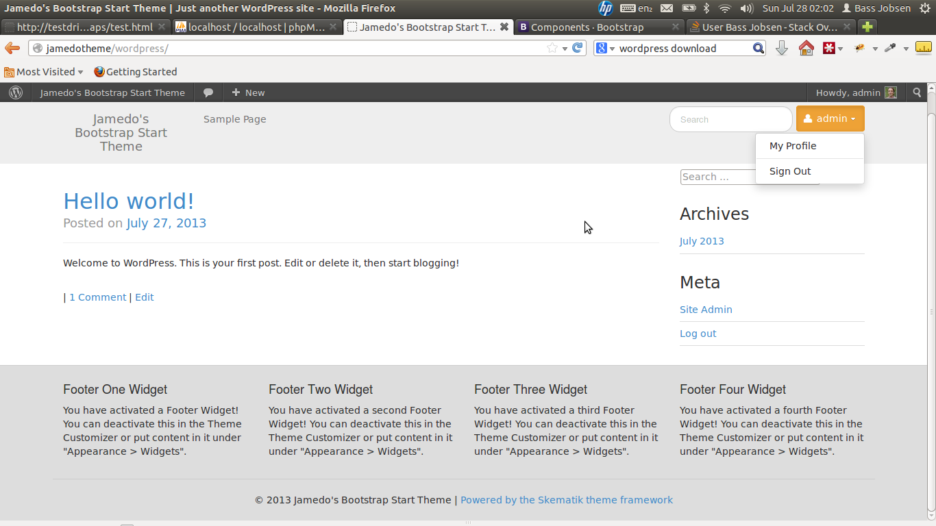
Powerful theme framework that can be used as a standalone website builder or as a framework to create child themes for wordpress build on Twitter's Bootstrap 3. The original framework is written by Matt Jones of Rocket Farmer, LLC (former Skematik theme framework) It also has built in support for theme options, metaboxes, BuddyPress and eCommerce (WooCommerce, JigoShop and WPeCommerce).
- Twitter's Bootstrap 3 ready
- E-Commerce ( we recommend WooCommerce )
- Buddy Press
- BBPress
Demo of default install: http://demo.jbst.eu/ (some quick install notes: bassjobsen#34)
Download the latest version as .zip file. Upload the .zip file to your Wordpress theme directory (wp-content/themes) or use Install theme function in your dashboard. Activate the theme in your dashboard ( Appearence > themes ).
- download from: https://github.com/bassjobsen/jamedo-bootstrap-start-theme/archive/master.zip
- unzip this file in the wp-content/themes folder (this will create a folder with the name “jamedo-bootstrap-start-theme”)
- (search and) replace all “span*” classes in your theme files with “col(-sm|lg)-*”, see Grid (below) and also: http://stackoverflow.com/a/17890898/1596547. Or try Twitter's Bootstrap Migrator
- fix all other points (general issues should be send by email to [email protected], twitter @bassjobsen, or send as a pull request )
The most important changes in Twitter Bootstrap 3 will be the more mobile-first approaching and the grid. From now Twitter’s Bootstrap defines three grids: Extra small (xs) grid for Phones (<768px), Small/Medium grid for Tablets (>=;768px), the Medium grid for Laptops (>=992px) and the Large grid for Desktops. The row class prefixes for these grid are “.col-xs”, “.col-sm-”,“.col-md-“ and “.col-lg-”. The Large grid will stacks below 1200px pixels screen width. So does the Medium grid below 992px pixels and the small below 768px. The extra small grid never stacks. (updated for Twitter's Bootstrap3 RC1). Also read: Twitter Bootstrap 3 breakpoints and grid
JBST use the Small grid by default. You can change this in the customizer. (Tiny, Small or Large). The large grid will stack below the 992px and be horizontal for desktop (and large tablets) while the Tiny grid never stacks.
More about the grid and examples on: http://getbootstrap.com/css/#grid
NOTE: Twitter's Bootstrap 3 RC2 intoduced a new grid class (col-xs-*). The class is used for mobile phones and col-xs-* will never stack). The new grid classes are add to the settings now.
Before reading futher, first read: http://getbootstrap.com/getting-started/#disable-responsive
The Extra Small grid will never stack so use this if you don't want to use responsive features of Twitter's Bootstrap. There is no option to choose between repsonsive and non-responsive at the moment. Beside the Extra Small grid setting you will need to add some custom css and an extra class to your templates, see: Bootstrap 3 - Turn off responsive completely.
Keep in mind this setting don't set the @grid-float-breakpoint. This (Less) setting will be used for the collapsing point of the navbar. The setting is also used for modals, forms and carousels. To (re)set the @grid-float-breakpoint you will have to compile your own copy of the Bootstrap CSS and use this (replace libary/assets/css/bootstrap.min.css).
To remove all responsive features consider to replace the Bootstrap CSS (replace libary/assets/css/bootstrap.min.css) with the one from https://github.com/bassjobsen/non-responsive-tb3. Also read: Compile Twitter’s Bootstrap 3 without responsive features.
For a non responsive website set the default grid in the customizer to "Extra Small" and set the Max container width.
The default language for the theme is English (US). Translation into Dutch has been started Help us Translate Localization workflow is managed on http://poeditor.com/
Use JBST to create child themes for wordpress build on Twitter's Bootstrap 3. We provide you a Boilerplate JBST Child Theme and an example of a Webshop based on Twitter Bootstrap Webshop Template with vertical menu. Download this Demo Webshop E-commerce Template or try the Demo.
JBST doesn't integrate Twitter's Boostrap Shortcodes since version 1.1. In stead of integration we offer support for plugins which provide this functionality. We support these plugins:
- Twitter's Bootstrap Shortcodes Ultimate Add-on, recommended!
- Easy Bootstrap Shortcode
- Bootstrap WP Plugin
Download the plugin and activate it. Troubles? Post an issue.
JBST offers support for the plugin shown below. Slider plugin are not bundled you will have to install them your self.
- Twitter Bootstrap Slider,recommended!
- Royal Slider
- Flex Slider
- Wordpress SEO Plugin
- WooCommerce, with WooCommerce Twitter's Bootstrap Plugin
- Stimulate correct headings Plugin for accessibility and seo
- WP Defer Loading, Defer loading javascript for WordPress, see: https://developers.google.com/speed/docs/insights/BlockingJS
- Twitter Bootstrap Galleries Plugin, Wraps the content of a WordPress media gallery in a Twitter's Bootstrap grid. And make it full responsive.
- Twitter Bootstrap Slider responsive image slide show (slider component)
JBST Expo is a project to showcase the absolute best projects built on JBST.
The JBST Expo is all hosted on GitHub, meaning recommending new sites is as easy as opening a new issue. It also keeps the primary JBST repo focused on code and documentation, and not dozens of extraneous images.
We are always happy to help you. If you have any question regarding this code. Send us a message or contact us on twitter @JamedoWebsites
