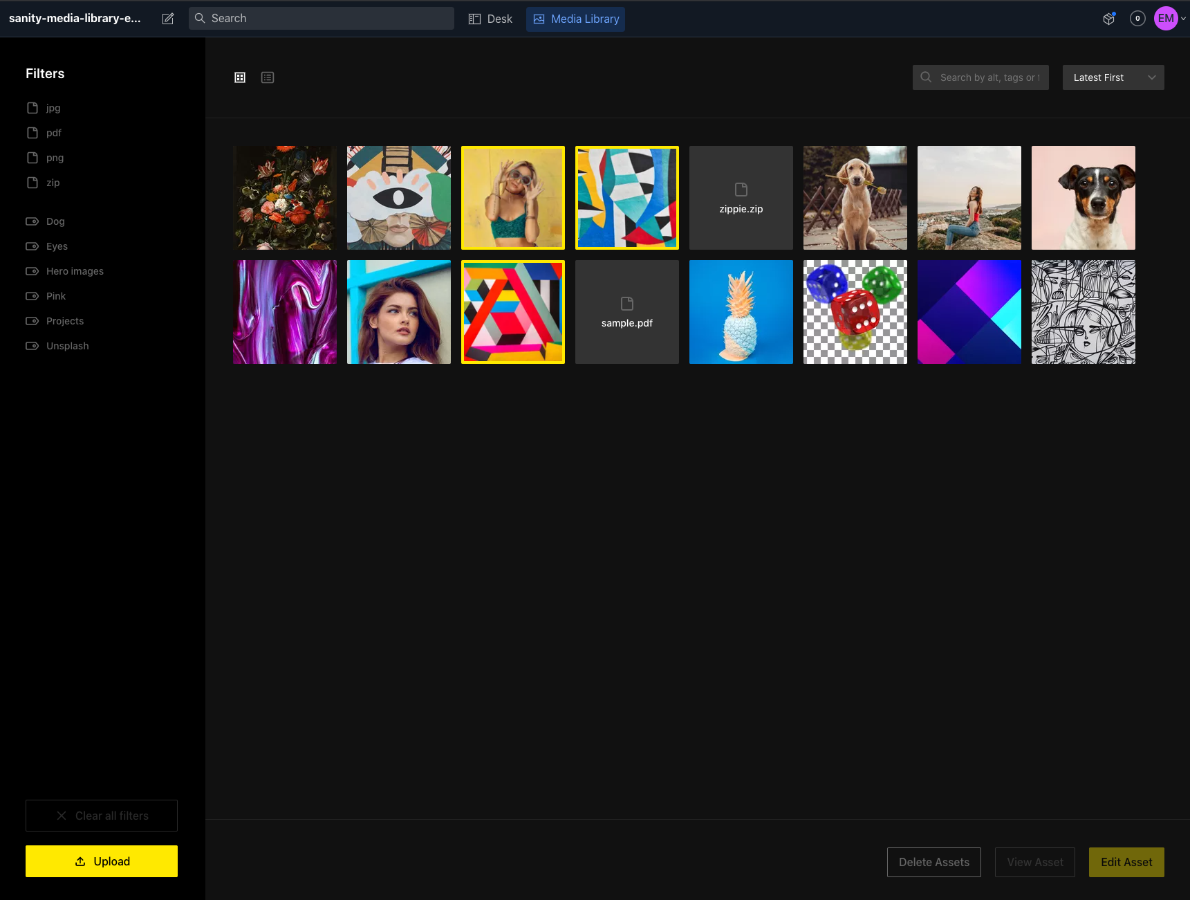
The missing media library for Sanity. With support for filters per tag and extension. And it's fully themeable! 🔥
- Media library appears in CMS navigation
- Support for images and files
- View/Edit your assets in once single place:
- View asset details
- Add alt tags to your image in a central place
- Add location and attribution information, change title
- Grid view and list view (with more details):
- Sort by latest or alphabetically
- Search by alt, tag, or file name
- View asset details in a list view
- Asset organizing:
- Add tags to your assets to create structure in your media library
- Select 1 or multiple assets with cmd/ctrl or shift
- Delete 1 or multiple asset(s) at a time
- Filter by (multiple) file extension(s) or tag(s)
- Clear filters with a click on a button
- Drag 1 or multiple assets to a tag to add them
- Asset uploading:
- Upload 1 or multiple files with the upload button
- Also drag to upload 1 or multiple files
- Asset source:
- Use it where it's useful: select images with the media library in your documents
- Quick action: Double click an asset to trigger it's primary action
- Customizable theme:
- Comes with a dark and light theme, both are fully customizable.
- Customizable interface
- Define custom fields (text, number, checkbox, textarea are currently supported)
- Hide unused asset fields
In your Sanity project's directory run :
sanity install media-library
yarn add sanity-plugin-media-library
or
npm install --save sanity-plugin-media-library
In your sanity.json add it to the list of plugins:
{
  "plugins": [
    "@sanity/base",
    "@sanity/components",
    "@sanity/default-layout",
    "@sanity/default-login",
    "@sanity/desk-tool",
    "media-library"
  ]
}Using the media library as an asset source requires a little more configuration.
In your sanity.json add the following to the parts array:
{
  "implements": "part:@sanity/form-builder/input/image/asset-source",
  "path": "./assetSource.js"
}
And in assetSource.js add:
import AssetSource from "part:sanity-plugin-media-library/asset-source";
export default [AssetSource];
Done, you're ready to go!
After installing the plugin, a config file is automatically created at config/media-library.json.
In this file you can set the theme to light or dark and optionally add themeChanges. For a list of available options see the keys in /src/themes/darkTheme.ts.
{
  "theme": "dark",
  "themeChanges": {}
}
Example with themeChanges:
{
  "theme": "light",
  "themeChanges": {
    "bottomBarBorderColor": "hotpink",
    "buttonPrimaryBorderColor": "hotpink"
  }
}
Example with asset fields listed and custom fields added:
{
  "theme": "dark",
  "themeChanges": {},
  "assetFields": {
    title: true,
    alt: true,
    location: true,
    attribution: true,
    tags: true
  },
  "customAssetFields": [
    {
      "name": "description",
      "label": "Additional description",
      "type": "textarea"
    },
    {
      "name": "decade",
      "label": "Decade when photo captured",
      "type": "number",
      "min": 1800,
      "max": 2200,
      "step": 10
    },
    {
      "name": "premiumPhoto",
      "label": "Is a premium photo",
      "type": "checkbox"
    }
  ]
}- Improve the tag input in AssetModal
To contribute a theme, add it in themes/[themename].ts.
If you run into problems or have feature requests, please create an issue or pull request and I'll look into it as soon as I can.

