-
Notifications
You must be signed in to change notification settings - Fork 4.3k
New issue
Have a question about this project? Sign up for a free GitHub account to open an issue and contact its maintainers and the community.
By clicking “Sign up for GitHub”, you agree to our terms of service and privacy statement. We’ll occasionally send you account related emails.
Already on GitHub? Sign in to your account
Fix table regressions. #9306
Fix table regressions. #9306
Conversation
This PR fixes table block regressions introduced in #7899 (comment)

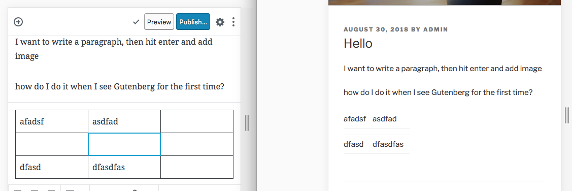
The block property for the table makes sure that it's mobile responsive. The "display table" is necessary for fixed layout to work.
| @@ -1,5 +1,6 @@ | |||
| .wp-block-table { | |||
| overflow-x: auto; | |||
| display: block; // Necessary in order for this table to be mobile responsive. | |||
There was a problem hiding this comment.
Choose a reason for hiding this comment
The reason will be displayed to describe this comment to others. Learn more.
This seems odd to me, changing display of a table element. I had some problem with this rule in a PR, so I took it out. What Exactly does mobile responsive mean here? Could you elaborate?
There was a problem hiding this comment.
Choose a reason for hiding this comment
The reason will be displayed to describe this comment to others. Learn more.
To answer your question, if we had the whole thing wrapped in a div, we could do this instead:
https://codepen.io/joen/pen/RYojVZ?editors=1100
But as the markup is today, we need to leverage the table as the full-width block to hold the horizontal scrollbar, and then make a child element of that (in this case, tbody/thead/tfoot) be the full-wide table that has a min-width.
| @@ -1,6 +1,7 @@ | |||
| .wp-block-table { | |||
| // Fixed layout toggle | |||
| &.has-fixed-layout tbody { | |||
| display: table; | |||
There was a problem hiding this comment.
Choose a reason for hiding this comment
The reason will be displayed to describe this comment to others. Learn more.
Should this be added as well for thead and tfoot?
There was a problem hiding this comment.
Choose a reason for hiding this comment
The reason will be displayed to describe this comment to others. Learn more.
I think this should definitely be resolved.
| @@ -1,6 +1,7 @@ | |||
| .wp-block-table { | |||
| // Fixed layout toggle | |||
| &.has-fixed-layout tbody { | |||
| display: table; | |||
| table-layout: fixed; | |||
There was a problem hiding this comment.
Choose a reason for hiding this comment
The reason will be displayed to describe this comment to others. Learn more.
Why is this not used on the table element? This seems a bit odd.
There was a problem hiding this comment.
Choose a reason for hiding this comment
The reason will be displayed to describe this comment to others. Learn more.
Same reason as noted in #9306 (comment) essentially.
|
Wondering if there could be any alternative fix for unresponsiveness. I'm guessing tables are by nature unresponsive though... If you have a few columns, you'll want to scroll them, not have them all squashed together. I wouldn't mess with the normal CSS rules of a table to make it more responsive. Could it help to wrap the table in a (scrollable) |
|
All good feedback, thank you. As a preface, there are two features of the table block being discussed. One is the fixed layout, which is off by default and toggled on in the sidebar. The other is the responsiveness, which, note, is stored in the But the idea here is that every block should come with a minimum level of mobile responsiveness. And a "true" responsive table isn't really a table anymore, it's a rather complex collection of divs put together to look like a table. This is completely fair to explores separately, but as the vanilla offering we have to consider the basics which are accessible. For that reason, the most minimal responsiveness I could find, was to have the table scroll horizontally, if less than 360px wide. You can see that here: https://codepen.io/joen/pen/RYojVZ Due to the nature of how the Here's a GIF: If we can accomplish a minimally responsive table in a different way, I'd love suggestions. |
|
I think the thead and tfoot should also be added. I feel a bit uncomfortable with changing the display of a table from the default, but if this is valid and the way to do it, ok. Is there any way tests could be added for this (unsure here)? This seems like something with so many different configurations that we could easily break in the future. |
|
I could use some help getting this PR in ship shape if you have bandwidth. I feel strongly that all blocks we ship should have some measure of responsiveness, remember it's opt-in for themes. Right now both the responsiveness and the fixed-cell-width are broken in master, so it would be nice to find some solution soon, even if we need to refine it later. |
|
@jasmussen Cool, I'm fine with just restoring the display rule. Could we just add |
|
Will do, feel free to separately track any concerns you have and we'll look at it. 👍 👍 |
|
Addressed the feedback. Thanks for the reviews. If we need to refactor the table display values to not re-do the tbody/tfoot/thead elements, we need a wrapping div, see https://codepen.io/joen/pen/RYojVZ?editors=1100 |
|
Hmm, you're right. And this suggests @iseulde was right to be nervous as well, because what causes the table to collapse like that is the changing to I pushed a fix in b7d41bf, and I do think we should merge this because it fixes a regression — it is frustrating that the fixed width switch is broken in master. But if we discover that changing the display properties of the table, thead, tbody, and tfoot, we should look at an alternative fix, which I think would include a wrapping div, see: https://codepen.io/joen/pen/RYojVZ. What do you think? Should we get this merged so we can fix the regression? |
|
Oh, taking a look at the inverted styles in the Twenty theme. |
|
Thanks, let's get this in and look at any other enhancements separately. |
It looks like this is the cause of #9779: thead, tbody and tfoot need to be set to their default style properties for columns to properly align. We then also have the secondary issue that the table needs to be Unfortunately it looks like we need another approach. Probably a wrapping Seeing as we're discussing it on #9801, I think I'll introduce a fix there. That PR also handily introduces a block deprecation, so probably makes sense to handle it there. |


This PR fixes table block regressions introduced in #7899 (comment)
The block property for the table makes sure that it's mobile responsive. The "display table" is necessary for fixed layout to work.
display: table;ontbodyis necessary for thehas-fixed-layoutoption to work. Please see Polish the Table block #6314 for a GIFdisplay: blockon.wp-block-tableis necessary for the table itself to be responsive. Please see Add responsive CSS to the table out of the box #2152.Note that the responsiveness for the table is in the
theme.scssfile, which means themes have to opt into these "opinionated styles".Please test this PR with and without the fixed table cells option enabled, frontend and backend. And please verify that this PR does not regress what #7899 was meant to fix.