-
Notifications
You must be signed in to change notification settings - Fork 4.3k
New issue
Have a question about this project? Sign up for a free GitHub account to open an issue and contact its maintainers and the community.
By clicking “Sign up for GitHub”, you agree to our terms of service and privacy statement. We’ll occasionally send you account related emails.
Already on GitHub? Sign in to your account
Try sibling inserter tweaks #7220
Conversation
|
I really like this! Definitely an improvement over what's in place now! |
|
It's interesting, I thought it would be disruptive to not be able to invoke the sibling inserter above the selected block, but it feels like a non issue in this branch. |
|
One potential refinement: maybe the inserter should be visible above if the toolbar is pinned? |
|
Yep, definitely. It could also be cool to explore, potentially separately if need be, fading out the block outlines entirely if you're hovering the sibling inserter. Right now you can end in a situation where you're hovering both the sibling inserter, and one block. |
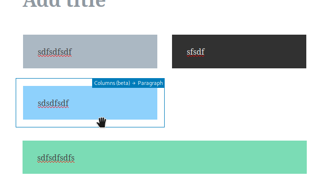
That could also help solve the overlap issue right now with narrow blocks (in columns, for instance): Also a "maybe another issue?" thought: should the inserter line go to the edges of the visible border? |
|
This feels really nice! This is definitely an improvement over One bug I noticed is that when you have selected a nested block, the sibling inserter does not appear for any of the other blocks in the same
Definitely. There is no reason not to show it when the block toolbar is docked, since there is nothing to conflict with the inserter.
Yeah, since the block toolbar is already taking up space at the top of the selected block, it feels natural that the sibling inserter is not usable there.
I think this is a good idea.
Right now the block borders do not always match the actual size of the block since they are adjusted to make parent blocks always selectable. At the moment, I feel like the inserter line should continue to be the width of the actual block content, but I do not have any strong opinions on it either way. |
|
I don't want to rock in and suggest something isn't a good option, but I think we have to consider discoverability here. I think there is a little danger of having created now something only those that know where to hover would understand. What can we do to ease that? I feel using this it's less discoverable for those that don't use Gutenberg, we have to consider how used to it we are. Language wise can we not have 'insert block' (this may be another PR) as it should be 'add block' for consistency. Maybe good to fix with improvements. |
|
Maybe I'm missing something, but seems to me there's no way to use the sibling inserter with the keyboard? |
I don't think this PR actually changes any of the hover areas — the inserter button still shows up if you hover in the same areas as before. Unless you mean having the line visible all the time (instead of just when the button itself is hovered, which this PR does change), as an additional visual indication of the inserter button being available? |
|
Andrea:
You're not missing something. That's a regression. I went a little fast there with my try branch. Will fix. Tammie:
I strongly agree, and that is the genesis of #7168. I feel like this pull request makes things much better, and we should get it in as soon as we can, as it simply refines who the existing sibling inserter works in https://user-images.githubusercontent.com/1204802/41030245-286f5794-697e-11e8-8c1c-5057ef8cd675.png However I also do not think that this PR closes #71698. It mitigates aspects, but the original issue is still present, and I think we should keep the discussion going there. Already a ton of good ideas, and some low hanging fruit like adding shortcuts to the block's More menu. What do you think about getting this PR into master, as an improvement to the breakage that's present, and then continue to look at enhancements beyond this? |
3dceea5 to
113dc6f
Compare
|
Pushed a fix to enable tabbing again. It's solid in my testing, but please give it a run through so we can see if it works as expected. If it does, I think this branch is ready for final review! |
|
I like the iterations here, it's coming back full circle :) With the new block outlines I feel the line on hover is out of place. I think we should remove it. It's also looking like this feature will always be a bit of a "cool when you discover it". And I think that is fine for this feature. We'd probably want to add a "insert block below / above" to the ellipsis menu for completion purposes as it's one of those features where multiple avenues can benefit people with different flows. What @jasmussen proposed here: https://user-images.githubusercontent.com/1204802/41144730-23c68fce-6afe-11e8-8ab3-5322724c86bc.png |
ac5549f to
274dd55
Compare
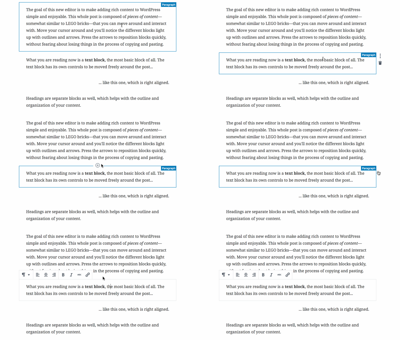
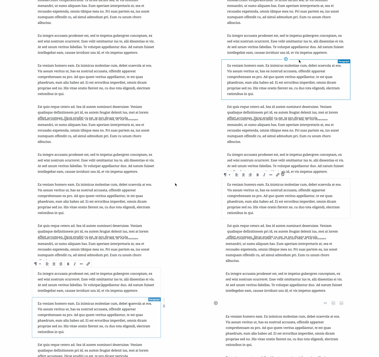
This PR is based on feedback in #7168. It does this:

- It doesn't show the sibling inserter when hovering before the selected block.
- It shows the separator line when hovering the plus, never before.

This PR is a "try", and if we like it we'd want to make a few further improvements. Like we might actually want to allow showing the sibling inserter _before_ the selected block, if the user has chosen to dock the block toolbar to the top.

We might also want to look at improving it further by fading out hover outlines if you're hovering the sibling inserter. We'd need someone like @aduth or @youknowriad's help here.
274dd55 to
e85dce8
Compare
Since it only appears on hover, it doesn't help discovery, and although the point is to show where you will insert things, it adds clutter next to the hovered outlines.
|
Gave this one a good rebase and squash, and I removed the line per feedback: Created #7297 to address the menu items separately. |
|
This seems much nicer to me. |
|
Great feedback as usual. You've been super helpful in the past few months, Zeb, you too Chris. Very much appreciated 🏅
Fixed.
The sibling inserter is actually a component that's part each block, and sits before. So no "last blocks" actually have a sibling inserter that sit below them. That can be fixed of course, it would be if #6834 were addressed, but it's not a simple fix. It might also be mitigated if we always show the trailing appender after the last block, even in nested contexts — right now it's only shown if the last block is not a text block. Can't recall where this is ticketed. So would think we should look at this separately. |
There was a problem hiding this comment.
Choose a reason for hiding this comment
The reason will be displayed to describe this comment to others. Learn more.
I still have discoverability concerns in general about adding in-between elements. That all said, let's get this in and see it as a step in iterating. Approving on that basis.
|
I made the plus blue, it looks better, and it also distinguishes this button a little bit from other Add Block buttons, which is good since the behavior is to insert a paragraph placeholder. I explored this a bit further, with a new icon: This icon contains a line separator that indicates what's about to happen, and mimics the enhancements we've suggested could be added to the Block Menu: Thoughts? |
|
Yes, this looks real good! The only thing I'm fuzzy on is the + button on the left after you insert an empty block and defocus, what's that for? |
This is in |
|
I see, to me that one is a little confusing - I just clicked a + to add a block, why is there now a + in a different place that does a different thing? Conceptually, I get that it opens the block library beyond the three suggestions on the blank block. But then I would find it more logical to have it as the last option after the three suggestions. "Do you want these common ones, or something else?" But that might be a separate ticket to explore. |
There was a problem hiding this comment.
Choose a reason for hiding this comment
The reason will be displayed to describe this comment to others. Learn more.
Let's get this in. Nice work!
|
Travis is complaining. I can rebase if need be? |
|
The test failure was intermittent. Passes now on a restart. See also #6956 (comment). |
|
@jasmussen Nice improvements! 😄 I am not sure how I feel about the modified icon with the lines on the side. I do not dislike it, but I am not really sure I like it either. It feels redundant to me since the block border kind of doubles as a line for the icon, but I do not feel strongly either way about it. @hedgefield I agree; it seems weird to have the inserter icon on the left. In nested contexts where the block suggestion buttons are not shown, the inserter icon is shown by itself within the borders of the placeholder block and on the right, rather than on the left and outside of the borders of the placeholder block. I think this inconsistency is a little confusing. |
This PR partially fixes #7508. It is an alternate version of #7525, though much the same.

In #7220 we introduced a new behavior for the sibling inserter, which requires a click on the plus in the center as opposed to just clicking between two blocks.

Turns out it was sort of a race condition between onClick and onMouseDown, the latter which fires first. So in a way, the Firefox and Safari behavior of selecting the block (which is selected onMouseDown) as opposed to clicking the sibling inserter was the correct one.

This PR "fixes" it by also making the sibling inserter use onMouseDown. But in addition to this, it uses onClick as well, so it's still keyboardable.

The net effect is that both work, with the added benefit that in Firefox and Safari, the block that you're hovering isn't briefly "selected" when you're clicking.
* Try another approach to fixing the sibling inserter in Firefox

This PR partially fixes #7508. It is an alternate version of #7525, though much the same.

In #7220 we introduced a new behavior for the sibling inserter, which requires a click on the plus in the center as opposed to just clicking between two blocks.

Turns out it was sort of a race condition between onClick and onMouseDown, the latter which fires first. So in a way, the Firefox and Safari behavior of selecting the block (which is selected onMouseDown) as opposed to clicking the sibling inserter was the correct one.

This PR "fixes" it by also making the sibling inserter use onMouseDown. But in addition to this, it uses onClick as well, so it's still keyboardable.

The net effect is that both work, with the added benefit that in Firefox and Safari, the block that you're hovering isn't briefly "selected" when you're clicking.

* Use the onClick handler for mouseDown

* Fix issues in Firefox and Safari

Turns out this issue has been present in some hidden form for a long time, and _partially fixed_ in Chrome. But there has always been a race condition, it looks like, between onClick, onFocus and onMouseDown.

This commit simply adds the "onFocusInserter" action to the onMouseDown event as well, which seems to solve the issue.

You still briefly see the block being selected and the toolbar appearing in Firefox and Safari, but at least this can work as a hotfix pending further investigation or improvements.

* Add comment.


This PR is based on feedback in #7168. It does this:
This PR is a "try", and if we like it we'd want to make a few further improvements. Like we might actually want to allow showing the sibling inserter before the selected block, if the user has chosen to dock the block toolbar to the top.
GIF:
We might also want to look at improving it further by fading out hover outlines if you're hovering the sibling inserter. We'd need someone like @aduth or @youknowriad's help here.
CC: @folletto @SuperGeniusZeb @hedgefield @chrisvanpatten