Core Widgets
The api for each widget is detailed in it's javadoc. More info here. If a widget can have an interaction listener added, then the circumstances that will fire it are listed under the Listener heading. Each table contains the json attributes settable via a .ui prefab.
The source for each example can be found in this repositories code.
Displays a simple box that can contain another widget or layout
| Name | Description |
|---|---|
updateContent |
Should the content inside the box be updated as well |
content |
The widget or layout to render inside the box |
Example

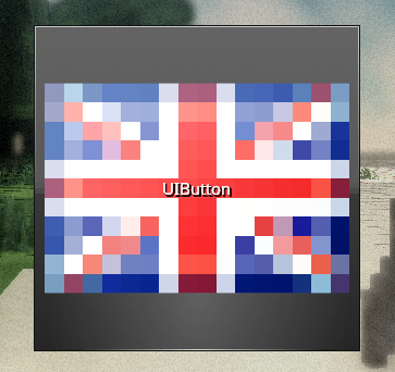
Displays a clickable button with custom text and/or image.
Listener Activates when the button is pressed.
| Name | Description |
|---|---|
image |
The image to display on the button |
text |
The text to display on the button |
clickSound |
The sound to play when the button is clicked |
clickVolume |
The volume at which to play the sound |
Example
A checkbox that can be ticked or unticked.
Listener Triggers when ticked or unticked.
| Name | Description |
|---|---|
enabled |
Controls if the checkbox should start out ticked or not |
Example

A slider bar with two sliders on it, allowing for two values to be set. The left bar cannot higher than the right bar.
| Name | Description |
|---|---|
minimum |
The minimum value of the slider |
range |
The range of values available |
increment |
Minumum amount the slider bar can move by |
precision |
Number of decimal places to show precision to |
valueLeft |
Inital value of the left slider |
valueRight |
Inital value of the right slider |
Example

A simple dropdown screen with a list of options. The selected option is displayed in the dropdown's box. This version is not scrollable.
Example
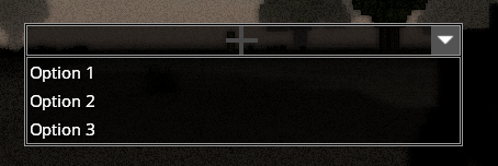
A scrolllable version of Core-Widgets#Dropdown
Example

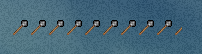
A bar comprised of icons that can display a value.
| Name | Description |
|---|---|
halfIconMode |
The mode to use to display decimal values. Can be "SPLIT", "SHRINK" or "NONE" |
maxIcons |
The number of icons to use in total |
spacing |
The space between each icon |
value |
The current value of the bar |
maxValue |
The maximum value the bar can display |
icon |
The icon to use in the bar |
Example
Displays an image. The image can be tinted set colours
| Name | Description |
|---|---|
image |
The image to display |
tint |
The tint to apply (if any). Can be any value from Color
|
ignoreAspectRatio |
Whether to stretch the image non-uniformly. This is equivalent to creating a new skin with the scale mode set to stretch. The default value is false |
Example

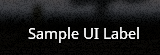
Displays some text in a label.
| Name | Description |
|---|---|
text |
The text to show. |
Example
Displays a vertical list of buttons. Each element in the list can be selected.
Example

A loading bar. It uses a tiled texture to display the load amount.
| Name | Description |
|---|---|
fillTexture |
The texture to tile across the bar. |
animate |
Controls whether the bar should be animated (Tiles scroll to the right) |
value |
The inital percentage loaded. Can be from 0 to 1. |
Example

A scrollbar that can be oriented horizontally or vertically.
| Name | Description |
|---|---|
value |
The initial level of scrolling |
minimum |
The smallest value scrollable to |
range |
The maximum value scrollable to |
vertical |
A boolean setting the orientation of the bar |
Example

A widget that displays some text that scrolls upwards.
| Name | Description |
|---|---|
text |
The text to display |
step |
The number of pixels to go up each frame |
lineSpacing |
The space between each line of text |
offsetBottom |
The offset from the bottom of the parent widget |
offsetTop |
The offset from the top of the parent widget |
autoReset |
Sets whether the widget should restart scrolling once finished |
Example

A slider bar that can be set to any value in a range.
| Name | Description |
|---|---|
increment |
The smallest increment a value can be changed by |
value |
The initial value of the slider |
precision |
The number of decimal points to display the value to |
range |
The largest value settable |
minimum |
The smallest value settable |
Example

A spacer UI element designed to be used with some layouts
| Name | Description |
|---|---|
size |
An array containing the horizontal and vertical size. |
Example
| Name | Description |
|---|---|
text |
The text to display |
multiline |
Should the content be displayed on multiple lines |
readOnly |
Allows the text to be editable when false. |
Example
