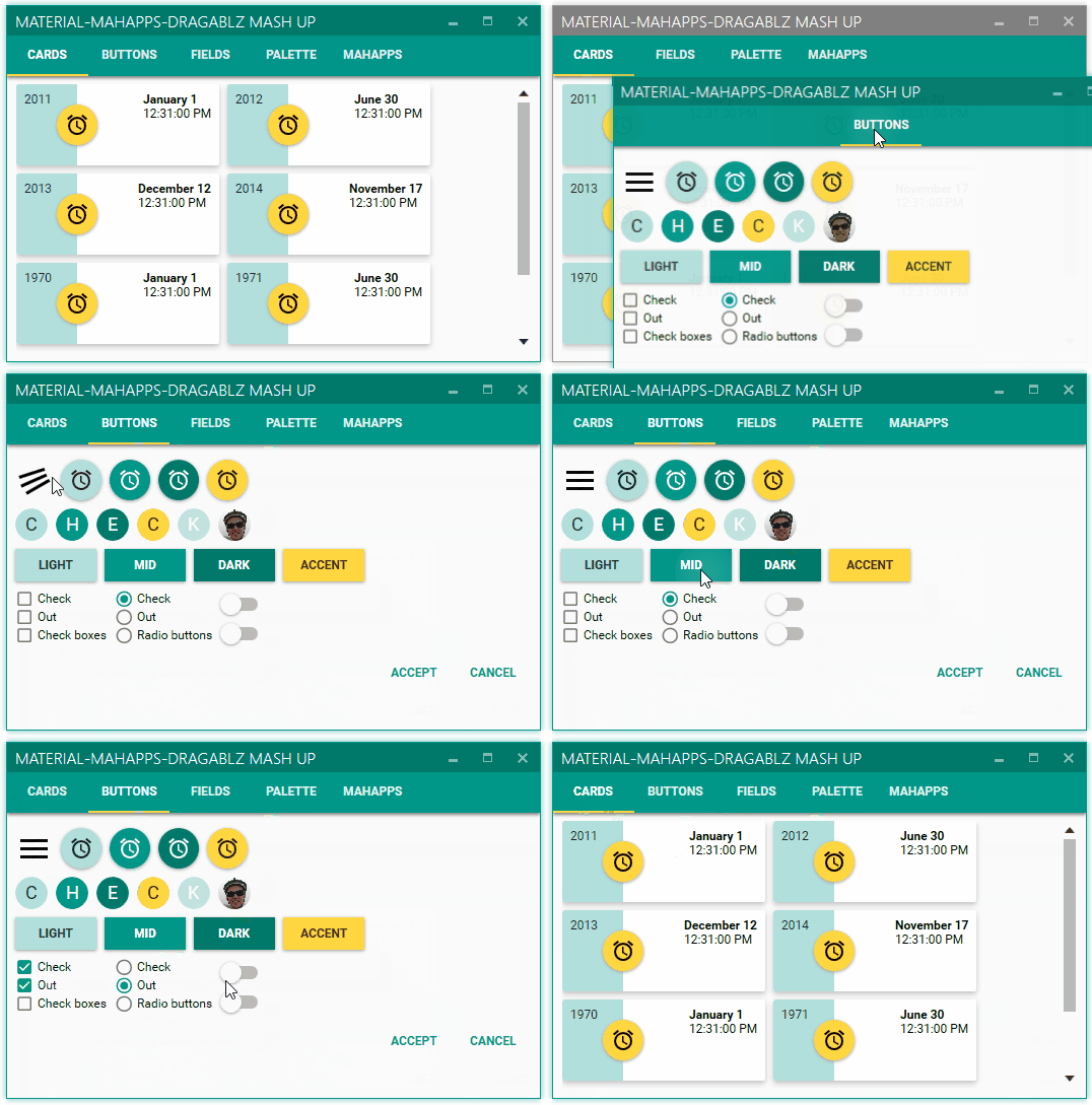
Illustrates basic theme, more themes at end of page
- Docs 'n' help 'n' stuff: dragablz.net
- NuGet details here: http://www.nuget.org/packages/Dragablz/
- You can criticise the developer here: @James_Willock or here: [[email protected]]
- No, seriously, please get involved and give me a ping with any questions/requests.
XAML as simple as this will give you a tab the tears out (using the basic theme).
<dragablz:TabablzControl Margin="8">
    <dragablz:TabablzControl.InterTabController>
        <dragablz:InterTabController />
    </dragablz:TabablzControl.InterTabController>
    <TabItem Header="Tab No. 1" IsSelected="True">
        <TextBlock>Hello World</TextBlock>
    </TabItem>
    <TabItem Header="Tab No. 2">
        <TextBlock>We Have Tearable Tabs!</TextBlock>
    </TabItem>
</dragablz:TabablzControl>- Drag and tear tabs
- User friendly docking
- Floating tool windows & MDI
- Supports MVVM
- IE style transparent Windows
- Fully style-able, included styles:
- Basic
- MahApps: demo | theme | MahApps
- Material Design: tutorial | theme | guidelines | Material Design in XAML Toolkit
- Chrome style trapzoid tabs
- Custom (and optional) Window which supports transparency, resizing, snapping, full Window content.
- Miminal XAML required, but hooks provided for advanced control from client code
- Single light weight assembly targeting .net 4.* frameworks, no additional dependencies
- Demos in source (make sure you restore NuGet packages)
Here are some helpful blog posts to help you get started:
- Layout persistance and restore
- Extra themes
Material Design theme (see Material Design in XAML Toolkit):
Docking:
MDI:
MahApps theme:


