CSS系列之如何让一个元素水平垂直居中(方案总结+代码实例) #16
Assignees

Comments
Sign up for free
to join this conversation on GitHub.
Already have an account?
Sign in to comment
1. flex
使用弹性盒子布局,只需要给待处理的块状元素的父元素添加属性:
该方案在实际开发中应用颇多,也比较简单直观,不需要确定子盒子宽高就可以实现。
实例代码,复制即可查看效果:
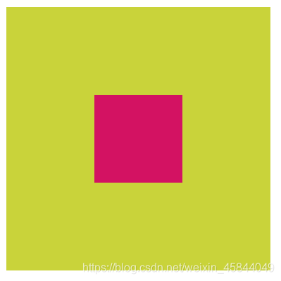
效果:

2. position (需要确定子元素宽高)
position: relative;子元素设置为绝对定位:position: absolutetop: 50%; left: 50%;margin-left和margin-top为自身宽高一半的负值:margin-left: -50px; margin-top: -50px;(自身宽高为height: 100px; width: 100px;)实例代码,复制即可查看效果:
效果:
3. position + transform 元素平移
只需将上面例子中的:子元素设置
margin-left和margin-top为自身宽高一半的负值替换为:
transform: translate(-50%,-50%);即:
position: relative;子元素设置为绝对定位:position: absolutetop: 50%; left: 50%;transform: translate(-50%,-50%);这个方法比较特殊,虽说只改了一行代码,但是原理是什么?只是背一行代码就会显得十分草率。
所以再放实例代码之前,我们先来看看这个方法如何实现了水平垂直居中。
transform: translate(x,y);的语法定义了元素的2D转换,也就是元素移动(平移),讲完这个我们再来看,子元素设置绝对定位,top和left各移动50%后,子元素左上角正好在父盒子的中心,此时还没有实现子元素的水平垂直居中(即子元素的中心点在父盒子的中心,而不是左上角在父盒子中心)。接着往下看:translate(x,y)括号里填百分比数据的话,会以本身的长宽做参考,注意,不是以父盒子宽高为参考,这就是该方法最需要理解的一个点。比如,本身的宽为100px,高为100px. 那填translate(50%,50%)就是向右和向下各移动50px,添加负号就是向着相反的方向移动。移动后的效果就是子元素的中心点在父元素的中心,实现了水平垂直居中。实例代码,复制即可查看效果:
效果:

http://www.imooc.com/qadetail/129282
4. position + margin:auto
position: relative;子元素设置为绝对定位:position: absolutetop: 0; bottom: 0; left: 0; right: 0;margin: auto;实例代码,复制即可查看效果:
效果:

参考
The text was updated successfully, but these errors were encountered: