-
Notifications
You must be signed in to change notification settings - Fork 153
New issue
Have a question about this project? Sign up for a free GitHub account to open an issue and contact its maintainers and the community.
By clicking “Sign up for GitHub”, you agree to our terms of service and privacy statement. We’ll occasionally send you account related emails.
Already on GitHub? Sign in to your account
Inconsistency in list component #3898
Comments
|
@mmoulian and ready for the Front End Team implement it wherever they will be able |
|
Lets standardize on the "right aligned" values in the key-value pair UI. Acceptance Criteria: This should componentized into a |
By doing this we will end up with reducing the width of the To be able to achieve the optimal solution for it we need to use Using this will cause some restrictions with the conversion to FLEX wrapper as it's what we are hopping for consistency in gap between items (sections, key/value, icon+text , chips,...) In application details, we moved the details items to a collapsible and we ended up displaying the items in two grid Fixed width Table @mmoulian @alfaris 2- Use Flex and set a |
|
Thank you for your comprehensive analysis and technicality behind the view, and I prefer option 2. Utilizing Flex with a min-width for the key sounds like a balanced solution that maintains consistency while allowing for the necessary adjustments. |
|
Yes, thanks for your work!! |


Throughout the different functionalities of the Demo we have different ways of organizing the information in lists.
From my point of view, the options with two columns are clearer. I would leave it as the standard component but reduce the spacing between columns.
Clusters, GitOpSet, Terraform, Source: two columns
See image as reference:
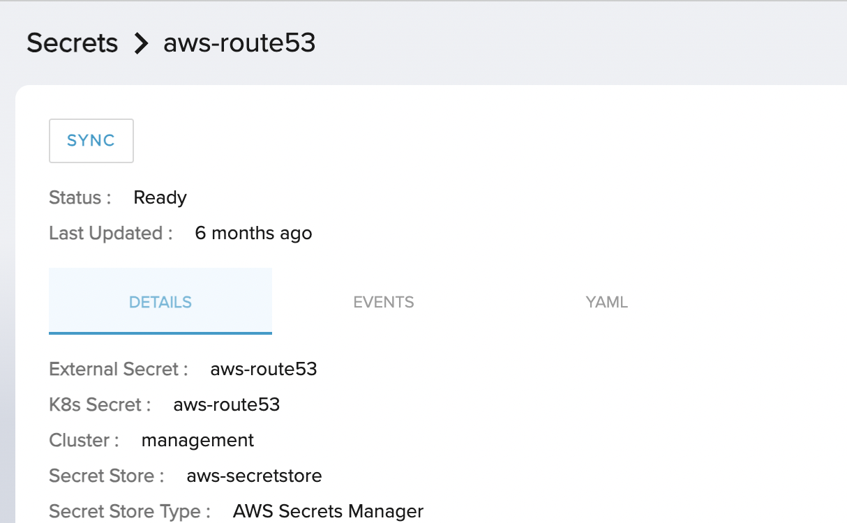
Secrets, Delivery, Policies: One column
 !
!
See image as reference:
The text was updated successfully, but these errors were encountered: