Show link to docs on a build #3446
Conversation
| Build #{{ build_id }} | ||
| {% endblocktrans %} | ||
| </span> | ||
|
|
There was a problem hiding this comment.
I don't know how to do this on a better way, what js library are you using?
|
Hope I didn't break any other parts with the css change. |
There was a problem hiding this comment.
Looks good to me in local testing. Will let @agjohnson comment on the HTML/JS stuff.
| Build #{{ build_id }} | ||
| {% endblocktrans %} | ||
| </span> | ||
|
|
I think that with this change we are loosing some visual strengh impact on the status of the build when changing the red/green square by colorizing just the text I'd like to have the link Something like this:
|

|
Visually, I prefer the change that @humitos suggests as well. Alternatively, the view docs link would also fit in the right float area nicely. My vote would be for adding the link to this section. My original thought is that we'd repurpose the main View Docs button, as it is really confusing that it always points to the same branch. This is another option. |
|
I reverted the other changes and put the link to the right as @agjohnson suggest On building state
No staff user
Staff user
|


This PR is related to readthedocs/ext-theme#278 and #2469
For now, I trying to solve this:
I think the
View Docsbutton must remain the same on all the project area, otherwise it would be confusing.I don't know much css, so any feedback is more than welcome :).
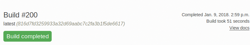
Here is how it looks right now
And how it will looks like after merging
This is still very WIP, so any feedback and suggestion is welcome!