-
-
Notifications
You must be signed in to change notification settings - Fork 346
New issue
Have a question about this project? Sign up for a free GitHub account to open an issue and contact its maintainers and the community.
By clicking “Sign up for GitHub”, you agree to our terms of service and privacy statement. We’ll occasionally send you account related emails.
Already on GitHub? Sign in to your account
docs(examples): Update block example #351
Conversation
 joshka
commented
Jul 27, 2023
|
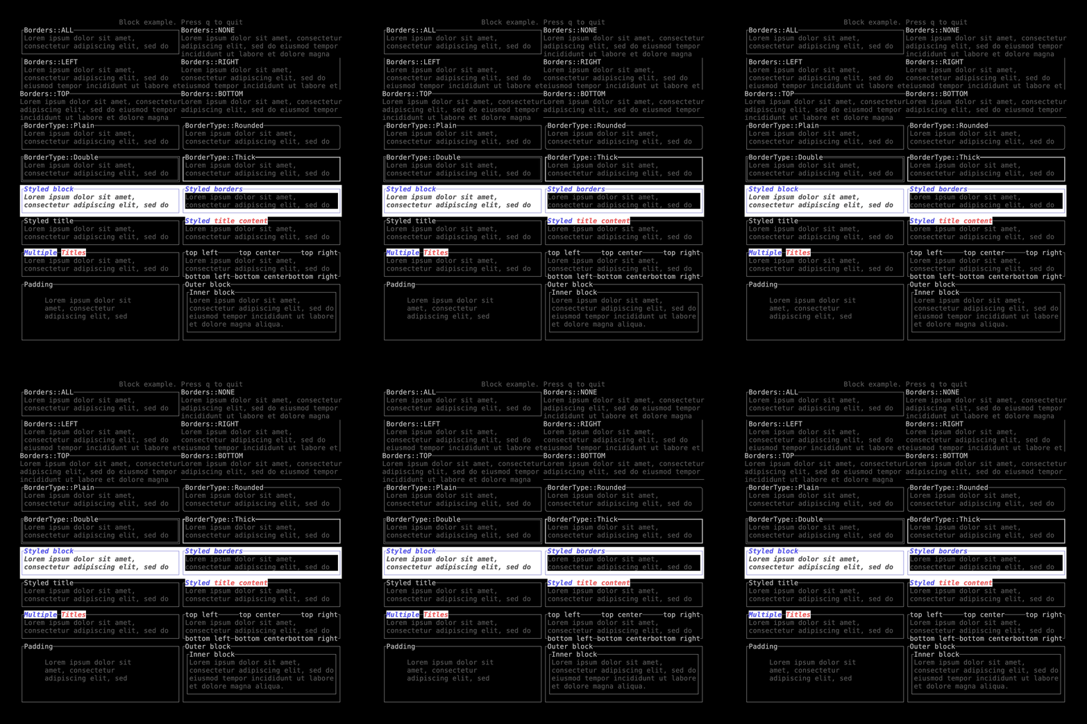
I have several goals in re-doing this example:
My hope is that by starting with a single easy example and then doing a more complex one, we have a couple of high quality examples that we can point at and then make the other widgets consistent with (e.g. add some issues labelled |
|
Added a couple of comments, and removed unnecessary anonymous lifetimes on |
Codecov Report
@@            Coverage Diff             @@
##             main     #351      +/-   ##
==========================================
- Coverage   85.08%   84.76%   -0.33%
==========================================
  Files          40       40
  Lines        8608     8603       -5
==========================================
- Hits         7324     7292      -32
- Misses       1284     1311      +27
|
|
I like having an example like this! Thoughts on making this interactive? If I could hit Also, maybe for styled borders, only change foreground colors? (this is feedback that I think could go in a separate PR about making everything prettier) |
|
Those are both good points. I think it’s worth making interactive examples separate to the examples that demonstrate how things look. There’s a lot of ways of doing interactivity that work well small for demos but don’t scale well to apps that have more a diverse UI. I experimented a little with having a cli flag to to choose the example to display so we could use VHS to generate smaller images to include directly in the docs, but it’s difficult to keep it simple with that approach. This example would be easy to refactor to add interactivity though, so perhaps let’s revisit the idea after this. My rationale behind the styled borders using the background color was to make it easy to contrast the difference between the block style and border style. The background makes it obvious how the dark gray styling on the paragraph combines with the background block style. Background color also helps show which things affect blank space not just the text (which the foreground doesn’t). Do you think this makes sense? Overall my goal is to try to pare this down to the absolute minimal amount of code necessary to show the info we need. There’s some ideas I have about fixing the backend implementations that could make this even smaller. |
|
Merging this to make it easy to see that #363 fixes the bug |
