

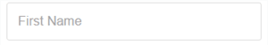
A simple input component implementing infield top-aligned form labels. Labels are displayed as placeholders and subsequently at the top of the field when the component has a value.
### [Usage](https://github.com/pemrouz/vanilla/#using)
### State
These are all the options you can pass to the component:
value = ''
The value of the element
placeholder = ''
The placeholder text to display
multiline = false
Allows using this component like a textarea
focused = false
Whether the component is in the focused state or not
optional = false
If true, an optional label will be displayed on the
top-right
type = 'text'
The type attribute to use on the underlying input element
The following will also be set on the underlying input element if specified: min, max, disabled, autofocus, required
### Events
change
Notifies of changes to the value.