-
Notifications
You must be signed in to change notification settings - Fork 15
Single subject
Using the trk_compile_data example, we output the mean tract geometry CST_L_mean.trk and a plain text version of the tract group CST_L.txt for the left corticospinal tract from one example subject. We also saw how to generate a basic along-tract figure in MATLAB in Basic workflow. Now we are going to build on this example further by bringing the data into R and leveraging some more advanced plotting libraries.
Included in the example directory is the single_sub.R script for generating 2-dimensional along-tract plots. At the top of the script you should set the exDir argument to the correct example directory. It then loads in:
-
tract_info.txt– The same file we used in MATLAB. -
CST_L.txt– The ASCII version of the tract group we saved usingtrk_compile_data. -
trk_avgs.txt– A tab-delimited text file containing a list of tract-averaged mean FA and standard deviation values. These can be copied from within TrackVis.
The script will then loop through the tracts listed in tract_info.txt and generate an along-tract figure for each.
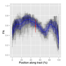
Combining a screenshot of the original tract group, a screenshot of the mean tract geometry we generated earlier (CST_L_mean.trk), and the along-tract plot from R, we can generate a single-subject along-tract atlas with entries that look something like this:

The reason for using R to do this plotting is the ease with which we can create complex plots. If you work through the code, you’ll see that the package ggplot2 allows us to build up our final plots from different reusable modular components we create first. This is sort of like layers in Photoshop. We define different building blocks for:
-
p– Plots the individual streamlines as lines, with transparancy and a slight x-axis jitter used to control overplotting. -
means– Plots the along-tract mean FA ± the pointwise 95% confidence band. -
avg– Plots the tract-averaged estimate as a point-spread. -
opts– Sets options for axis limits and labels.
Then we can build up our final plot by simply adding these modular components together:
p
p + means
P + means + avg
p + means + avg + opts


Back to Wiki Home