English | 中文
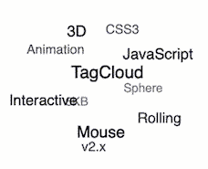


It's 3D TagCloud that rolling with the mouse. It's only 6KB in minsize and doesn't depend on other libraries. Examples
$ npm i -S TagCloudconst TagCloud = require('TagCloud');
const container = '.tagcloud';
const texts = [
'3D', 'TagCloud', 'JavaScript',
'CSS3', 'Animation', 'Interactive',
'Mouse', 'Rolling', 'Sphere',
'6KB', 'v2.x',
];
const options = {};
TagCloud(container, texts, options);<!-- html -->
<script type="text/javascript" src="./dist/TagCloud.min.js"></script>TagCloud(container, texts, options);Returns tagcloud instance.
Type: String or HTMLElement or Array
Container for constructing a tagcloud.
Type: Array
List of tag text for init.
Type: Object
Type: Number
Default: 100
Unit: px
Rolling radius.
Optional: 'slow', 'normal', 'fast'
Default: 'normal'
Rolling max speed.
Optional: 'slow', 'normal', 'fast'
Default: 'normal'
Rolling init speed.
Type: Number
Default: 135 (right-bottom)
Unit: clockwise deg
Rolling init direction, e.g. 0 (top) , 90 (left), 135 (right-bottom) ...
Type: Boolean
Default: true
Whether to keep rolling after mouse out area. Default true (decelerate to rolling init speed, and keep rolling with mouse).
Type: String
Default: tagcloud
Css class to be used for the tagcloud container. Default tagcloud
Type: String
Default: tagcloud--item
Css class to be used for tagcloud items. Default tagcloud--item
Type: Boolean
Default: true
Add common inline styles to the items which are required for correct view. When this option is disabled you have to add the css by yourself. Default true
.tagcloud--item {
  position: absolute;
  top: 50%;
  left: 50%;
  z-index: 1;
  opacity: 0;
  filter: alpha(opacity=0);
  will-change: transform, opacity, filter;
  transform-origin: 50% 50%;
  -webkit-transform-origin: 50% 50%;
  -moz-transform-origin: 50% 50%;
  -o-transform-origin: 50% 50%;
  transform: translate3d(-50%, -50%, 0) scale(1);
  transition: all 0.1s ease 0s
}Type: Boolean
Default: true
Add inline styles to the tagcloud container which are required for correct view. When this option is disabled you have to add the css by yourself. Default true
.tagcloud {
    /* 100% width and proportional height */
    position: relative;
    width: 100%;
    height: 0;
    padding-bottom: 56%;
}Update tag list.
Pause the tagcloud animation.
Resume the tagcloud animation.
Destroy the tagcloud instance.
The following is an example, click the TagCloud sub-item to jump to Google to search for keywords.
let rootEl = document.querySelector('.content');
rootEl.addEventListener('click', function clickEventHandler(e) {
    if (e.target.className === 'tagcloud--item') {
        window.open(`https://www.google.com/search?q=${e.target.innerText}`, '_blank');
        // your code here
    }
});The following is an example, TagCloud sub-item is in green font, and when it is moved to it, it becomes red.
First, add an extra class to the container (the container used to construct TagCloud, the container in this example is called content), such as diy.
<div class="content diy"></div>.diy .tagcloud--item {
color: #67C23A;
}
.diy .tagcloud--item:hover {
color: #F56C6C;
}MIT