Clusterysis is a simple tool for a first cluster analysis that helps you visualize the difference between clusters.
import clusterysis as cly
Just pass a Dataframe with a cluster column to see several charts.
cly.View(df=df, cluster_col="cluster")
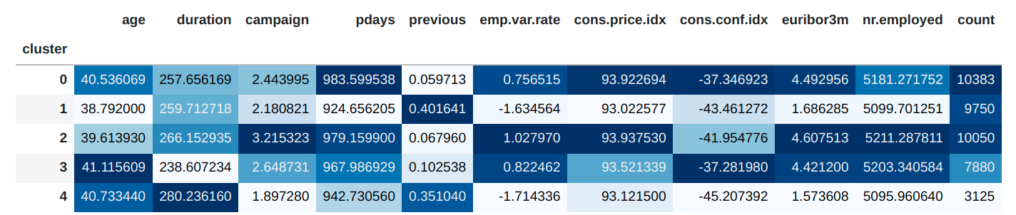
A table with the mean of each quantitative variable:
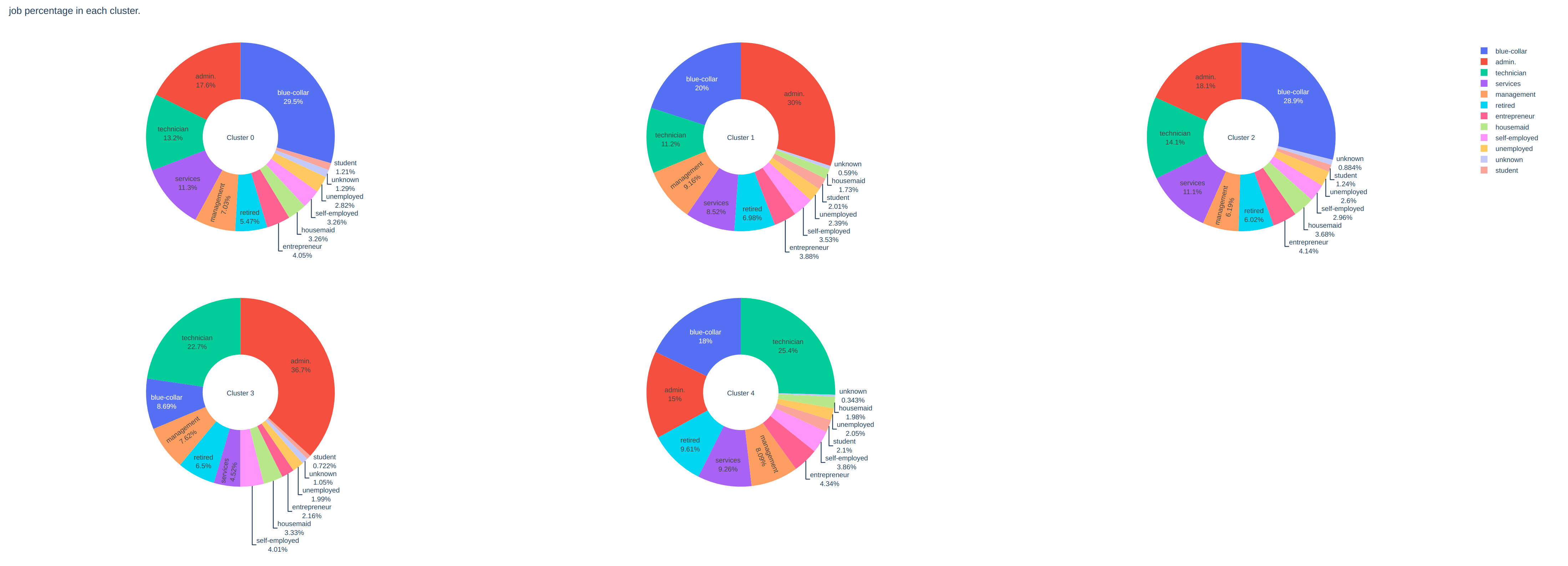
Cluster composition of each categorical variable:
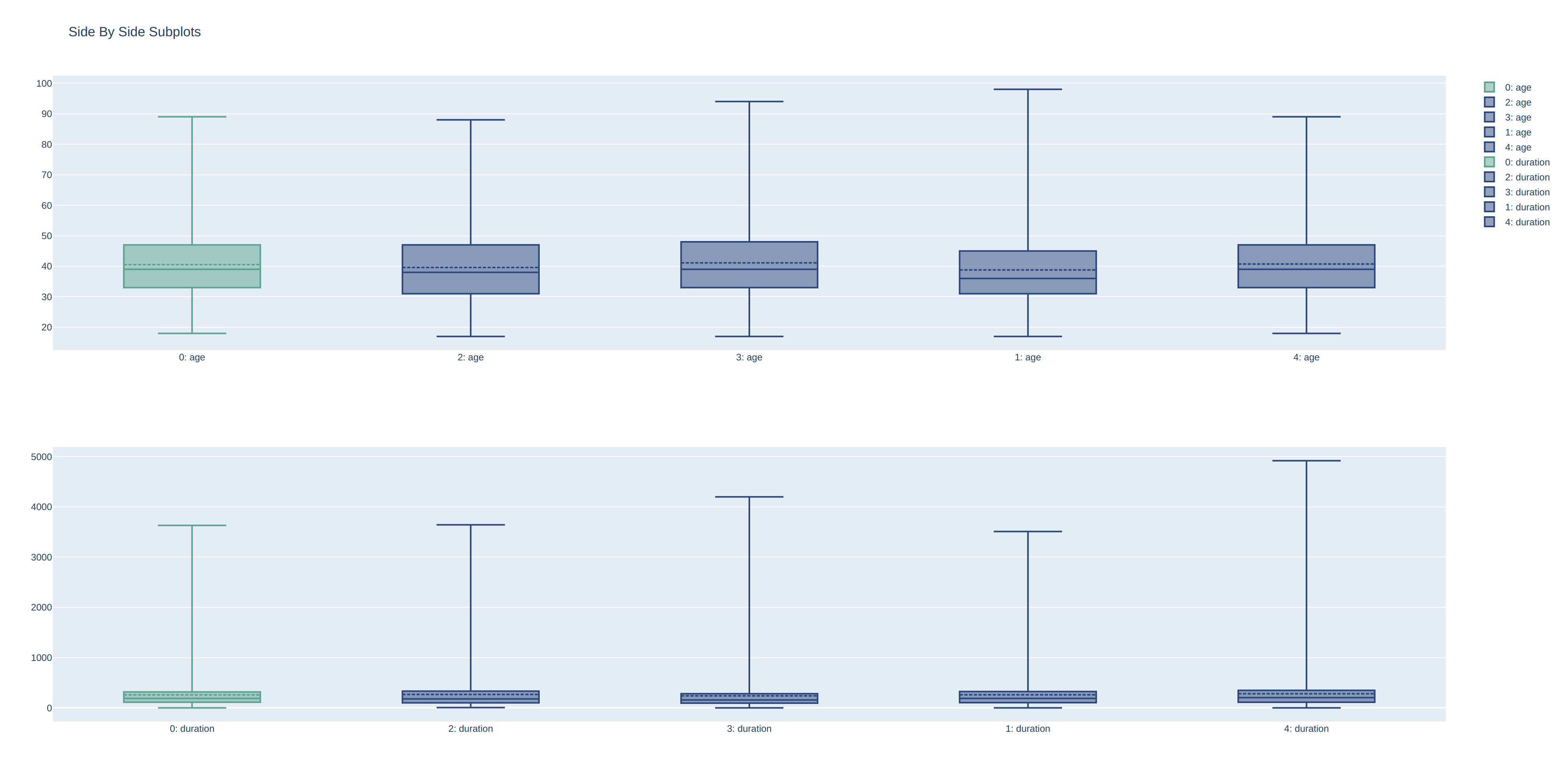
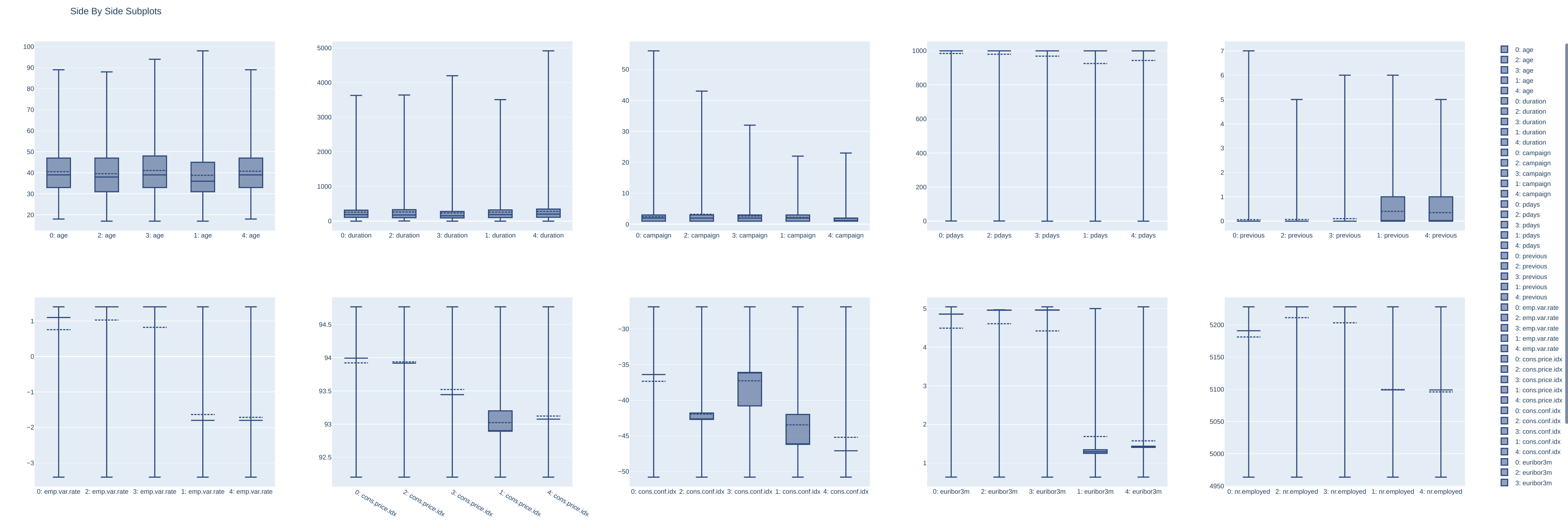
Boxplot chart for quantitative variables:
df and cluster_col are required, if you want you can explicit which are the quantitative and categorical variables (if you don't it will be assumed strings are categorical and numbers quantitative).
You can also ask to highlight a specif cluster.
cly.View(
    df=df,
    cluster_col="cluster",
    cat_cols=["job", "education"],
    quant_cols=["age", "duration"],
    diff_cluster=0
)