Table truncation / wrap audit in the Security app #14
Replies: 5 comments
-
|
Possible next step:
Long-term question:
|
Beta Was this translation helpful? Give feedback.
-
|
I have more thoughts on this than I realized 😂 -- jotted them down below: I’m super curious to hear the collective opinion on this. This occurs a TON — in many of our tables and sometimes on multiple columns within tables. I haven’t done any formal documentation, but when I worked more extensively with observability and Fleet I remember thinking this occurred lot more rarely there. When it did occur, it was generally isolated to one column — usually a description column. At that time, the designers dedicated more room to that column and truncated w tooltip when it overflowed. And I think reason this issues affects security so much more than other solutions is multivariable: 1. We generally have way more columns per table than tables in other solutions. In conversations I’ve had in the past with designers outside security, this the first thing that comes up. I’ve gotten feedback from Elastic designers that we need to audit our tables and remove columns, and perhaps but the extra info into a details page or flyout. Coming to a consensus on what stays and what goes though is something I’ve found much easier said than done. The other piece of feedback I’ve received in response to this is that maybe tables aren’t always the right component to use given the data we have. I think this potentially makes sense for datasets where the cell input is generally long for multiple columns (more on that below), like trusted apps which was originally a table. If the problem is simply that we have many columns with limited characters per cell (say an average of ~12 characters or less), I still think a table/data grid is right and we need to audit content. 2. We often display dates very, very specifically. This takes up a lot of space and makes it so that column and other columns are more likely to be truncated. My recommendation here is that we display relative dates (i.e. “5 minutes ago) with a more detailed hover tooltip up until 24 hours. At that point, we write the date (xx.xx.xx) again with a more detailed hover tooltip. Furthermore, we have a lot of columns where the input is likely to be long. I mentally separate this point into a few different categories.
One is multi-word input (i.e a description). These can sometimes be a phrase. And sometimes they can be a sentence plus. For ones where the description is generally a phrase. I think it makes sense to give more space to that column and then truncate+tooltip the excess. If the input is generally more than a sentence, first I’d consider seeing if we can put a character limit on that input field (I wonder something similar for long names I.e. policy/trusted app names). If that doesn’t make sense, I could see dedicating two rows to that text input across the board (I.e. making every row in that table taller).
Again, just my take and I would love to know how others see this. |
Beta Was this translation helpful? Give feedback.
-
|
This is a bit of a brain dump. I feel like we could have a very long conversation about this.
I agree the number of columns is large. I'd be up for removing this complexity. In my experience, this kind of complexity comes from not really understanding users needs around the interface. How opinionated are we in taking things away? A really good way to find out if users need a thing is to remove it and see how much they complain about its loss? We can do that in a controlled way.
Yes!, GitHub doesn't this I think. I agree about making the rows taller for things like descriptions. We should work out what we need to show people and then work out the best way to present that content. A table may not be the best way. A few final thoughts
I'd love to hear others thoughts too... |
Beta Was this translation helpful? Give feedback.
-
|
@yiyangliu9286 Thank you for the write up, I went through this discussion ticket and the doc. Regarding "Truncated (w/o tooltips)" vs "Truncated (w/ tooltips)" vs "Wrapped":
I also created a few new tickets for table UI enhancements, please take a look and let me know what you think. I hope we could finalize at least one of them soon if you agree with the ideas in general.
|
Beta Was this translation helpful? Give feedback.
-
|
Thanks for all the design consideration input @bfishel @gavinwye! @banderror Thanks for adding all the issues below. I will address the design considerations for those items on how to address those in those issues.
@banderror @vitaliidm Yes I agree, the wrap behaviour is a short-term fix for 7.16, and we should address the consistency problem for Rules and Rules monitoring tables going forward in the future. See below the general guidance. After in discussion with the Security design team; here are the agreed design decision for long text table cells and date format guidance for the Security app:
|
Beta Was this translation helpful? Give feedback.
-
Aligned UX Guideline / Decision [November 2 2021]:
After in discussion with the Security design team; here are the agreed design decision for long text table cells and date format guidance for the Security app:
Context:
This audit exercise examines how we treat an overflow of long text being displayed in different Tables within the Security app.
Goal:
Design contact: Yiyang Liu
Engineer: Vitalii Dmyterko, Georgii Gorbachev
Team: Security D&R, Security Design
Resources:
Please view full audit in this doc
Info about name characters (quoted by Dima's conversation here): the Eden XDR project, the average rule name length is 39, max length 79
Some highlights from the full audit docs are:
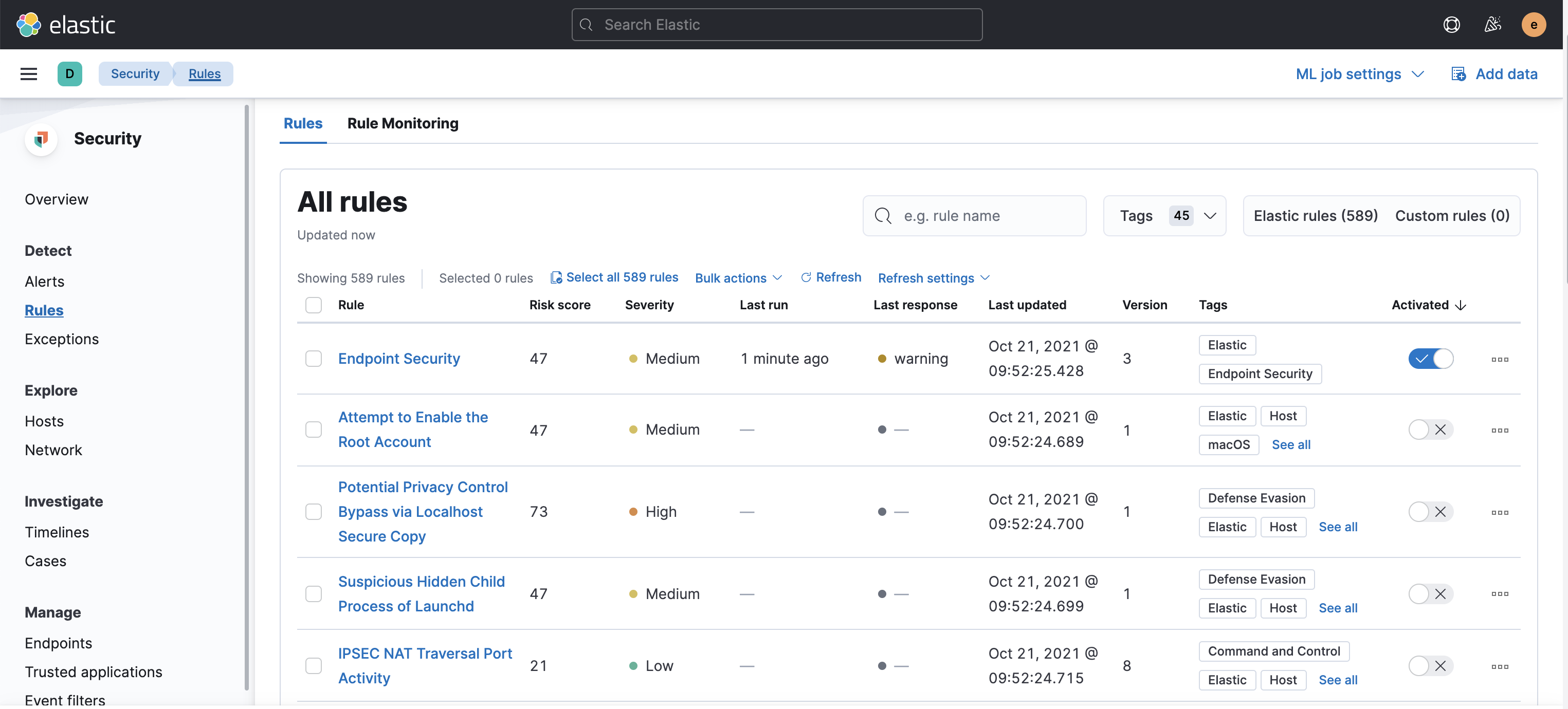
Rules
Suggested next step [need to fix now]:
For readability, we should make
RuleandLast updatedcolumns as truncated + tooltip format (similar toEndpointstable)For readability, we should redesign the
Tagscolumn (to something like 2 tags max + a number with Popover to show all the tags) [needs design]Suggested next step [need to fix now]:
Rulecolumn as truncated + tooltip format (similar toEndpointstable)Behaviour: Truncated (w/o tooltips) (e.g.
Rules assignedto column) + TooltipsScreenshot:
Suggested next step [need to fix now]:
Rule assigned toandLast editedcolumns as truncated + tooltip formatBeta Was this translation helpful? Give feedback.
All reactions