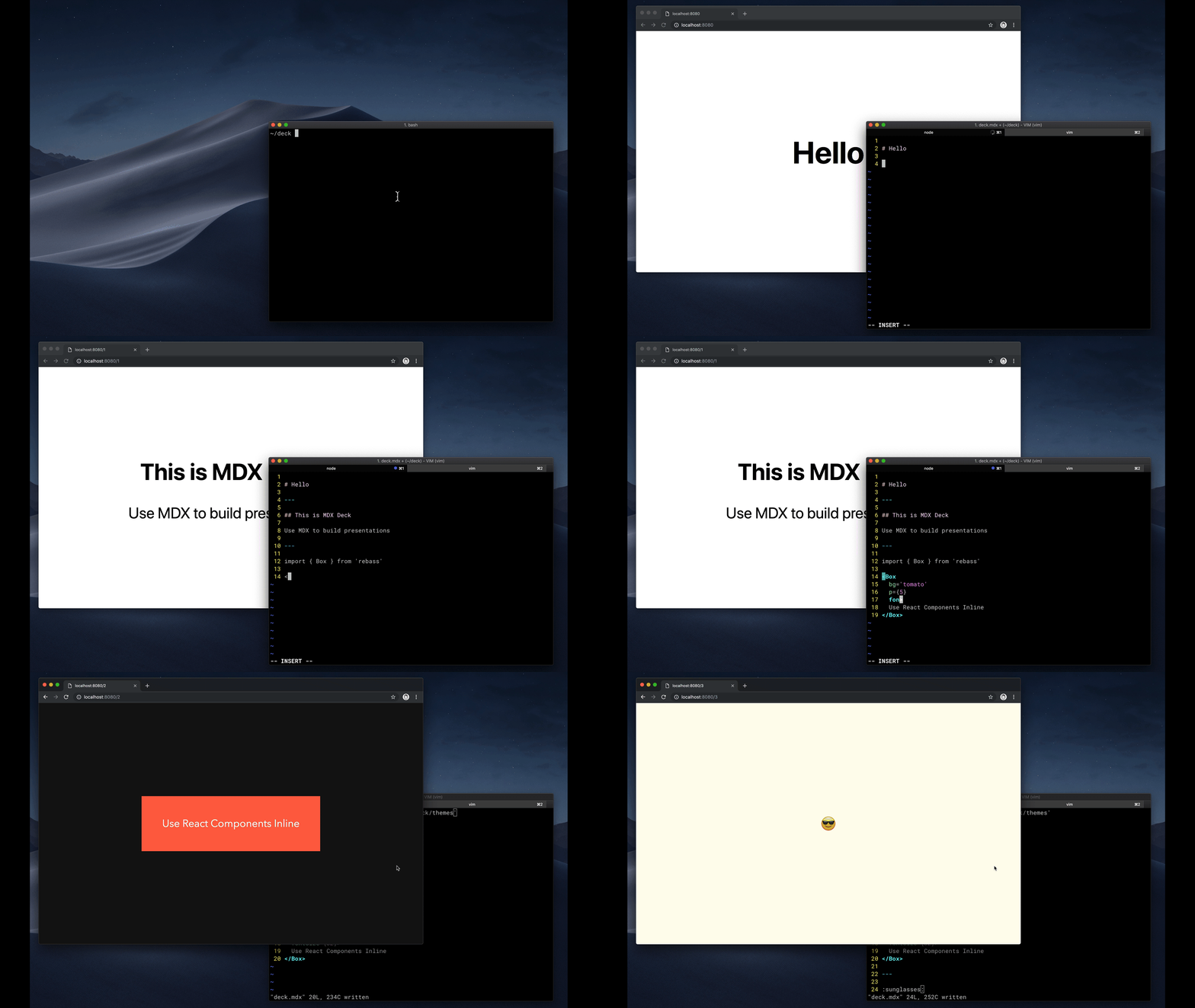
Award-winning React MDX-based presentation decks
- 📝 Write presentations in markdown
- ⚛️ Import and use React components
- 💅 Customizable themes and components
- 0️⃣ Zero-config CLI
- 💁♀️ Presenter mode
- 📓 Speaker notes
- Getting Started
- Using MDX
- Theming
- Components
- Layouts
- Presenter Mode
- Keyboard Shortcuts
- CLI Options
- Videos & Articles
- Examples
npm i -D mdx-deckCreate an MDX file and separate each slide with ---.
# Hello

---

## This is my deck

---

## The End
Add a run script to your package.json with the MDX Deck CLI
pointing to the .mdx file to start the development server:
"scripts": {
  "start": "mdx-deck deck.mdx"
}
Start the development server:
npm startUse the left and right arrow keys to navigate through the presentation.
MDX uses Markdown syntax and can render React components inline with JSX.
To import components, use ES import syntax separated with empty lines between any markdown or JSX syntax.
import { Box } from 'theme-ui'

<Box color="tomato">Hello</Box>
Read more about MDX syntax in the MDX Docs.
MDX Deck uses Theme UI and Emotion for styling, making practically any part of the presentation themeable. It also includes several built-in themes to change the look and feel of the presentation.
- See the list of available Themes
- Read more about theming in the Theming docs.
MDX Deck includes built-in components to help with creating presentations,
a Notes component for adding speaker notes,
a Head component for the document head,
Header and Footer components for persistent header and footer content,
and a Steps component for adding multiple intermediate steps in a single slide.
Read more in the Components docs.
These optional libraries are intended for use with MDX Deck.
- CodeSurfer: React component for scrolling, zooming and highlighting code.
- mdx-code: Runnable code playgrounds for MDX Deck.
- mdx-deck-live-code: Live React and JS coding in slides.
Note: please check with version compatibility when using these libraries.
Each slide can include a custom layout around its content, which can be used as a template for visually differentiating slides.
// example Layout.js
import React from 'react'

export default ({ children }) => (
  <div
    style={{
      width: '100vw',
      height: '100vh',
      backgroundColor: 'tomato',
    }}>
    {children}
  </div>
)
import Layout from './Layout'
# No Layout
---
<Layout>
# Custom Layout
</Layout>The layout component will wrap the MDX elements within that slide, which means you can add custom layout styles or style child elements with CSS-in-JS.
Press Option + P to toggle Presenter Mode,
which will show a preview of the next slide, a timer, and speaker notes.
The presentation can be opened in two separate windows at the same time, and it will stay in sync with the other window.
| Key | Description |
|---|---|
| Left Arrow, Page Up, Shift + Space | Go to previous slide (or step in Steps) |
| Right Arrow, Page Down, Space | Go to next slide (or step in Steps) |
| Option + P | Toggle Presenter Mode |
| Option + O | Toggle Overview Mode |
| Option + G | Toggle Grid Mode |
-p --port     Dev server port
-h --host     Host the dev server listens to
--no-open     Prevent from opening in default browser
- Egghead Tutorial by Andrew Del Prete.
- mdx-deck: slide decks powered by markdown and react by Kent C. Dodds
- Make Fast & Beautiful Presentations with MDX-Deck by Harry Wolff (Demo)
- What is MDX by Kent C. Dodds
- Build a Custom Provider Component for MDX-Deck by Kyle Shevlin
See how others have used MDX Deck for their presentations.
- Design Systems & React by Diana Mounter
- Bringing Brazil to the Cloud, Now by Guillermo Rauch
- Simplify React by Kent C. Dodds
- I Got 99 Problems but GraphQL Ain't One by Sara Vieira
- Stop de #divFest by Sara Vieira
- MDX, authors and richer JAMstack content by Josh Dzielak
- Components as Data: A Cross Platform GraphQL Powered Component API by Luke Herrington
- A short history of webdevs future 🔮 by Hendrik Wallbaum
The following examples will open in CodeSandbox.


