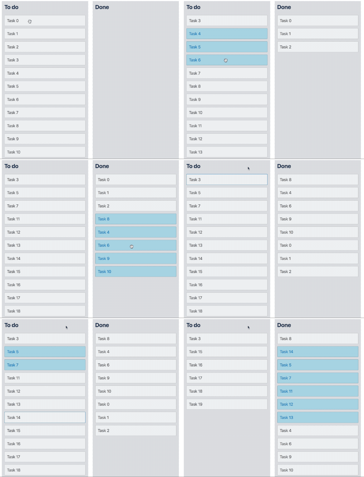
Releases: atlassian/react-beautiful-dnd
6.0.0
New features
Multi drag pattern #10
We now provide a pattern for dragging multiple Draggables at once.
We have created an extensive multi drag pattern to assist you in building your own multi drag experience on top of react-beautiful-dnd. We have not included the interaction into the library itself. This is done because a multi drag experience introduces a lot of concepts, decisions and opinions. We have done a lot of work to ensure there is a standard base of dom event management to build a mutli drag experience on.
| Toggle selection | Toggle selection in a group | Multi select |
|---|---|---|
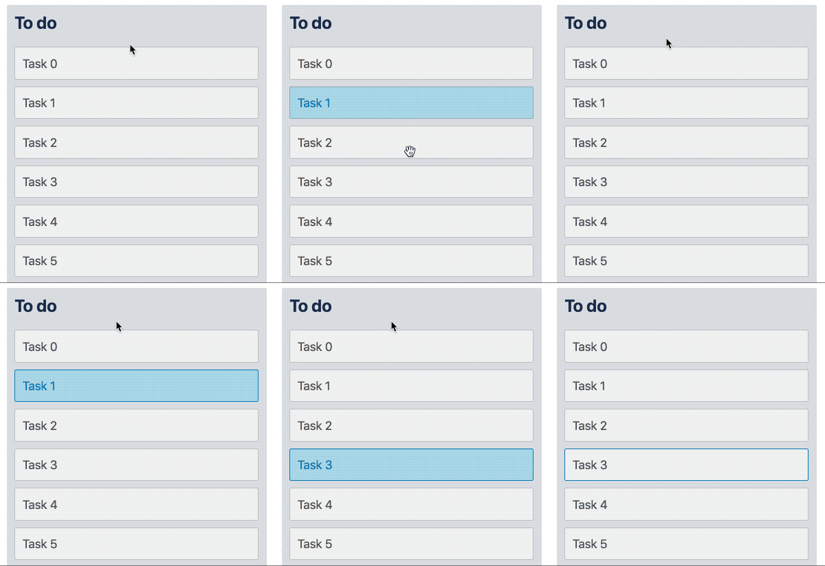 |
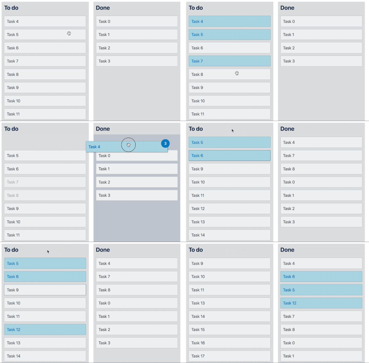 |
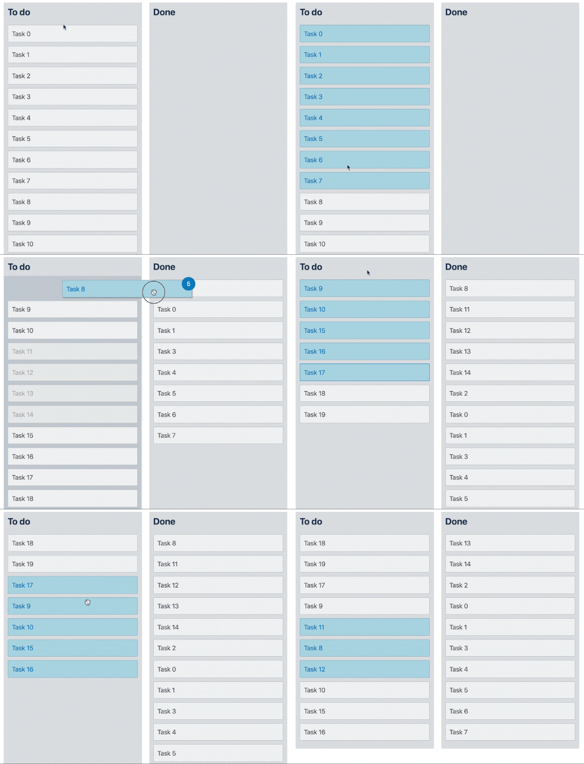 |
A huge thank you to Jeniffer Heng for her hard work designing this. Also thank you to @Blasz for reviewing it!
This resulted in a no version change (it does not change any code - it is a pattern)
Server side rendering helper: resetServerContext #323
The resetServerContext function should be used when server side rendering (SSR). It ensures context state does not persist across multiple renders on the server which would result in client/server markup mismatches after multiple requests are rendered on the server.
Use it before calling the server side render method:
import { resetServerContext } from 'react-beautiful-dnd';
import { renderToString } from 'react-dom/server';

...

resetServerContext();
renderToString(...);
Thanks to @czechdave for raising this and creating a PR to fix this! Thanks also to @Blasz for seeing this change across the line!
This resulted in a minor version change
Improvements
Reduced bundle size #346
Thanks to the hard work of @TrySound our bundles have lost some weight!
| bundle type | old size | new size | reduction |
|---|---|---|---|
| raw | 391kb | 326kb | 16.5% |
| minified | 152kb | 124kb | 18.5% |
| gzip | 40kb | 35kb | 12.5% |
Thanks also to @lukebatchelor and @Andarist for their input
Consistent handling of DOM events #379
We have done a major cleanup of how we use DOM events for drag and drop. We have created a thorough [guide about how we use DOM events]((/docs/guides/how-we-use-dom-events.md). This was done to provide a consistent base to build multi drag on top of.
If you are not building your own events on top of react-beautiful-dnd there is nothing you need to do for this - there is no change in behaviour.
This change also fixes an issue with sloppy clicks and click blocking prevention whereby elements other than anchors where publishing a click a event after a drag - now everything publishes the click event!
"Wait, what!?" you might be asking. Well, we have cleaned up how we process DOM events. We now have a very consistent strategy:
If we use an event as a part of a drag and drop interaction we call event.preventDefault() on the event. We also might call event.preventDefault() on some other events leading up to or during a drag where we need to opt out of the standard browser behaviour for that event. We are no longer stopping the propogation of any events.
In order to see if an event has been used for drag and drop you simply need to check if the event.defaultPrevented property has been set to true.
As a result of this we no longer block clicks after a drag - we prevent them. So if there is a click event it will bubble up the tree as normal but it will not perform the standard browser interaction.
For more indepth information about this change have a read of the how we use dom events guide.
This resulted in a breaking change as we have changed the behaviour of underlying DOM events and specifically click blocking.
Adding ES6 module build #369
We are now publishing an es6 module build. This is helpful for tree shaking and de duping dependencies when consuming the library. Thank you so much to @b1f6c1c4 for raising this pull request and @TrySound who did such a good job reviewing it.
Fixes
Move or drop on an empty Droppable #351
Previously if your Droppable had any margin or padding on it directly then it would have an incorrect animation when moving to it (either by dropping with a mouse/touch or moving there with a keyboard). This was not exposed in our examples as we were always applying margin or padding to the parent. This has been fixed and you can now apply margin and padding to a Droppable directly. This issue prompted us to cleanup our internal box model terminology #355.
Other
- Simplified distribution of flow types #347. Thanks @TrySound!!
- Internal cleanup and improvement of box model terminology: #355. Thanks @jaredcrowe for raising this one
- Fixing drop animation in firefox caused by firefox not clearing transforms off elements when instructed. This has been fixed by changing some internal style timings #357. Thanks @Amev for raising this!
- Fixing minor performance regression on lift caused by the auto scrolling changes #358
- No longer reading from the DOM in state functions #365
- Avoiding some
console.warnstatements after a reorder #382 - Phrasing content within a button (which is valid) was not being caught by our interactive element drag blocking. This has been fixed #368. Thanks @LouisCuvelier for finding this one
Changes
DragHandleProps
As a result of the click prevention changes you no longer need to add an onClick handler directly to a drag-handle. Therefore if you want to add your own onClick handler to a drag handle you can do so without needing to monkey patch our events. Additionally we where able to remove an unneeded html5 drag and drop event onDrop.
type DragHandleProps = {|
  onMouseDown: (event: MouseEvent) => void,
  onKeyDown: (event: KeyboardEvent) => void,
  onTouchStart: (event: TouchEvent) => void,
  onTouchMove: (event: TouchEvent) => void,
-  onClick: (event: MouseEvent) => void,
  'data-react-beautiful-dnd-drag-handle': string,
  'aria-roledescription': string,
  tabIndex: number,
  draggable: boolean,
-  onDragStart: () => boolean,
-  onDrop: () => boolean,
+  onDragStart: (event: DragEvent) => void,
|}
As we have removed properties from
DragHandlePropsthis is breaking change.
5.0.0
New features
Delivering on accessibility #311
The objective of react-beautiful-dnd:
Beautiful, accessible drag and drop for lists with React.js
In this release we truely deliver on our core goal of being accessible. We now ship with great screen reader support. We have decided to be accessible by default: we ship with english screen reader messaging out of the box 📦. So if you are just getting started you can rest knowing that your lists are highly accessible without you needing to do anything! We also provide total control of all of the messaging to enable you to tailor the screen reader messaging for your use case as well as to power internationalisation. We have put together a screen reader guide to assist you with crafting your own screen reader announcements if you would like to do so.
By combining our amazing keyboard support and impressive screen reader support we now provide an incredible drag and drop experience for users with visual (or other) impairments ❤️
An example
This feature was made during an Atlassian shipit. We placed 5th in the Sydney office 😎
Auto scrolling #27
When a user drags a Draggable near the edge of a Droppable or the window we automatically scroll the container as we are able to in order make room for the Draggable.
We have poured a lot of effort into this experience to make it feel great. You can have a read of our new auto scrolling section in the docs to find out more information.
| Mouse and touch | Keyboard |
|---|---|
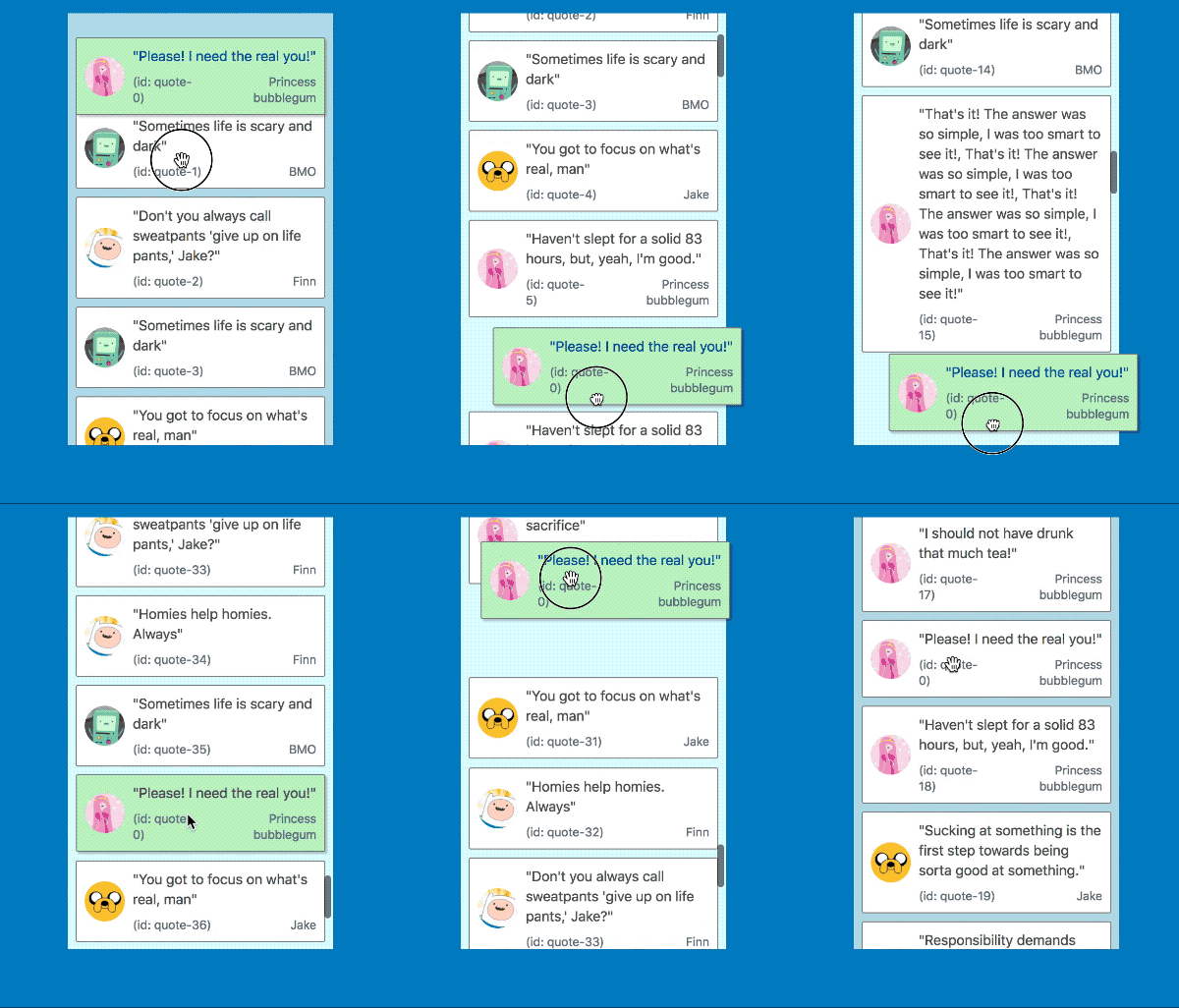 |
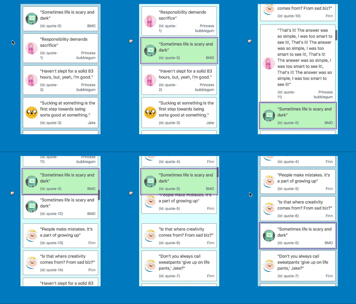 |
It also works in multi list configurations with all input types
| Mouse and touch | Keyboard |
|---|---|
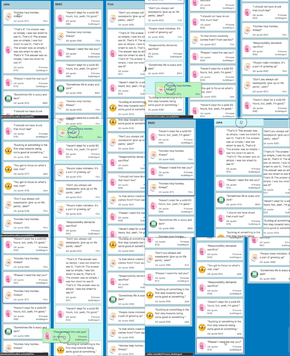 |
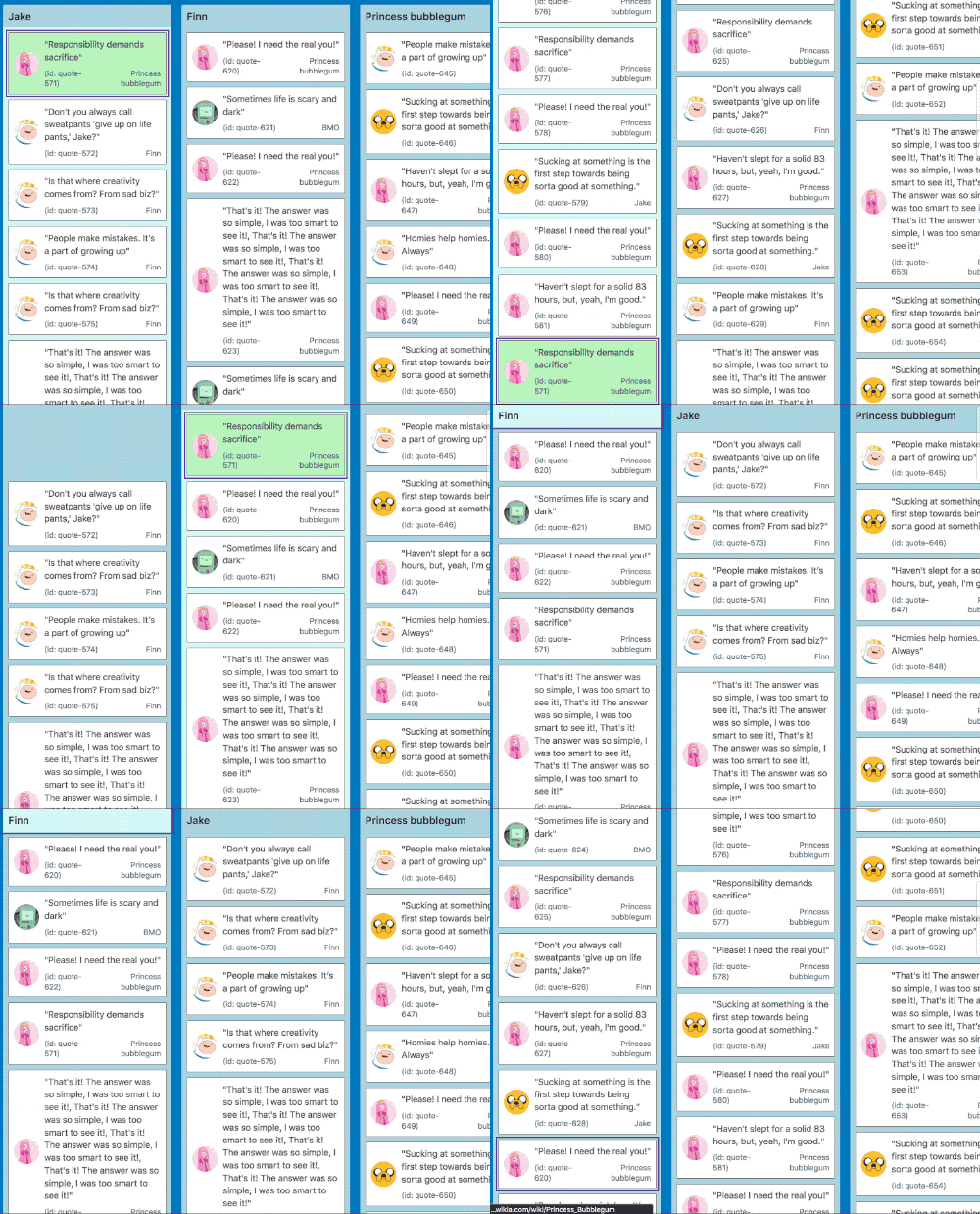 |
New hook: onDragUpdate #298 #311
We now provide a new optional DragDropContext hook to notify you when something changes in a drag: onDragUpdate.
type OnDragUpdateHook = (update: DragUpdate, provided: HookProvided) => void;This hook is called whenever something changes during a drag. The possible changes are:
- The index of the
Draggablehas changed - The
Draggableis now over a differentDroppable - The
Draggableis now over noDroppable
Increased information in state snapshots #298
We have added some extra information to DraggableStateSnapshot and DroppableStateSnapshot to assist you with creating even more meaningful experiences for users while dragging.
type DraggableStateSnapshot = {|
  isDragging: boolean,
+ // What Droppable (if any) the Draggable is currently over
+  draggingOver: ?DroppableId,
|}
type DroppableStateSnapshot = {|
isDraggingOver: boolean,
+ // The id of the Draggable that is currently dragging over the Droppable
+ draggingOverWith: ?DraggableId,
|}Improvements
- You are now able to distinguish between drops in the home location and drops on no
Droppable#336. - Now stripping
console.*messages from production builds #309. Thanks @ajaymathur! - Moving from
babel-preset-es2015tobabel-preset-env#325. Thanks @alirezavalizade! - Add notes about supporting table layouts in the docs #311. Thanks @jesstelford!
- Improving the docs #340. Thanks @Blasz!
- Improved logic for container clipping #321
Fixes
Changes
HookProvided
All of the Hook functions now have a second argument: HookProvided. This is currently used to optionally control the screen reader messaging through the announce function. You can read more about announce in our screen reader guide
+ type HookProvided = {|
+   announce: Announce,
+ |}

+ type Announce = (message: string) => void;
- type OnDragStartHook = (start: DragStart) => void;
+ type OnDragStartHook = (start: DragStart, provided: HookProvided) => void;
- type OnDragEndHook = (result: DropResult) => void;
+ type OnDragEndHook = (result: DropResult, provided: HookProvided) => void;
// this hook is new!
+ export type OnDragUpdateHook = (update: DragUpdate, provided: HookProvided) => void;
export type Hooks = {|
onDragStart?: OnDragStartHook,
+ onDragUpdate?: OnDragUpdateHook,
// always required
onDragEnd: OnDragEndHook,
|}This resulted in a minor version change
New hook: onDragUpdate
+ type OnDragUpdateHook = (update: DragUpdate, provided: HookProvided) => void

+ type DragUpdate = {|
+  ...DragStart,
+  // may not have any destination (drag to nowhere)
+  destination: ?DraggableLocation,
|}

// existing type that is used for onDragStart
type DragStart = {|
  draggableId: DraggableId,
  type: TypeId,
  source: DraggableLocation,
|}
This resulted in a minor version change
Adding reason to DropResult
We now provide a reason for the drag ending: either the drag was cancelled or the user dropped the draggable.
- type DropResult = {|
-  ...DragStart,
-  destination: ?DraggableLocation,
- |}

// Now DropResult extends DragUpdate rather than DragStart. However, the properties of DropResult remain unchanged from the last release except for the addition of `reason`

+ type DropResult = {|
+  ...DragUpdate,
+  reason: DropReason,
+ |}

+ type DropReason = 'DROP' | 'CANCEL';
This resulted in a minor version change
Adding droppableProps to DroppableProvided
Similarly to Draggables and drag handles we know require some props to be spread onto a Droppable. We currently just use this to apply a data attribute to the Droppable in order to fix incorrect scroll updates when dropping #290. However, we may use this to apply other required non-visible styles in the future.
<Droppable droppableId="droppable-1">
  {(provided: DroppableProvided, snapshot: DroppableStateSnapshot) => (
    <div
      ref={provided.innerRef}
      style={{ backgroundColor: snapshot.isDraggingOver ? 'blue' : 'grey' }}
+      {...provided.droppableProps}
    >
      <h2>I am a droppable!</h2>
      {provided.placeholder}
    </div>
  )}
</Droppable>
type DroppableProvided = {|
innerRef: (?HTMLElement) => void,
placeholder: ?Node,
+ droppableProps: DroppableProps,
|}
+ type DroppableProps = {|
+ // used for shared global styles
+ 'data-react-beautiful-dnd-droppable': string,
+ |}This is a breaking change 💥. It is arguable that this is not a breaking change given that not applying this change attribute would simply result in a bug not being fixed. However, we may add attributes to
DroppablePropsin the future which really are required and so we might break people at that point. To avoid unintentional breakages in the future we thought it best just to list this as a breaking change now.
Credits
People
A lot of people assisted with this release even if they did not directly contribute code. The quality of this release would not have been possible without:
- @jaredcrowe: always pushing for a more refined user experience. The quality of this release would have been no where as high without his critical thinking and review.
- @seancurtis: an accessibility master
- @j-fan: for her work on improving our auto scrolling behaviour (thresholds, speed and acceleration)
- Karen Bywater: Greatly assisted in crafting our screen reader messaging experience and guides
- Raja Bellebon: Thrashing the changes to find bugs
- @petegleeson: for his assistance in white boarding some touch keyboard problems
- @svinkle: for proactively getting involved in improving our screen reader story
- The rest of my Atlassian colleagues for their encouragement
Projects
This release stands on the shoulders of giants. A big thank you to the following projects and blogs and their authors and maintainers. It was super helpful to have prior art to learn from.
4.0.1
Fixes
Droppableclipping issue for multipleDroppables in the same container: #269. Thanks @jaredcrowe for finding the bug- Fixing drag start lock when trying to drag a returning
Draggable: #271. Thanks @Li0liQ for finding it and helping walk me through it - Disabling partially implemented experimental behaviour: #264. Cheers @mariusbrn for finding this
Improvements
- If you are using ClojureScript you can now consume
react-beautiful-dnddirectly through https://cljsjs.github.io/ #142. Huge thanks to @Frozenlock! - Correcting flowtype urls in docs #267. Thanks @mrowles
- Now calling out the release notes at the top of the
README.md#263 - Fixing basic example in docs. #263
- More tests for connected components #258
Changes
type DraggingStyle = {|
  pointerEvents: 'none',
  position: 'fixed',
  width: number,
  height: number,
  boxSizing: 'border-box',
+  pointerEvents: 'none',
  top: number,
  left: number,
  margin: 0,
  transition: 'none',
  transform: ?string,
  zIndex: ZIndex,
|}4.0.0
Improvements
Massive performance improvements #86
This release involves some of the most comprehensive architectural changes to date - with one goal in mind: speed. Every single step of the drag life cycle has been audited and improved. The improvements are so good that everything feels much smoother to interact with.
Here are some figures that show the performance improvements:
| Action | Time before changes | Time after changes | Reduction |
|---|---|---|---|
Lifting a Draggable |
2600ms | 15ms | 99% |
| Dragging with small amount of displacement | 9ms | 6ms | 33% |
| Dragging with large amount of displacement | 9ms | 6ms | 33% |
| Moving into a large list with small amount of displacement | 380ms | 4ms | 99% |
| Moving into a large list with large amount of displacement | 380ms | 8ms | 98% |
| Time to start animation after a drop | 370ms | 4ms | 99% |
The figures are comprised from single and multi list configurations with a total of 500
Draggables. Recording was done using development builds and with instrumentation enabled - both of which slows things down. However, the recording was also done on a fairly powerful development machine. Exact improvements will vary depending on size of data set, device performance and so on.
How did we do it? 🤔
I plan on speaking in detail about how we achieved these results at an upcoming React Sydney meetup. You can have a read about the optimisations in detail on our blog post Dragging React performance forward
Great styles out of the box
We now apply some default styles out out of the box for consumption convenience. The styles are fairly reasonable:
cursor: grabon the drag handle element when you can grab a drag-handlecursor: grabbingon the body when you are dragginguser-select: noneon the body when you are dragging to avoid selecting any text on the page
There is a new section in the docs which go through this in more detail
✌️ These are also vendor prefixed correctly in accordance with our supported browser matrix. We have also kept things small and still include no css-in-js library.
Obviously you are welcome to override these styles - for example you may want to use different cursors. You can use any mechanism you like to override our styles as long as they have a higher specificity (eg classes, inline styles and so on). This is the first 'opinionated' style to go into the library. Generally we want to avoid making any style decisions for you. However, given that these styles are so common, as so easy to override - we thought a reasonable default would yield the most value.
Published a recommended performance optimisation
We have added a new recommended performance optimisation for Droppables which will greatly improve the performance of moving between lists.
Other
- Added peer dependency range for React to
^16.0.0#249. If you are already using React 16 you will no longer get peer dep warnings. Thanks @drew-walker - Streamlined visibility checks #226
- Bumped dependencies #254
Changes
In order to support our performance improvements we have needed to introduce some breaking api changes. These changes push us closer to the upcoming react 16 api
Draggable > Props
Breaking change 💥
draggableId: string
- type: string
+ index: number
// optionals
isDragDisabled?: boolean
disableInteractiveElementBlocking?: boolean
You now need to provide an index
You will now need to provide an ordered index to a Draggable. This avoids us needing to do a lot of upfront processing and also will allow us to move to a virtualised solution in the future.
Often the simplest way to grab the index is from a loop that generates the Draggable list within a Droppable.
Applied to our basic usage example:
<Droppable droppableId="droppable">
   {(provided, snapshot) => (
      <div
       ref={provided.innerRef}
       style={getListStyle(snapshot.isDraggingOver)}
      >
-     {this.state.items.map((item, index) => (
-        <Draggable key={item.id} draggableId={item.id}>
+     {this.state.items.map((item, index) => (
+        <Draggable key={item.id} draggableId={item.id} index={index}>
               {(provided, snapshot) => (
                  <div>
                    <div
                      ref={provided.innerRef}
                      {...provided.droppableProps}
                      {...provided.dragHandleProps}
                      style={getItemStyle(
                        provided.droppableProps.style,
                        snapshot.isDragging
                      )}
                    >
                      {item.content}
                    </div>
                    {provided.placeholder}
                  </div>
             )}
           </Draggable>
          ))}
        {provided.placeholder}
      </div>
    )}
</Droppable>
type no longer required
The type prop no longer needs to be provided to a Draggable. It will now be inferred from the parent Droppable. This was already the existing behaviour. However, for performance reasons we needed consumers to double provide the type. This is no longer needed. #188
Draggable > DraggableProvided
Breaking change 💥
type DraggableProvided = {|
-  draggableStyle: ?DraggableStyle,
+ draggableProps: DraggableProps,
+ // a simple rename to align with the naming of draggableProps
-  dragHandleProps: ?DragHandleProvided,
+  dragHandleProps: ?DragHandleProps,

- These two props will be removed in an upcoming React 16 release but are currently required
  innerRef: (HTMLElement) => void,
  placeholder: ?ReactElement,
|}

+ type DraggableProps = {|
+  // inline style
+  style: ?DraggableStyle,
+  // used for shared global styles
+  'data-react-beautiful-dnd-draggable': string,
|}

type DraggableStyle = DraggingStyle | NotDraggingStyle;

- // no longer needed as these are applied via data attributes
- type BaseStyle = {|
-  WebkitTouchCallout: 'none',
-  WebkitTapHighlightColor: 'rgba(0,0,0,0)',
-  touchAction: 'manipulation',
- |}

type NotDraggingStyle = {|
- // now applied by data attribute
- ...BaseStyle,
   transform: ?string,
- transition: ?string,
+ transition: null | 'none',
- // now applied by data attribute
- pointerEvents: 'none' | 'auto',
|}

export type DraggingStyle = {|
- // now applied with data attribute
-  ...BaseStyle,
  pointerEvents: 'none',
  position: 'fixed',
  width: number,
  height: number,
  boxSizing: 'border-box',
  top: number,
  left: number,
  margin: 0,
  transform: ?string,
+ // opting out of global movement style
+ transition: 'none',
  zIndex: ZIndex,
|}
Now setting up a draggable is as simple as:
<Draggable draggableId="my-draggable">
{(provided, snapshot) => (
  <div>
    <div
         ref={provided.innerRef}
-       style={provided.draggableStyle}
+      {...provided.draggableProps}
        {...provided.dragHandleProps}
   >
     My Draggable!
   </div>
   {provided.placeholder}
</div>
)}
</Draggable>
When we move to React 16 #202 we will be able to drop the wrapping element, ref, and placeholder ceremony. Then all you will need to do is spread the
provided.draggablePropson the element you want to be draggable. Boom.
You are still welcome to monkey patch these objects if you like. Also, now if you are using inline styles you will need to patch that correctly:
<div
    ref={provided.innerRef}
    {...provided.draggableProps}
    {...provided.dragHandleProps}
    style={{ color: green, ...provided.draggableProps.style }}
>
You will also want to apply the inline style at after you spread
provided.draggablePropsso that it is not overwritten by the spread
Special thanks ❤️
This PR has been a long time coming #86. It was also a huge effort to implement #226! Thank you to those of you who have engaged with the issue and given feedback. Thanks to @seancurtis for his great css insights. Also a huge thank you to @jaredcrowe for his suggestions, brainstorming, rubber ducking and being generally encouraging.
3.0.0
This release is aimed at improving overall ease of use
Improvements
Moving to long press only for starting a touch drag 👇📱🕑🎉 #176
A Draggable component will no longer stop a user from scrolling the page natively on their touch device. This means that you can have a list that is both reorderable as well as scrollable natively.
When we originally built touch dragging we wanted a long press only solution #165. We have to opt in or out of native scrolling on the first touchmove. We found that a touchmove always would fire instantly when selecting an item. Given that we did not know if the user was trying to scroll we had to opt out of native scrolling even if the user did not perform a long press. However, this finding proved to be inaccurate and indeed on actual devices a touchmove is not always fired instantly (unless the user moves their finger). This has allowed us to move back to the original intention of supporting only long press for dragging. This strikes the right balance between enabling drag and drop without interfering too heavily with standard browser interactions. You can read more about it on the issue #176 as well as in the docs.
A big thanks to @humphreybc and @bradleyayers for challenging our assumptions and pressing for a beautiful user experience.
This resulted in a minor version change
Better default for interactive elements #190
Previously we suggest monkey patching event handlers to block dragging on interactive elements - button, input and so on. This was a simple technique based on the thinking that not many people would want interactive elements within their drag handles anyway. However, this has been a constant source of issues for the repo.
#189, #185, #149, #110, #199 (there are probably others)
The default experience for interactive elements was broken and required the consumer to do some ugly monkey patching. We now provide a much more reasonable default which can be opted out of for increased control. We now block starting a drag on the following elements by default:
inputbuttontextareaselectoptionoptgroupvideoaudiocontenteditable(any elements that arecontenteditableor are within acontenteditablecontainer)
You can opt out of this behaviour by adding the disableInteractiveElementBlocking prop to a Draggable
This resulting in a breaking change 💥
Because this change in behaviour could break a consumer in some way depending on how they were relying on the previous behaviour we have decided to make this a breaking change 💥. Previously how interactive elements behaved by default was fairly broken and relied on monkey patching. Given we do not know exactly how people have monkey patched functions to get their desired behaviours we have decided to be cautions and label this as a breaking change. We want to avoid anybody bumping a minor version and having their applications break. For the vast majority of consumers nothing will need to be done, even if you where monkey patching. If you were previously monkey patching event handlers to get nested interactive elements working in a sane way you no longer need to and you should be safe to bump version without needing to change your existing code. Your monkey patching should not break anything it is now just redundant. If you where doing some conditional blocking of interactive elements then this will break you. You will need to opt out of the default by adding the
disableInteractiveElementBlockingprop to aDraggableand then your monkey patching will work as it did before.
Distribution bundles 🎁 #142
Thanks to the work of @vinifala we are now publishing react-beautiful-dnd as a stand alone bundle for consumption with other tools such as Clojurescript (see #142 for details) as well as consumption directly within the browser. We are now publishing the following files:
dist/react-beautiful-dnd.jsdist/react-beautiful-dnd.min.js(minified bundle)
If you are interested to know, the minified bundle is 34kb gzipped 👌
This resulted in a minor version change
More accurate placeholders #200
Placeholders now more accurately mimic the Draggable by replicating the margin configuration of the Draggable rather than setting its size inclusive of margins. This results in avoiding issues caused by margin collapsing when lifting a Draggable and moving it into other lists
This resulted in a patch version change
Notice: moving to React 16
It is worth calling out here that we are planning on moving to React 16 in early 2018. This will be listed as a breaking change and will result in the library no longer being compatible with React 15. You can read more information about it here: #202
2.6.4
2.6.3
This release is primarily concerned with knocking off some engineering health tasks
Fixes
Improvements
- Upgrading
flowfrom0.52→0.59. Previously we were blocked by doing this by an issue with the react eslint plugin. If you are consuming the flow code you will probably now need to move to the latest flow version also #37 - Upgrading all dependencies and dev dependencies to latest versions - except for react which is still on 15. #181
- Moving from blacklisting files for npm publishing to whitelisting. This will prevent unneeded files being published to npm #181
- Moving to fuzzy dependencies #166
- Setting up greenkeeper to help promote dependency health #182
- Assorted documentation improvements and updates
2.6.2
Fixes
- If a user ended a drag extremely quickly it was possible to lock the drag. This would need to be done faster than one
setTimeout. This was possible with a well performed force swipe interaction on mobile. This exposed a hole in how we performed lifting. The algorithm for lifting has been simplified and is now subject to testing to ensure that early exists are handled correctly. #172 - Dragging in nested lists on mobile is now fixed. Previously dragging an inner
Draggablewould actually lift the outer one on android #175. Thanks for raising this @ThomasJuster!
2.6.1
Fixes
- A late defensive addition was not tested thoroughly on devices and prevented touch dragging from working altogether. This has been corrected 😊
2.6.0
Features
Touch support! #11 📱👍
Mobile, tablet as well as other touch devices
Some examples recorded from an iphone 6s.
| Mobile portrait | Mobile landscape |
|---|---|
 |
 |
We have really sweated the details to bring you a drag and drop experience that works out of the box which is intuitive for users, respects standard browser touch interactions as much as possible, and looks amazing ✨.
This is the most requested feature of the library and it is exciting to see it ship!
If you are interested to read a bit more about the thinking that went into it you can read the docs as well as the discussions surroundings its creation.
Changes
Adding DragHandleProvided event handlers
These are used to start and manage part of the touch interactions.
type DragHandleProvided = {|
  onMouseDown: (event: MouseEvent) => void,
  onKeyDown: (event: KeyboardEvent) => void,
  onClick: (event: MouseEvent) => void,
+  onTouchStart: (event: TouchEvent) => void,
+  onTouchMove: (event: TouchEvent) => void,
  tabIndex: number,
  'aria-grabbed': boolean,
  draggable: boolean,
  onDragStart: () => void,
  onDrop: () => void
|}
DraggableStyle
Styles are applied by default to Draggables to facilitate a better touch device drag and drop experience. Consumers can opt out of these styles or change them if they really need too for their specific use case.
type DraggableStyle = DraggingStyle | NotDraggingStyle

+type BaseStyle = {
+  // Disable standard long press action
+  WebkitTouchCallout: 'none',
+
+  // Disable grey overlay on active anchors
+  WebkitTapHighlightColor: 'rgba(0,0,0,0)',
+
+  // Avoid pull to refresh action and anchor focus on Android Chrome
+  touchAction: 'none',
+}

+ type DraggingStyle = BaseStyle & {
  pointerEvents: 'none',
  position: 'fixed',
  width: number,
  height: number,
  boxSizing: 'border-box',
  top: number,
  left: number,
  margin: 0,
  transform: ?string,
  zIndex: ZIndex,
}
+ type NotDraggingStyle = BaseStyle & {
  transition: ?string,
  transform: ?string,
  pointerEvents: 'none' | 'auto',
|}
Improvements
- Major refactor to drag handle logic to simply how different types of dragging is done as well as adding lots more test cases #165
- Updating the readme with an updated example #168. Thanks @skroth!
- Remove disclaimer for moving between droppables #160. Thanks @on3iro!
- Adding keyboard patching example #152. Thanks @hql287!
Broader thanks
Getting dragging working on touch devices is no easy feat. The quality of this release would not have been possible without close examination of how others have already tackled this problem. In no particular order, a huge thank you to the following projects and those who work on them:
