-
Notifications
You must be signed in to change notification settings - Fork 39
Home
<www.steema.com>
Written from scratch (not derived from TCustomGrid or TGrid), aprox 10K lines of code and 100K compiled size.
Full source code and automatic installer:
Download latest version Nov-22nd, v0.2 Beta
Release Notes (What's new?)
Website: http://www.steema.com
TeeBI data-mining: https://github.com/Steema/BI
Automatically:
- Run TeeGridRecompile.exe
Manually:
- Open TeeGrid project group from "Sources\Packages" folder
- Right-click DCLVCLTeeGrid package, and do "Install"
- Right-click DCLFMXTeeGrid package, and do "Install"
TeeGrid is "data-agnostic"
Data must be provided to TeeGrid using a data provider class, manually created.
The reason is TeeGrid has no dependencies on database units (DB.pas) or any TDataset component.
This enables linking a TeeGrid to any kind of data, like a TDataset, TDataSource, arrays of objects or records or a generic TList using Rtti, a TCollection, TeeBI TDataItem structures or any other source, including your own custom "virtual data" class.
Note: Support for "TDataset" or "TDataSource" components at design-time is not yet implemented.
Several classes are provided to bind data to TeeGrid, like:
-
TVirtualData in Tee.Grid.Data.Rtti unit (for arrays, generic TList etc)
-
TVirtualDBData in Tee.Grid.Data.DB unit (for TDataSource and TDataSet)
-
TBIGridData in BI.Grid.Data unit (for TeeBI TDataItem objects)
-
TStringData in Tee.Grid.Data.Strings unit (to emulate a TStringGrid)
Examples:
// From a TDataSource:
TeeGrid1.Data:= TVirtualDBData.From(DataSource1);

// From an array:
var MyData : Array of TPerson;
... fill array...
TeeGrid1.Data:=TVirtualData<TPerson>.Create(MyData);

// From a TeeBI TDataItem:
var MyData : TDataItem;
MyData := TStore.Load('SQLite_Demo')['Products'];
TeeGrid1.Data := TBIGridData.Create(TeeGrid1.Grid, MyData );- Huge data
TeeGrid is capable of handling a very big number of cells. For example 1 billion cells ( 1000 columns by 1 million rows ).
The only limit is the available memory, (compile for the 64bit platform).
- Virtual data
TVirtualData or derived class to automatically create columns and provide cell values
- TStringGrid emulation
TeeGrid can be used like a TStringGrid with a TStringsData object:
var Data : TStringsData;
Data:= TStringsData.Create;

// Initialize size
Data.Columns:= 2;
Data.Rows:= 6;

// Set header texts
Data.Headers[0]:= 'A';
Data.Headers[1]:= 'B';

// Fill rows and cells
Data[0,0]:= 'A0';
Data[1,0]:= 'B0';

// Set data to grid
TeeGrid1.Data:=Data;- Sub-columns (any column can have children columns)
TeeGrid1.Columns.AddColumn('My Column 1').Items.AddColumn('Sub-Column 1')...- Per-column formatting (font, back fill, stroke, text alignment)
TeeGrid1.Columns[3].Format.Font.Size:= 14;- Individual row heights (per-row custom height)
TeeGrid1.Rows.Heights[3]:= 50; - Row groups
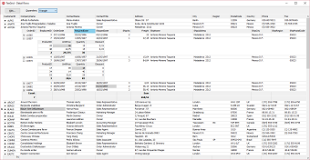
Any row can be expanded to show its detail sub-grid rows. The grid Data class must support master-detail relationships.
A TBIGridData class is provided to link TeeBI TDataItem data objects supporting master-detail See "TeeBI_Customer_Orders" example.
- Totals and SubTotals
Automatic summary "grid bands" can be added to a header or footer, also for "detail" subgrids.
var Totals : TColumnTotals;
Totals:= TColumnTotals.From(TeeGrid1.Data, TeeGrid1.Columns);

Totals.Calculation.Add( TeeGrid1.Columns['Quantity'], TColumnCalculation.Sum);

// Add band to grid footer
TeeGrid1.Footer.Add(Totals);

// Add also a band with total names
TeeGrid1.Footer.Add( TTotalsHeader.CreateTotals( Totals ) );- Row "Sub-Bands"
Any row might display a grid band above the row. The "band" can be anything, from a simple TTitleBand to a complex group of bands or rows.
var Title: TTitleBand;
Title:= TTitleBand.Create;
Title.Text:='My Rows';
TeeGrid1.Rows.SubBands[23]:= Title;- Custom cell rendering
Default class for cell rendering is TCellRender. Other classes can be used or created to override the default behaviour, like for example to show check-boxes in columns with boolean (True/False) values:
TeeGrid1.Columns[7].Render:= TBooleanRender.Create; - Cell text format (float, date-time formatting strings)
TeeGrid1.Columns[0].FloatFormat:= '0.###'; - Column Visible and Expanded (for sub-columns)
TeeGrid1.Columns[0].Visible:= False;
TeeGrid1.Columns[0].Items[3].Expanded:= False; // visible, but collapsed- Automatic column width (or fixed, in pixels or % percent of grid width)
TeeGrid1.Columns[0].Width.Automatic:= False;
TeeGrid1.Columns[0].Width.Value:= 40;
TeeGrid1.Columns[0].Width.Units:= TSizeUnits.Percent;- Column mouse drag resizing
Dragging the left mouse button in a column header edge resizes it
- Automatic scroll bars visibility
Scrollbars are automatically displayed when necessary. In Firemonkey they can be customized:
TeeGrid1.ScrollBars.Vertical.Width:=50;- Column ordering
Columns and sub-columns can be re-positioned:
TeeGrid1.Columns[2].Index:= 0; // move 2nd column to first (left-most) position- Grid Header formatting (font, back fill, stroke)
TeeGrid1.Columns[0].Header.Text:= 'My Column';
TeeGrid1.Columns[0].Header.Format.Font.Color:= TAlphaColors.Red;- Grid Header mouse-hover
TeeGrid1.Header.Hover.Visible:= True;
TeeGrid1.Header.Hover.Format.Brush.Color:= TAlphaColors.Green;- Grid "indicator" column (left-most column with symbol for current row)
TeeGrid1.Indicator.Visible:= True; // <-- False to hide indicator
TeeGrid1.Indicator.Width:= 20;- Row highlighting (mouse-hover and selected row formatting)
// selection
TeeGrid1.Selected.Column:= TeeGrid1.Columns[3];
TeeGrid1.Selected.Row:= 5;

// formatting
TeeGrid1.Selected.ParentFont:= False;
TeeGrid1.Selected.Format.Font.Style:= [TFontStyle.fsBold];- Multi-cell range selection (by mouse and arrow keys)
// range selection
TeeGrid1.Selected.Range.FromColumn:= TeeGrid1.Columns[3];
TeeGrid1.Selected.Range.ToColumn:= TeeGrid1.Columns[6];

TeeGrid1.Selected.Range.FromRow:= 10;
TeeGrid1.Selected.Range.ToRow:= 15;- Copy selected cells to clipboard in CSV format, pressing Ctrl+C or Ctrl+Insert key and also by code:
Clipboard.AsText:= TCSVData.From(TeeGrid1.Grid, TeeGrid1.Selected);- Full selected row highlight
TeeGrid1.Selected.FullRow:=True;- Grid and Columns ReadOnly
TeeGrid1.ReadOnly:= False;
TeeGrid1.Columns[0].ReadOnly:= True;- Custom Grid editors
TeeGrid1.Columns[1].EditorClass:= TCalendarEditor;- Rows and Columns lines separators (stroke settings)
TeeGrid1.Rows.RowLines.Visible:= True;
TeeGrid1.Rows.RowLines.Size:= 3;
TeeGrid1.Rows.RowLines.Color:= TAlphaColors.Skyblue;- Cell mouse-hover (highlights cell under mouse cursor)
Cell (or all cells in row) under mouse cursor can be highlighted:
TeeGrid1.Cells.Hover.Visible:= True;
TeeGrid1.Cells.Hover.FullRow:= True;
TeeGrid1.Cells.Hover.Format.Stroke.Size:= 2;- All coordinates as floats
For sub-pixel finetuning, Firemonkey only. VCL always rounds to integer pixels.
TeeGrid1.Header.Height.Automatic:=False;
TeeGrid1.Header.Height.Value:=124.3; // sub-pixels, decimals- Alternate row background filling (back brush, stroke settings)
TeeGrid1.Rows.Alternate.Brush.Visible:= True;
TeeGrid1.Rows.Alternate.Brush.Color:= TAlphaColors.Lightcoral;
TeeGrid1.Rows.Alternate.Stroke.Visible:= True;- Events
The usual Onxxx events:
OnAfterDraw
OnClickedHeader
OnColumnResized
OnEditing
OnEdited
TeeGrid-specific events:
OnNewDetail (called when a row is expanded to show a sub-grid)
OnShowEditor (called when a cell editor is about to be displayed)
- Abstract Grid "Painter" (canvas)
TeeGrid Painter property is of TPainter class. This is an abstract class that can be overriden, for example to use GDI+ in VCL:
TeeGrid1.Painter:= TGDIPlusPainter.Create; // <-- Note: not yet in beta version- Design-time editor dialog to modify all settings and properties
Several editor dialogs, for both VCL and Firemonkey, usable at design-time and runtime to modify all TeeGrid properties like columns, formatting, etc
uses VCLTee.Editor.Grid;
TTeeGridEditor.Edit(Self,TeeGrid1);- TDataSource / TDataSet support
Improve TVirtualDBData class to support DB buffering and events
- Easy embeddable controls in cells or rows.
To for example display sub-grids or TeeCharts below a row or inside a cell.
-
Image / Picture display in cells and header
-
Compositions (several texts, images, etc inside the same cell)
-
Column mouse-drag to reorder columns
-
Buttons at header to expand / collapse sub-columns
-
Automatic row sorting, filtering and searching
Note: Row sorting, filtering and searching is already possible with TeeBI TBIGrid control.


