-
Notifications
You must be signed in to change notification settings - Fork 134
Styling UINavigationBar: Part 2
iOS 7 has made a few changes to how UINavigationBar looks and how it gets customized. In this second part on styling the UINavigationBar, I'll review some of the changes we've made to Pixate 2.0 (RC3 and later) for making it easier to style the navbar as well as styling UINavigationItem and the various bar buttons.
Let's begin with taking a standard navbar with the system back button and customizing the back button.

For the default system button, there are just a few things you can customize. We'll start with changing the default back indicator icon. We'll use a svg vector file to render our new icon.
navigation-bar back-indicator {
    background-image: url(arrow.svg);
    background-size: 18;
}

Note that we used the back-indicator child for navigation-bar. iOS requires that a back-indicator-mask be also set, but we set it automatically to use the same image as the indicator. If you want to set an explicit indicator mask, then also specify it as follows:
navigation-bar back-indicator-mask { ... }
To set the tint color of the default system buttons, just use the color property of the navigation-bar, for example:
navigation-bar {
    color: #FF3B30;
}
Would result in this:
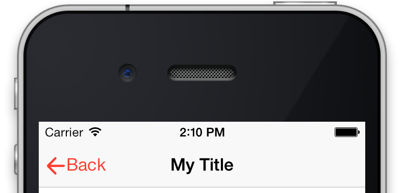
You can also set the font and color of just the system back button using something like this:
navigation-bar back-bar-button {
    color: #34AADC;
    font-family : "Avenir";
    font-size: 16;
}
That would result in this:
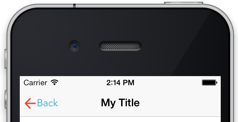
If you want to more completely customize the back button, now it's time to add your own. You could add a button in your view controller's viewDidLoad method, for example, like this:
self.navigationItem.leftBarButtonItem = [[UIBarButtonItem alloc] initWithTitle:@"Back" style:UIBarButtonItemStylePlain target:nil action:nil];

self.navigationItem.leftBarButtonItem.styleId = @"myBack";
Notice our custom button now looks like a normal button. Let's make it a bit custom with this markup:
navigation-bar left-bar-button {
    shape               : arrow-button-left;
    content-edge-inset  : 0 0 0 6;
    border-radius       : 5px;
    font-family         : "American Typewriter";
    font-weight         : bold;
    font-size           : 12px;
    font-weight         : normal;
    color               : #ffffff;
    background-color    : #008ed4;
}

Notice we had to use left-bar-button because it's no longer a standard back-bar-button but a custom one. Better yet, we should style it via it's style ID we had set:
#myBack { ... }
Adding a new right bar button is just as easy. For example, in your same view controller, you might add:
self.navigationItem.rightBarButtonItem = [[UIBarButtonItem alloc] initWithTitle:@"Go" style:UIBarButtonItemStylePlain target:nil action:nil];
self.navigationItem.rightBarButtonItem.styleId = @"myGo";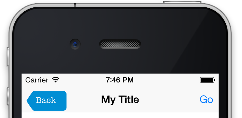
Now let's style it to match the left button we added, note that we can access it via right-bar-button or by its style ID, or in this case, both:
navigation-bar right-bar-button, #myGo {
    shape               : arrow-button-right;
    content-edge-inset  : 0 0 0 6;
    border-radius       : 5px;
    font-family         : "American Typewriter";
    font-weight         : bold;
    font-size           : 14px;
    font-weight         : normal;
    color               : #ffffff;
    background-color    : #008ed4;
}
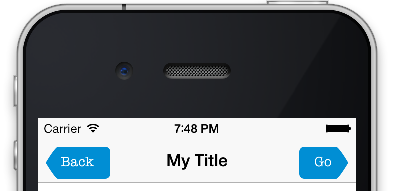
We can also set the icon of our custom buttons via the icon child, for example:
navigation-bar { color: white; }

#myGo icon {
    background-image: url(profile.svg);
    background-size: 20;
}
Note that you cannot have a label and an icon on a button at the same time, so you should not set both. Note that we set the navigation bar's color to white so the icon renders in white.
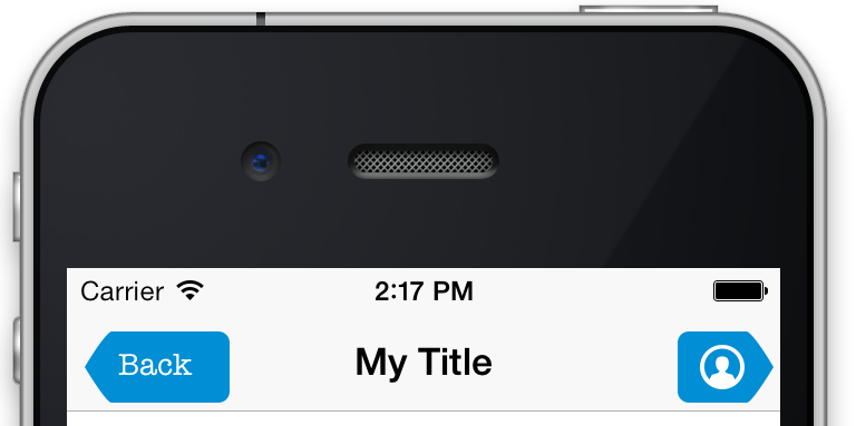
Finally, let's review how you might set the navigation bar's title font and color as well as the title text of individual navigation items.
For the title of each item in your navigation bar, you can set all of its font properties and color via the navigation bar itself, but when it comes to changing item specific properties, like the text itself, you'll want to access the navigation-item.
Let's first set the font and color of our title:
navigation-bar title {
    color: #4CD964;
    font-family : "Avenir";
    font-size: 26;
}

For customizing the text of the navigation item itself, I've added a styleId directly to the UINavigationItem and named it myNavItem:

Now you can set the text or text-transform directly, for example:
#myNavItem {
    text-transform: uppercase;
}
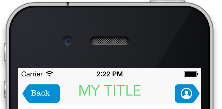
Or just set the text itself:
#myNavItem {
    text: "Pixate!";
}
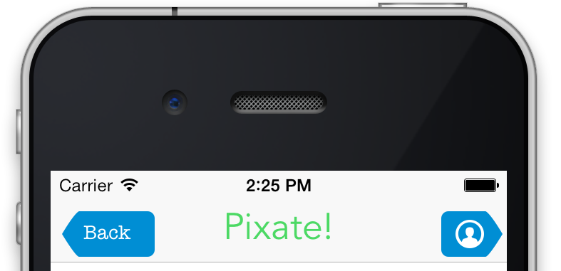
Here's the final CSS, cleaned up and shortened, that represents the final screenshot:
navigation-bar {
    color: white;
    background-color: #f7f7f7;
}

navigation-bar title {
    color: #008ed4;
    font-family : "Avenir-Black";
    font-size: 26;
}

#myBack, #myGo {
    content-edge-inset  : 0 0 0 6;
    border-radius       : 5px;
    font-family         : "Avenir";
    font-weight         : bold;
    font-size           : 14px;
    font-weight         : normal;
    color               : #ffffff;
    background-color    : #008ed4;
}

#myBack {
    shape               : arrow-button-left;
}

#myGo {
    shape               : arrow-button-right;
}

#myGo icon
{
    background-image: url(profile.svg);
    background-size: 20;
}

#myNavItem {
    text: "Pixate!";
}
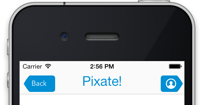
This brief overview gives some pointers on how to style the navigation bar on iOS 7 using Pixate. Remember, styling custom buttons versus styling the default buttons will give you more flexibility and customization options.
Hope you enjoyed this article.